- UI/UX
- Product
- Branding
- Iconography
Sentio*
utility mobile apps
In Sentio I’ve been designing a number of mobile apps. The goal is to quickly iterate through the ideas. If the app strives, double down the efforts, if not, abandon and switch to another one. With such approach I have a good opportunity to practice, fail and start again often. Over time quantity starts to transform into quality.
Fasting tracker
My latest design.
Being a regular faster myself for several years now, I was happy to find out we are building the fasting tracker at Sentio. It won’t be an overexaggeration to say that it is the favorite app I designed in Sentio so far.
Though there is quite a number of fasting tracking apps, many of them are too complicated. I wanted to make our app as simple as possible, which in my opinion is gonna help to form the habit to people using the app.
Being lightweight, app still gives enough flexibility to experienced fasters with custom fasting plans and schedules.


Widgets. Simple readable widgets with the most important information people on the fast want to see—fasting progress and current fasting zone.


Iconography. Bold filled icons and simple forms support interface the best. I aspired to ensure the best readability and quick recognition for users.

Messaging app
Simple app that allows to rent the virtual phone number to send and receive text messages.
Our users use the app for a variety of cases: from registering in services that are not available in their countries to using temporary number to sell items on Craigslist and avoid spam on their main phone number.
It was important to allow users to have multiple phone numbers and make it easy for them to distinguish between phone numbers (by giving each it’s unique alias) and let them easily see what number is being used in conversation.


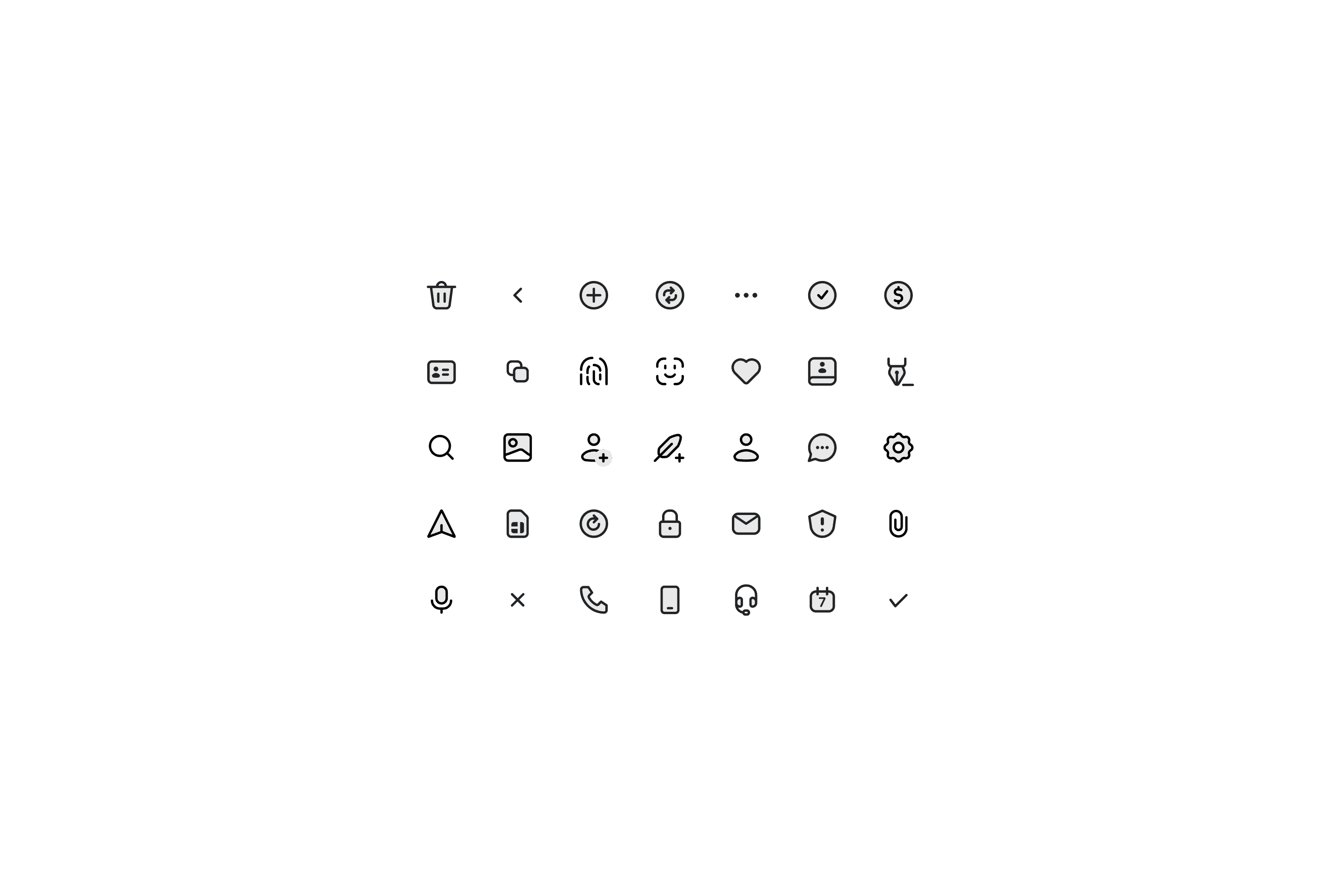
Icons. Simple two-tone icons should help people to easier navigate through the app. Also they are quite pleasant to look at.

Android app. With a distinct design language and platform it was quite a challenge to design an Android app that would feel right.


Other apps
I've also designed second phone number app, various PDF related apps and fax app. All of them have limited purposes that are clearly understandable through the focused interface.
In two apps due to time constraints I’ve used great ready-made icons from SF Symbols and Microsoft Fluent system, in all others the icons are made from scratch.


