- UI/UX
- Product
- Branding
- Iconography
Phone Cleaner
app for decluttering the phone
Our goal was to create a user-friendly tool that would streamline the often tedious process of phone cleanup. We decided to implement a subscription-based model for the app, aiming to provide ongoing value to users while ensuring a sustainable revenue stream for continued development and support.
Scope
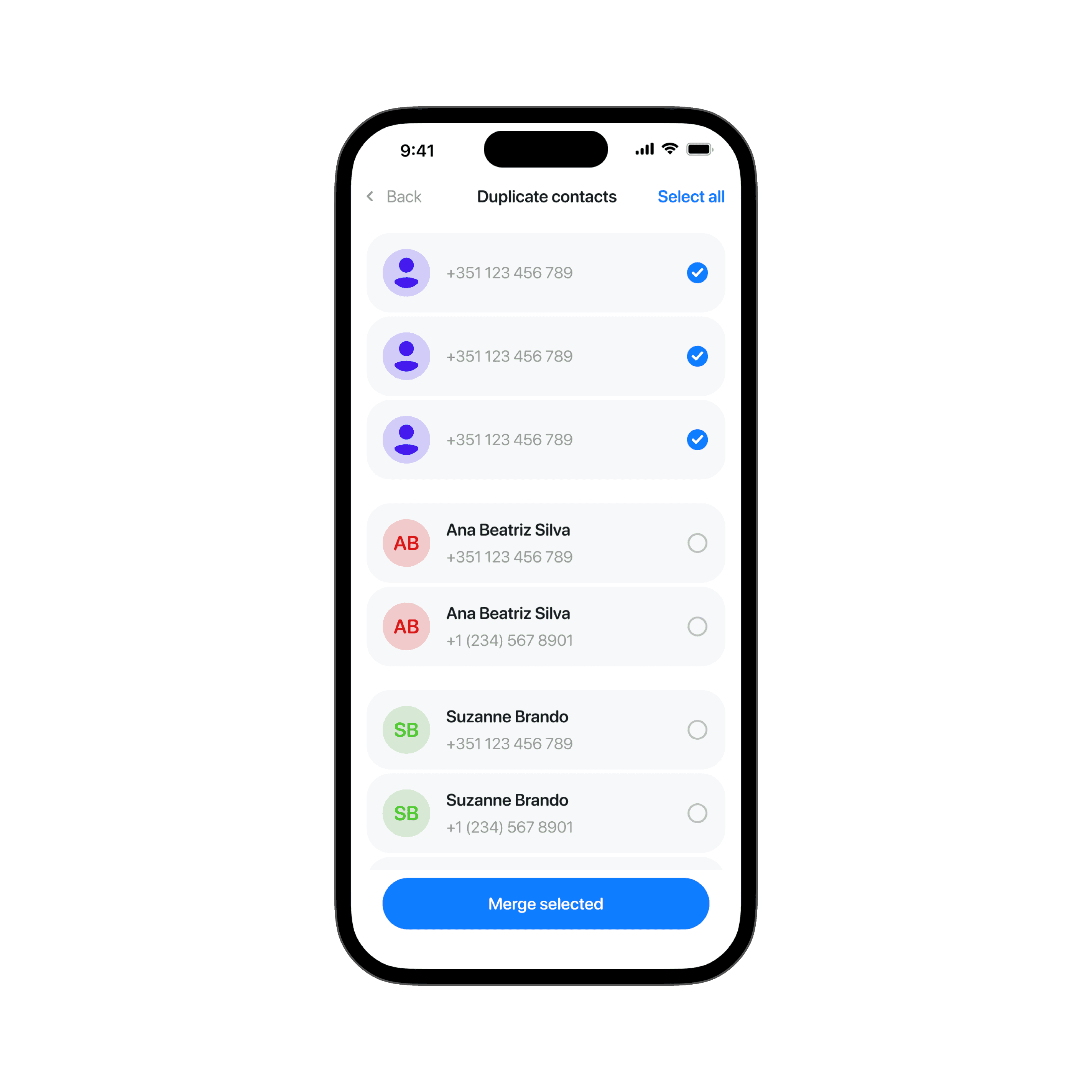
We set out to develop an iOS-exclusive utility app designed to help users efficiently manage their iPhone storage. The app's primary functions were to identify and delete similar, duplicate, and blurry photos and videos, as well as manage screenshots and contacts.
This initial version was planned as a foundation, with the potential to add more advanced features in future updates based on our ideas and user feedback.
Process
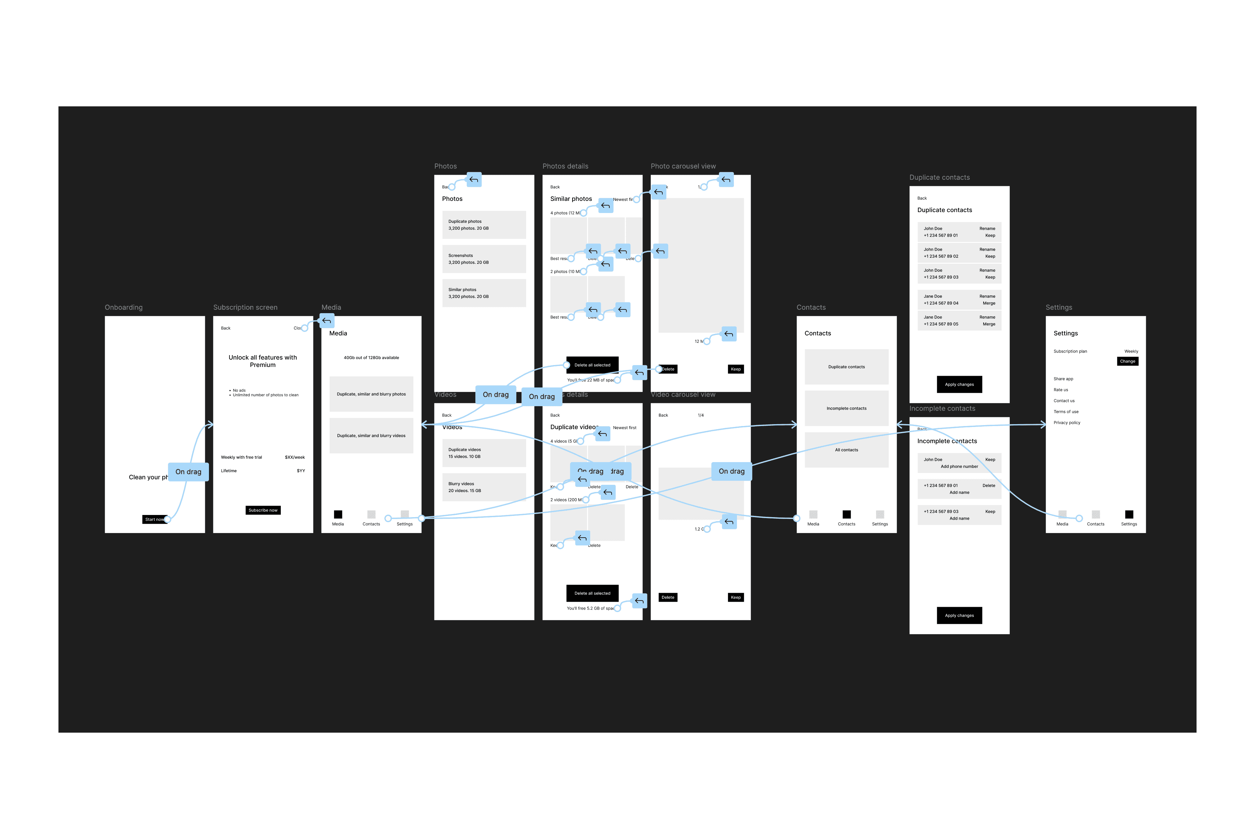
My typical process involves competitor research, documentation, and feature specification for the first version. I create an interactive UX wireframe in Figma, present it to the Product Owner with specifications and competitor analysis. After approval and developer feedback, I design high-fidelity mockups. I then present to developers, explain functionality, and incorporate their feedback. While developers build the first version, I worked on onboarding animation in After Effects. I test the first build, provide feedback, create the app icon, and prepare App Store screenshots. After QA, we publish the app.
Wireframes. The prototype was relatively simple, demonstrating the app's core functionalities.
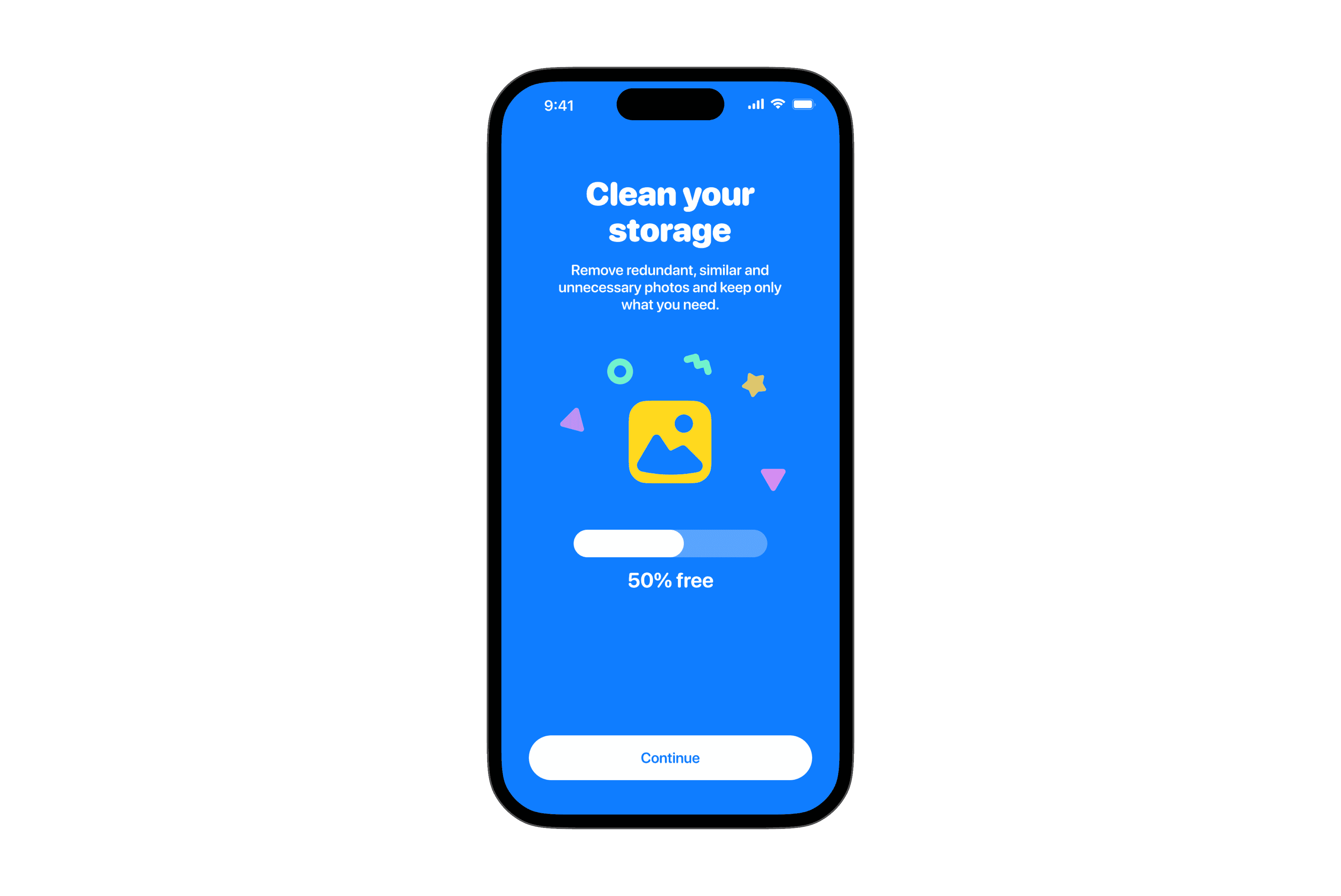
High-fidelity designs. I aimed for a friendly and playful feel to encourage user engagement.
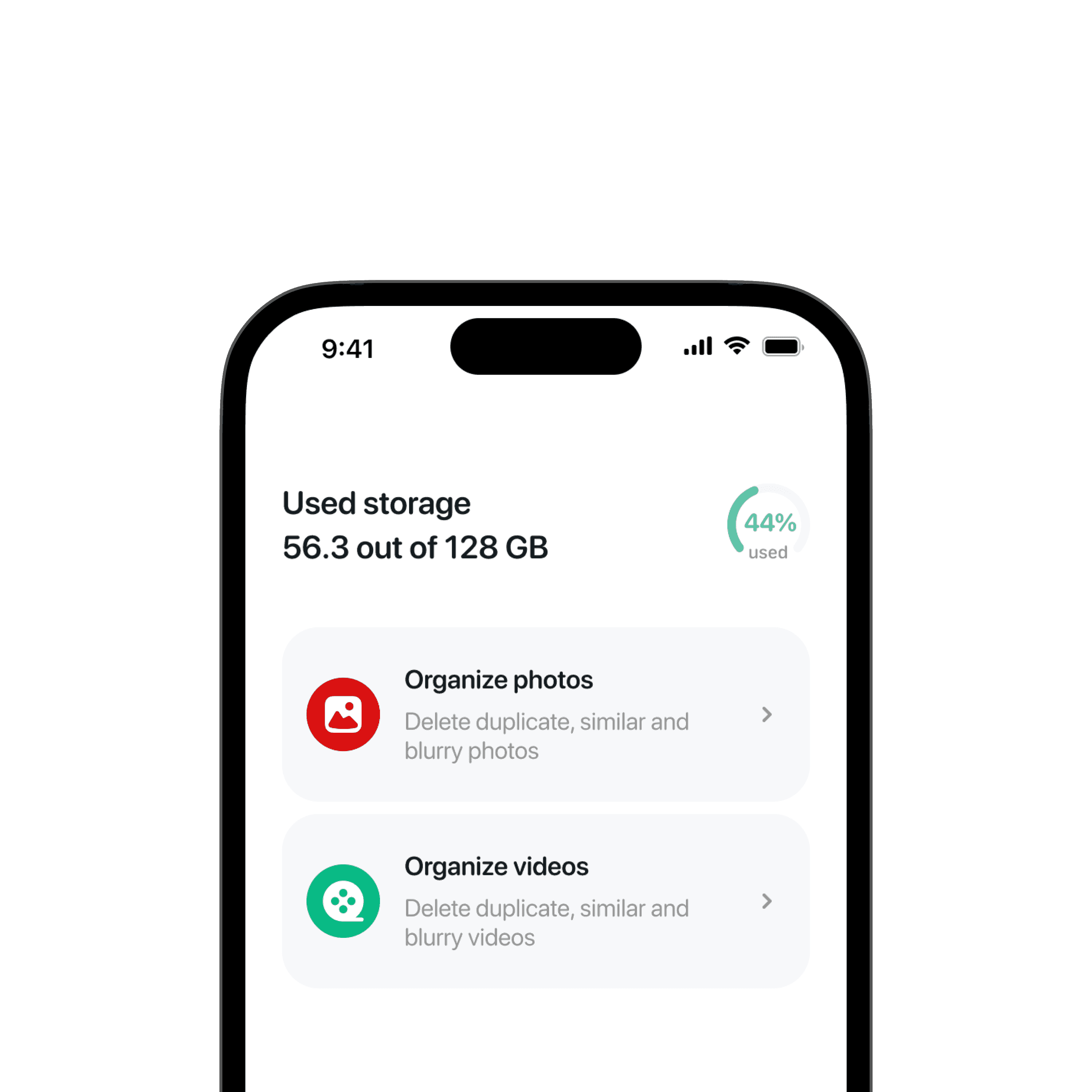
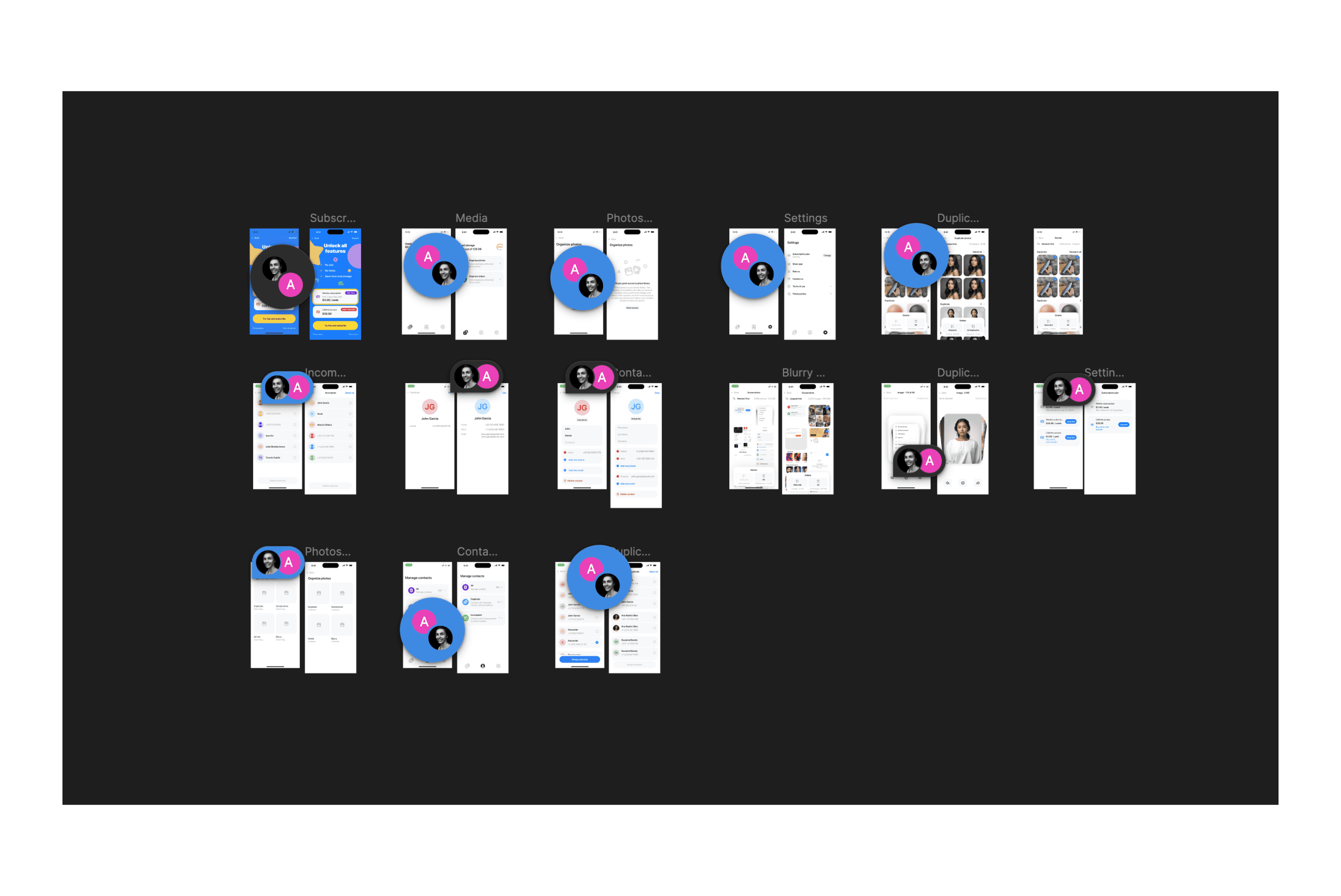
To provide feedback on the first implementation, I created a Figma page comparing screenshots of the implemented app with the original designs side-by-side. This visual approach allowed me to leave contextual comments directly on the Figma file, streamlining the feedback process for developers.
Challenges and mistakes
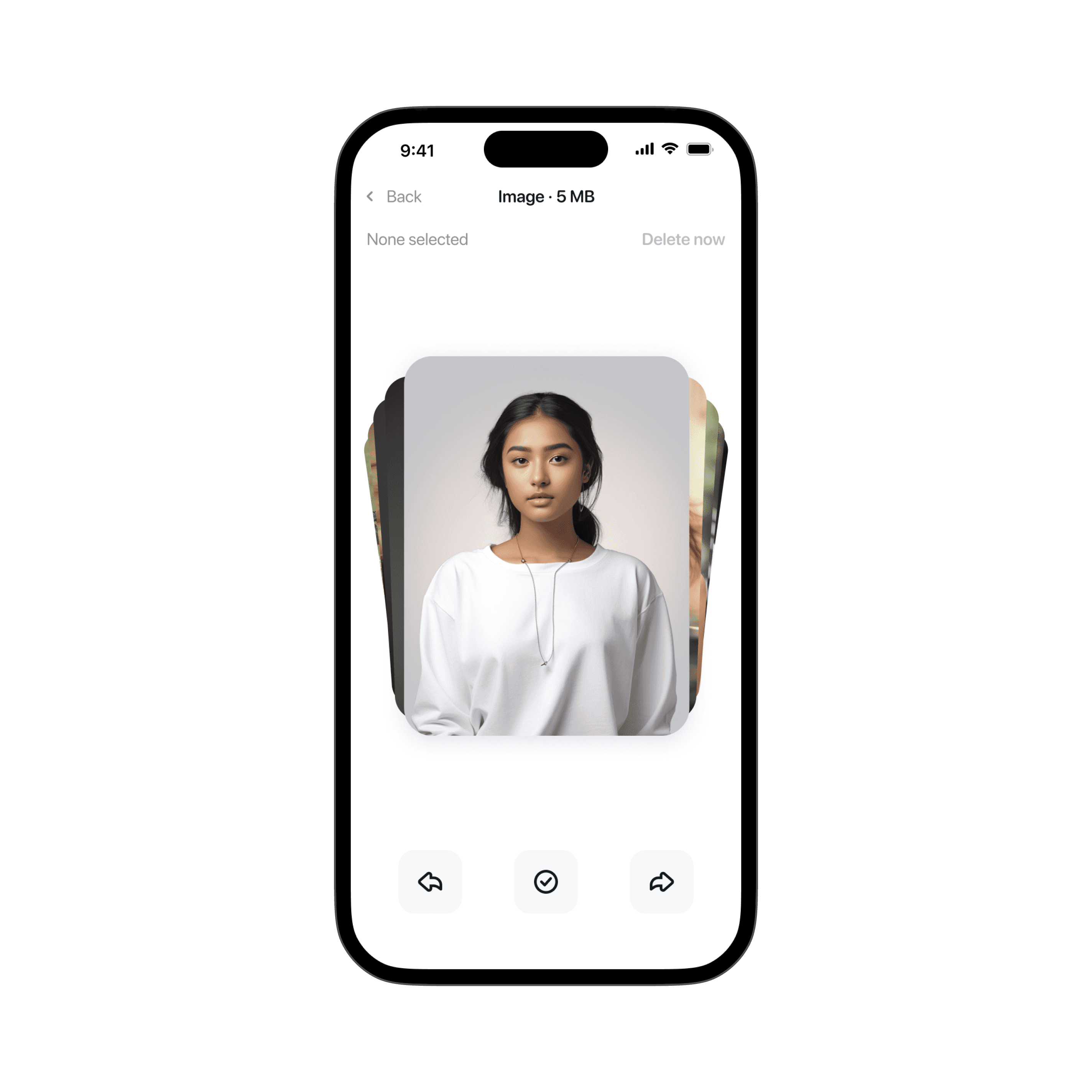
After the first build, I found the photo swiping process redundant. Initially, users could select photos to delete from a grid view or swipe through a "photo stack".
Initially, the Apple review team rejected our subscription model, citing that there were too few features in the app to justify a recurring payment. They instructed us to use a one-time in-app purchase instead. This setback forced us to reconsider our monetization strategy and focus on expanding the app's functionality.
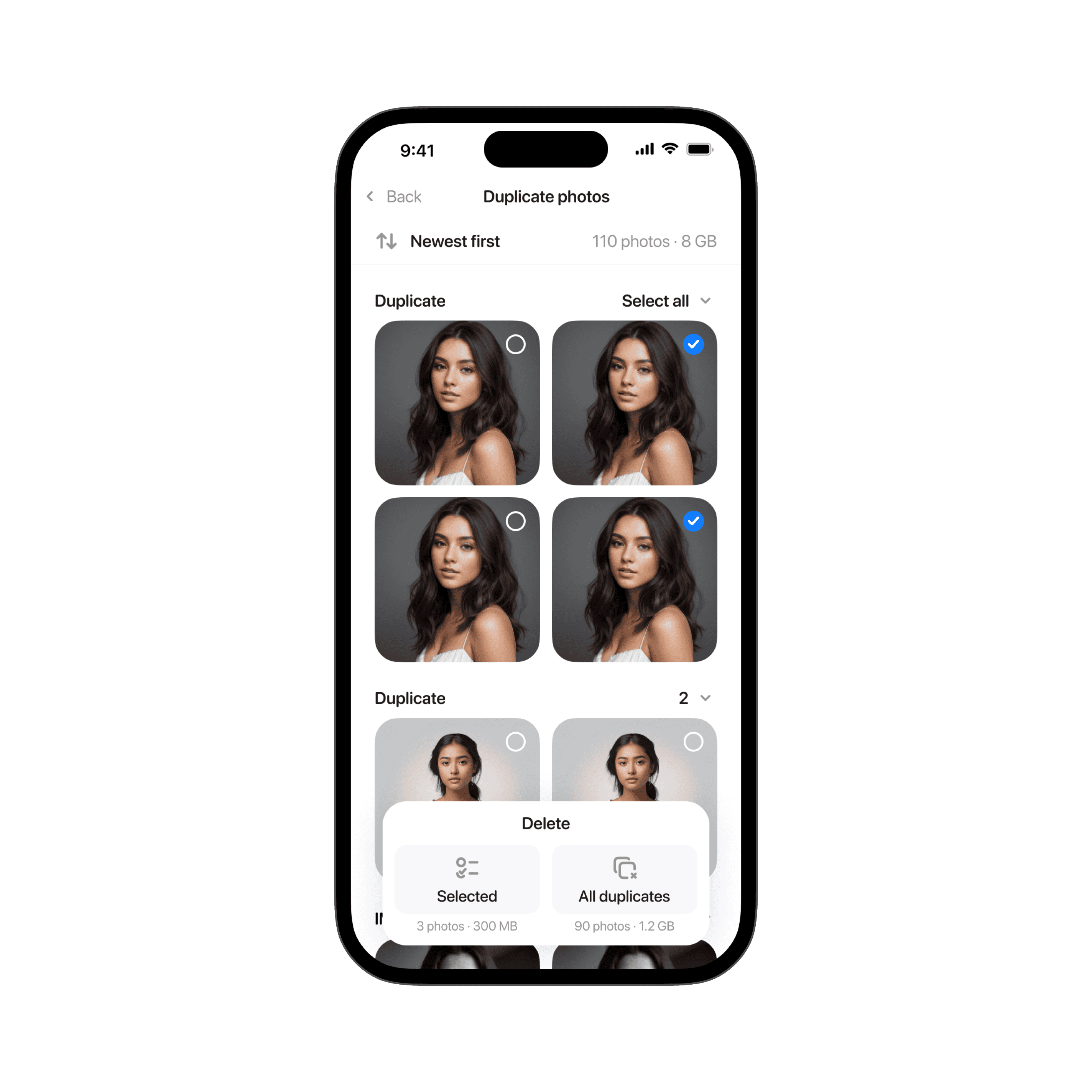
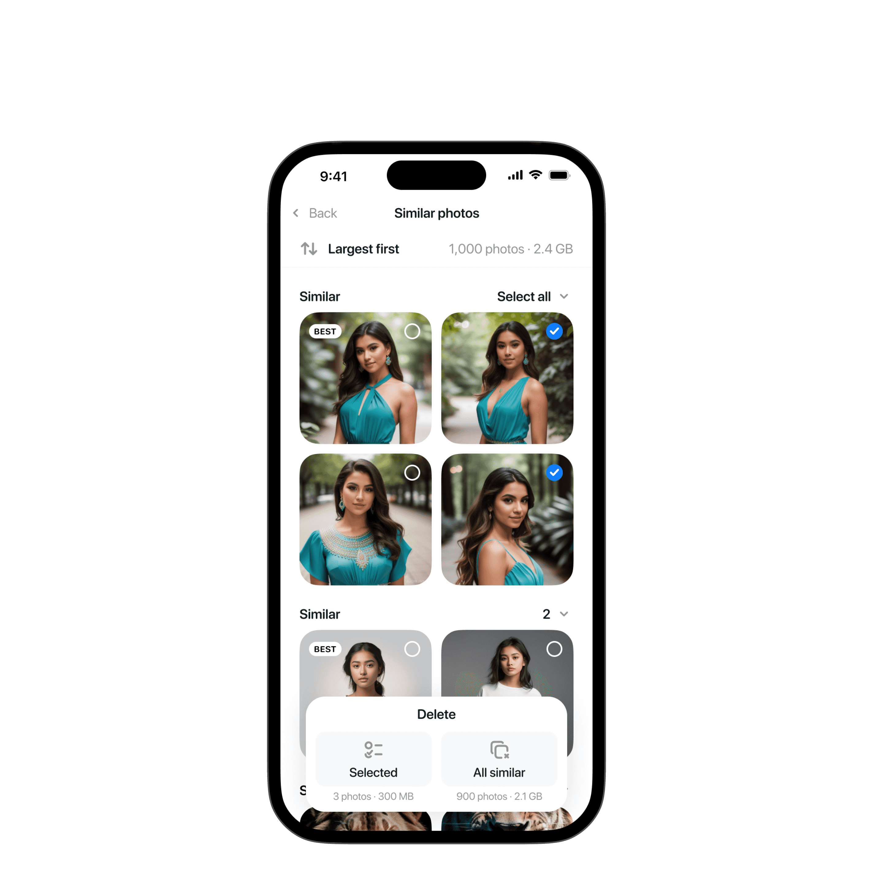
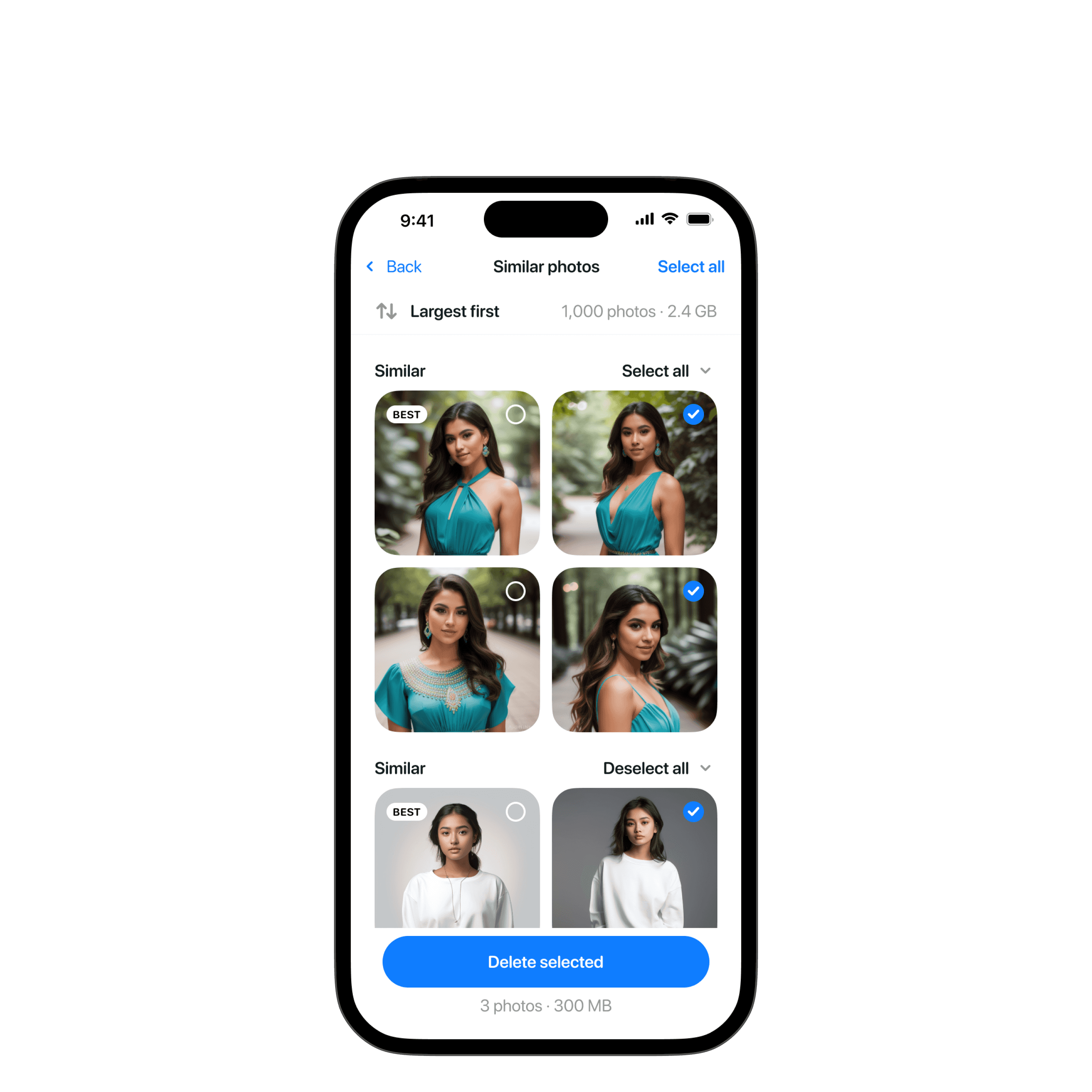
Post-release, users found the bottom panel on the photos management screen confusing.

I removed the "photo stack" screen, replacing it with a full-screen photo view when tapped.
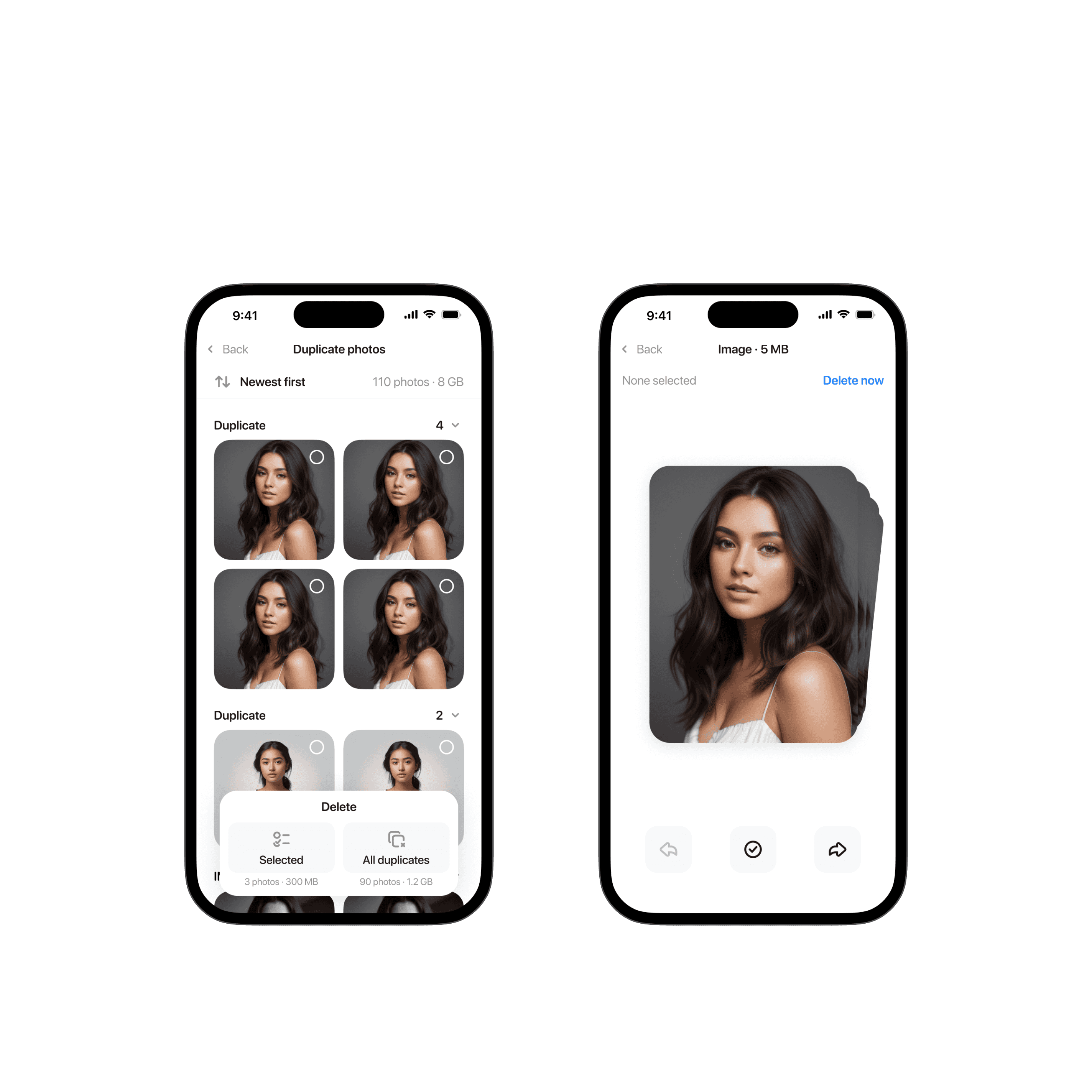
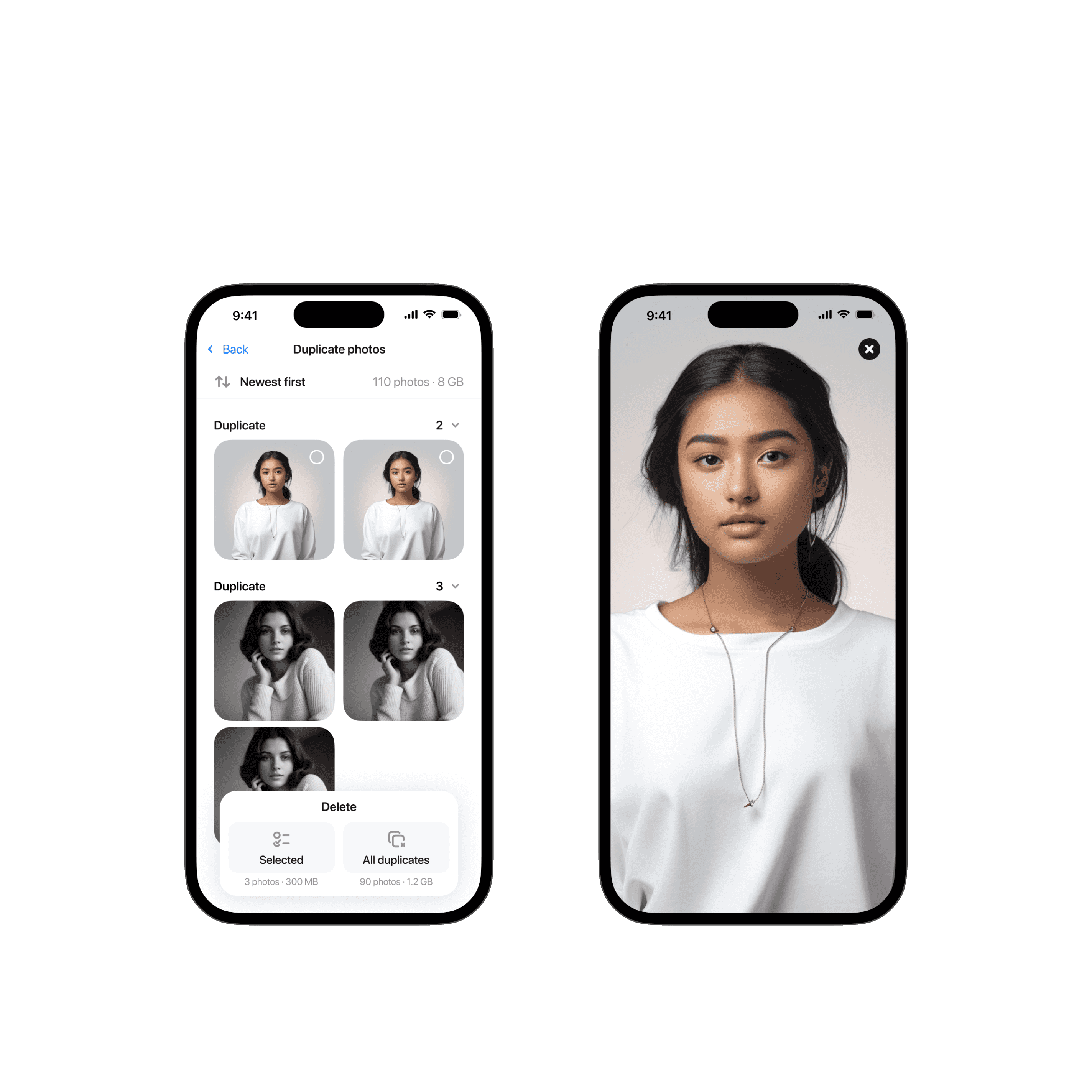
I simplified photos management screen to have a "Select all" button and a "Delete" button that removes selected items, which users found clearer.
Next versions
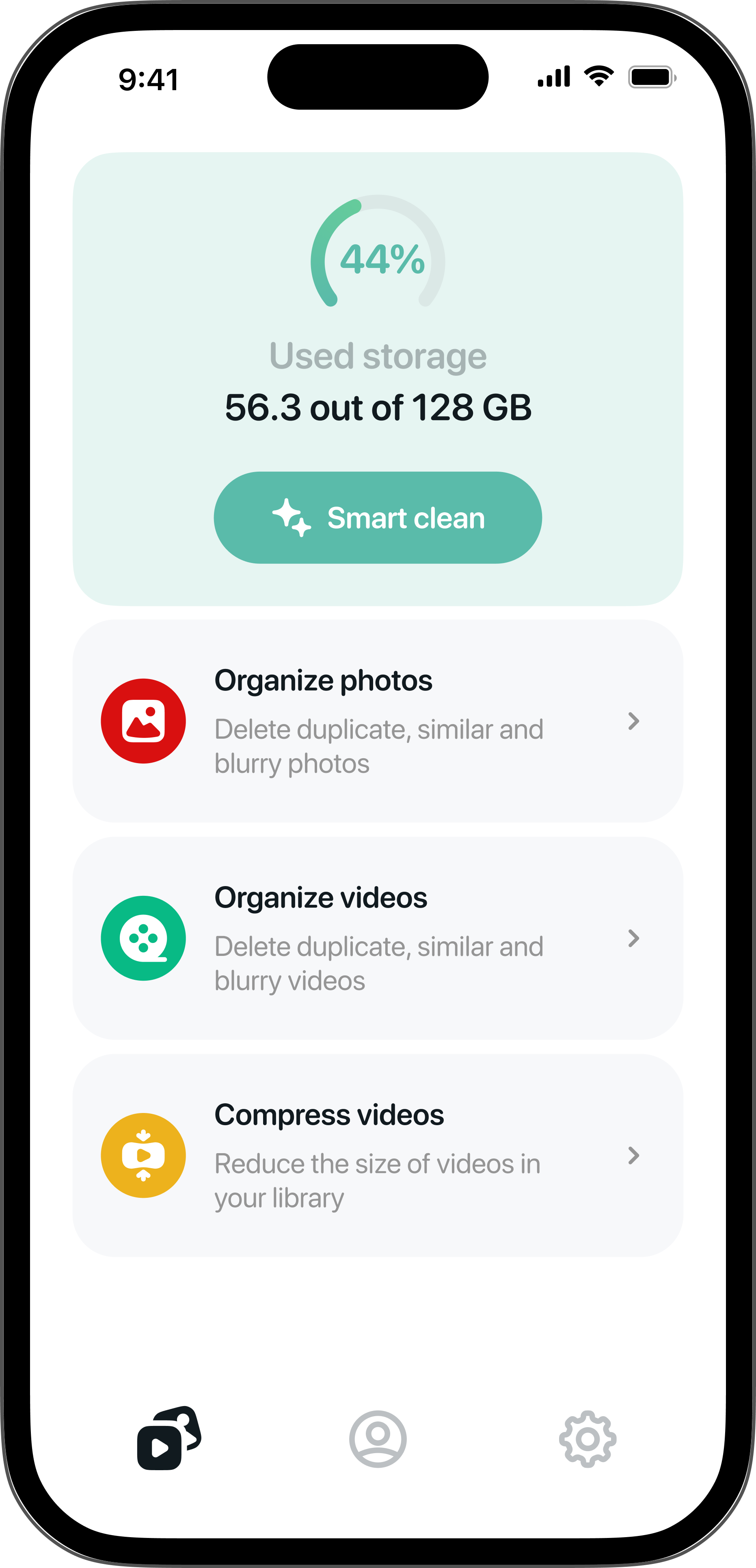
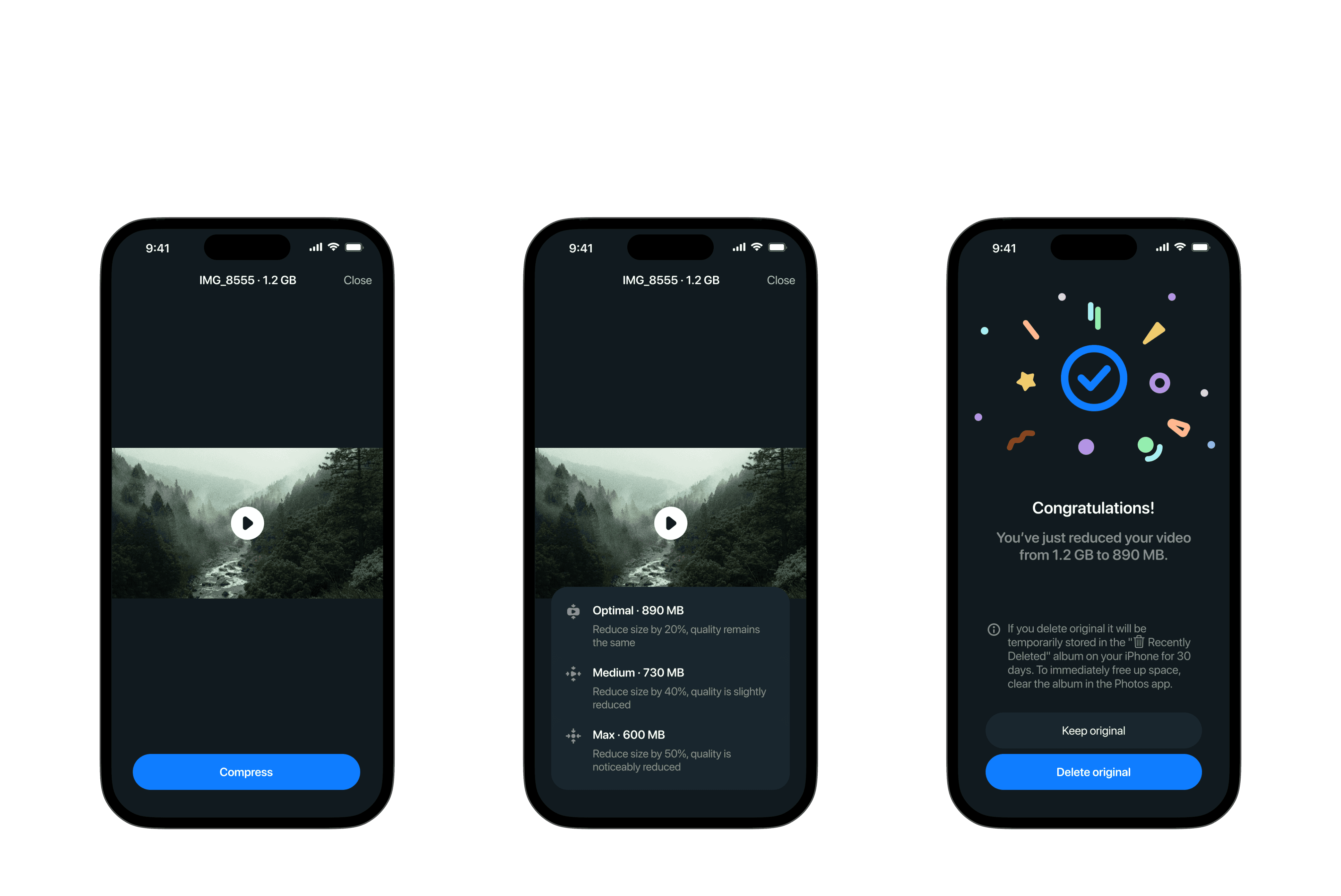
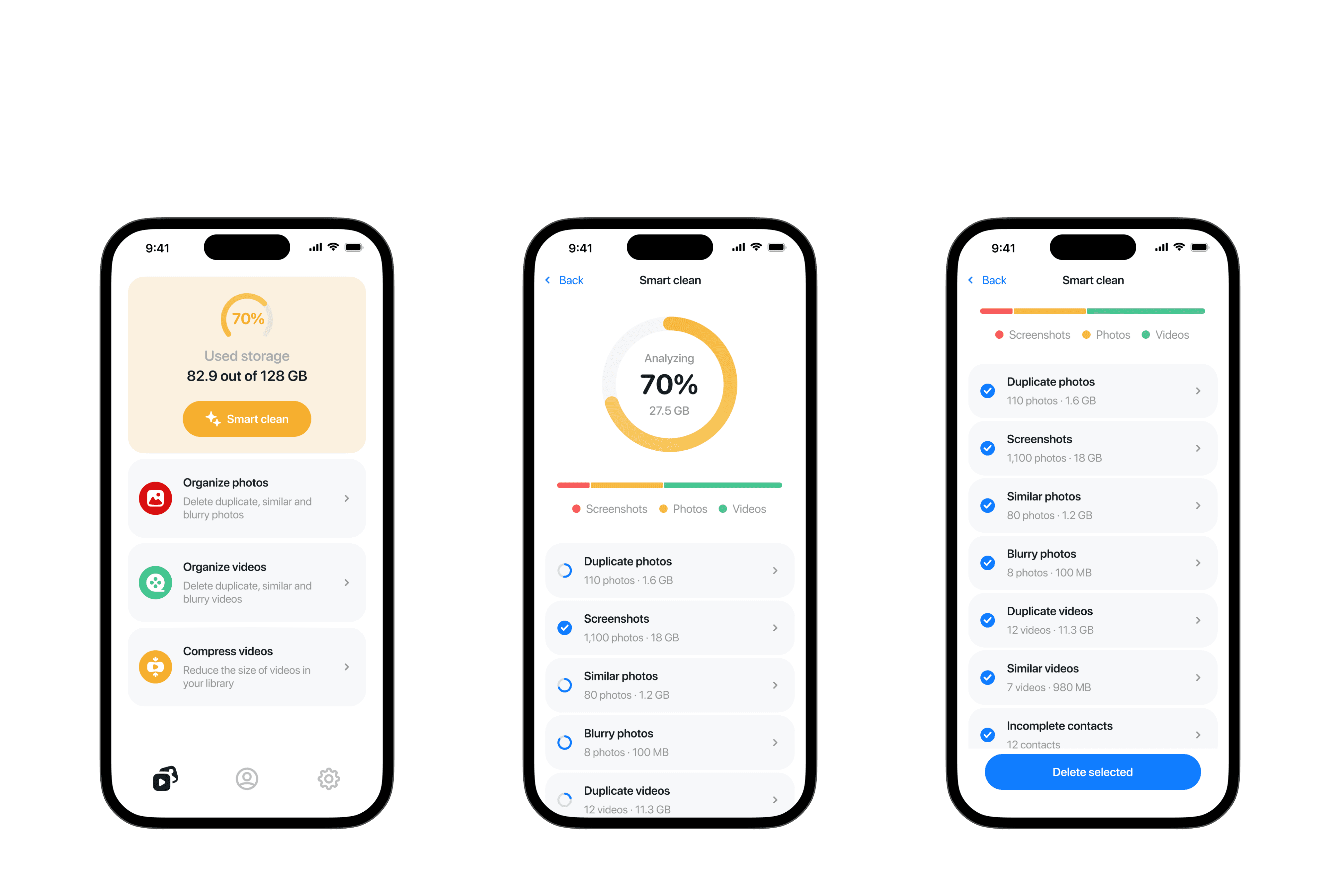
We added more functionality over time:
- Video compression
- Smart clean feature for comprehensive phone scanning and bulk deletion
Results
The app's Monthly Recurring Revenue (MRR) steadily increased to a satisfactory level. After implementing UX improvements and adding new features, the day 7 retention grew from 3% to almost 7%.
Importantly, as we continued to develop and add more functionality to the app, we were able to successfully switch to a subscription-based monetization model. This transition was approved by Apple's review team, recognizing the increased value we were providing to users. The move to a subscription model has allowed for more sustainable revenue, supporting ongoing development and improvement of the app.
