- UI/UX
- Product
- Branding
- Iconography
Messaging app
with virtual phone numbers
Scope
We were tasked with developing a messaging app for both iOS and Android platforms. The app's primary function was to allow users to purchase virtual phone numbers from various countries for sending and receiving messages. The main use cases were:
- Registering for services unavailable in the user's country
- Providing a "virtual" number for online boards to maintain privacy
The app needed to support multiple virtual numbers per user and offer subscription-based pricing models.
Process
My process for developing mobile apps at Sentio follows a consistent pattern. For this app, the steps were:
- Research competitors and analyze their features, pricing model, revenue and other metrics
- Create UX wireframes to outline the app's structure and flow
- Design high-fidelity mockups and prepare visual assets
- Present designs to the development team and discuss implementation
- Wait for the initial implementation to be completed to install and test the app on my phone
- Document and report any inconsistencies or bugs to the development team
- Iterate on designs based on technical constraints or new insights
- Retest the app after developers address reported issues
- Design app icons and App Store and Google Play screenshots for both iOS and Android platforms
- Conduct a final review of the app before launch
- Assist in preparing app store descriptions and metadata
This approach ensures a thorough development process from initial concept to final product launch, with multiple opportunities for refinement and quality assurance.
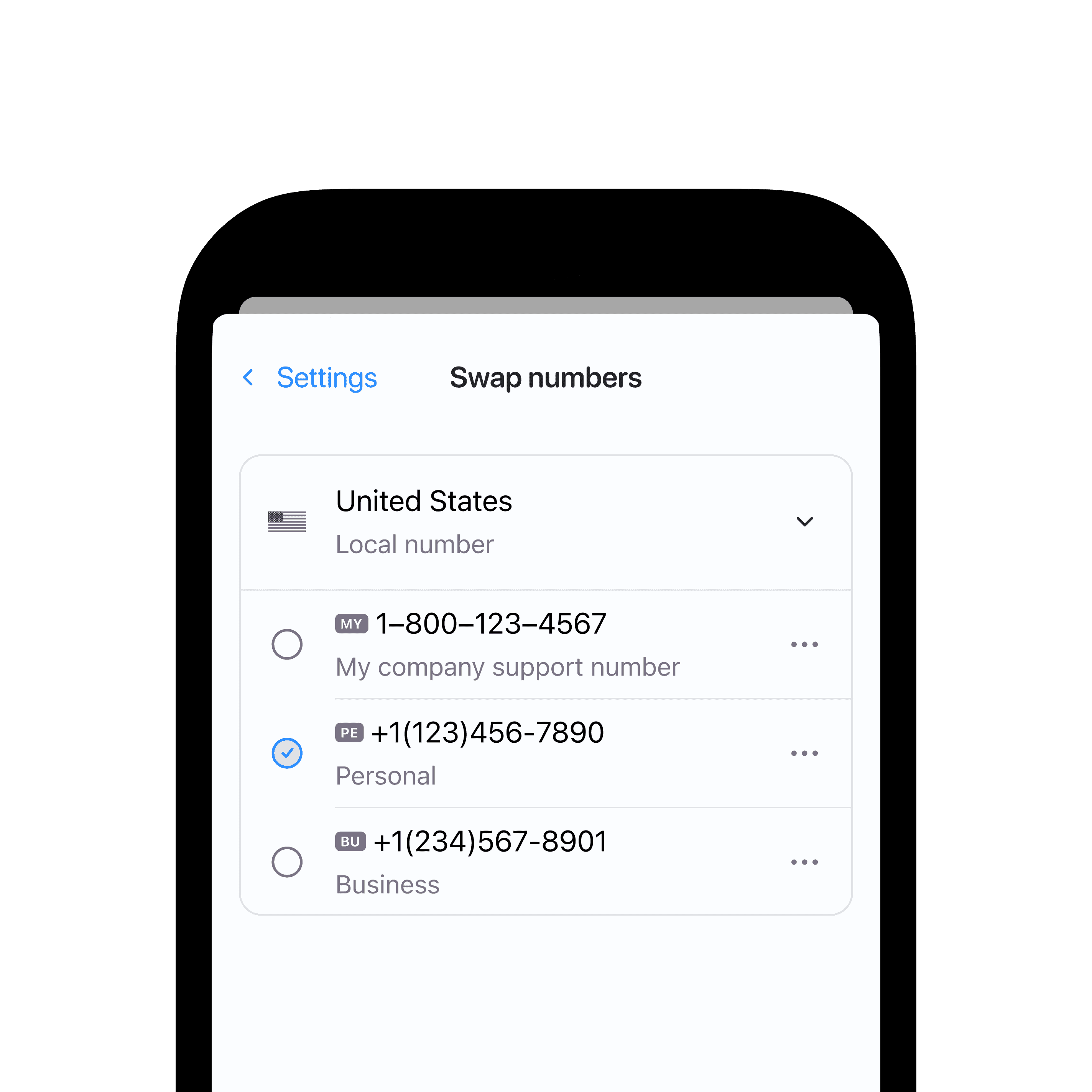
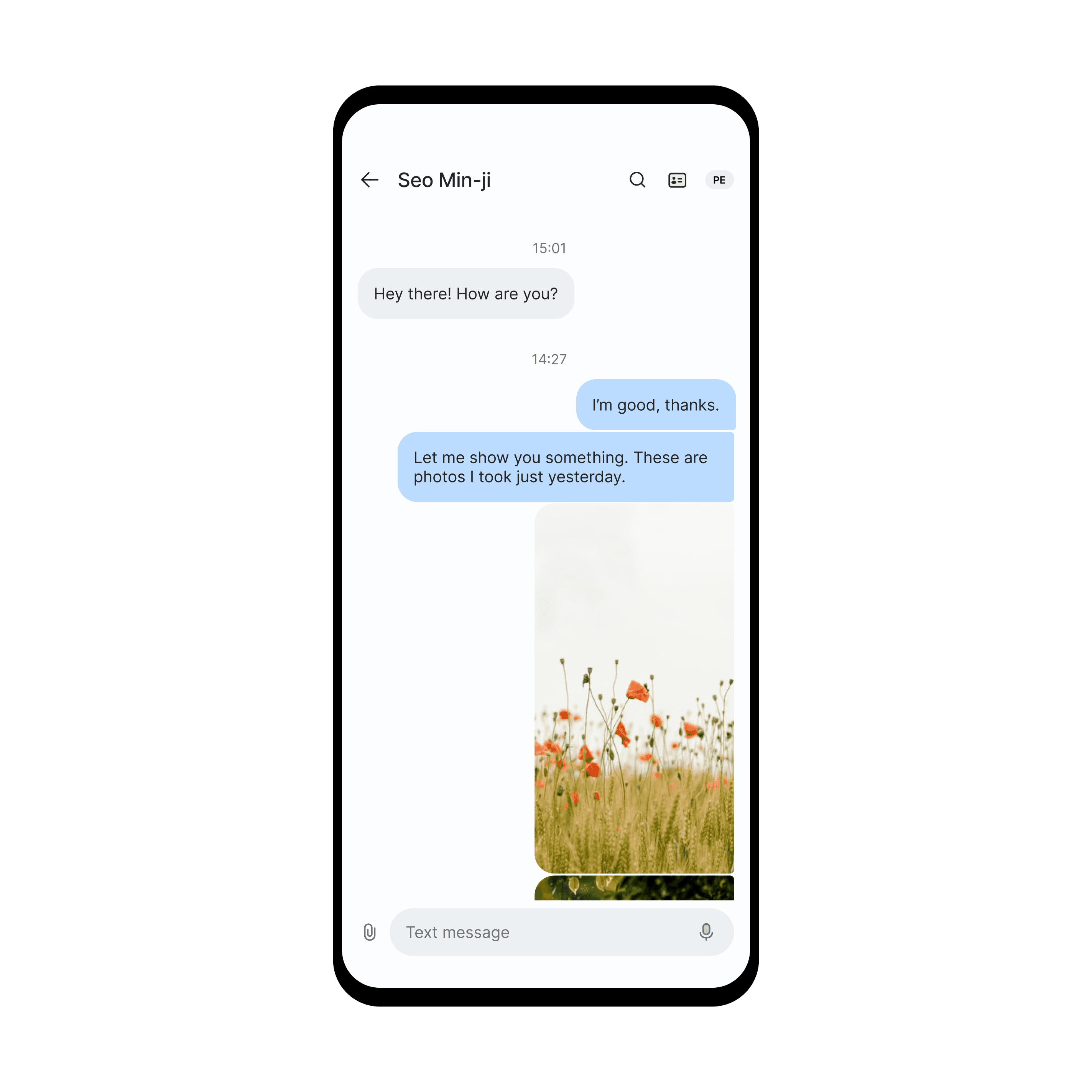
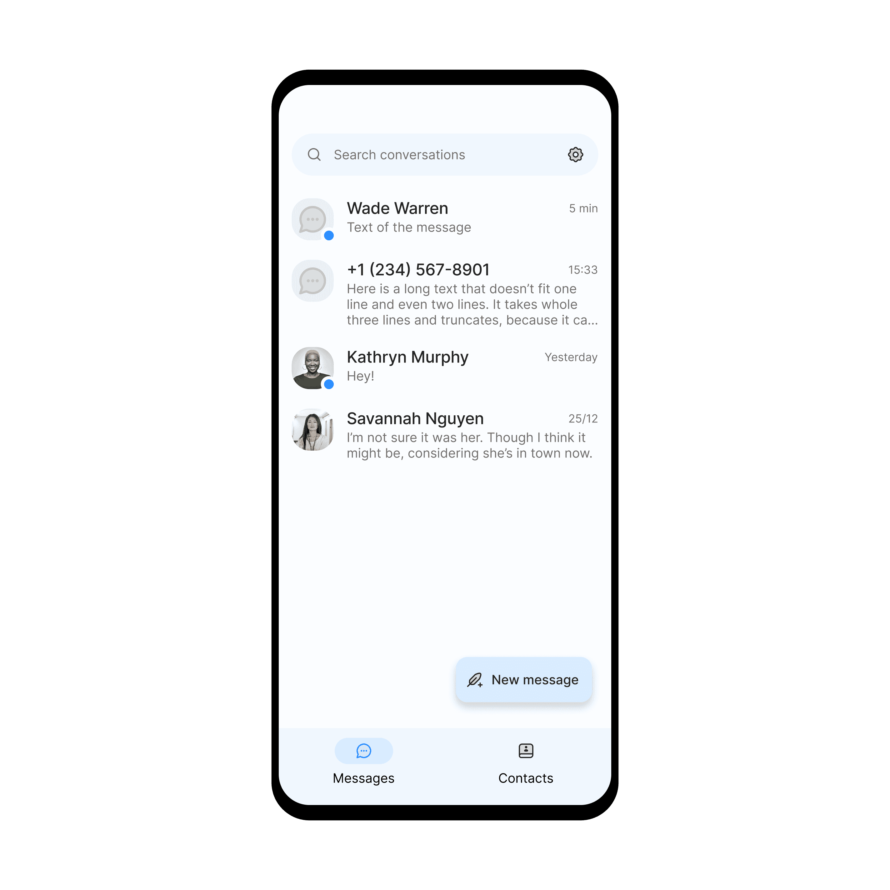
Wireframes. The messaging interface was straightforward, but I focused on designing an intuitive system for managing and swapping between multiple virtual numbers.
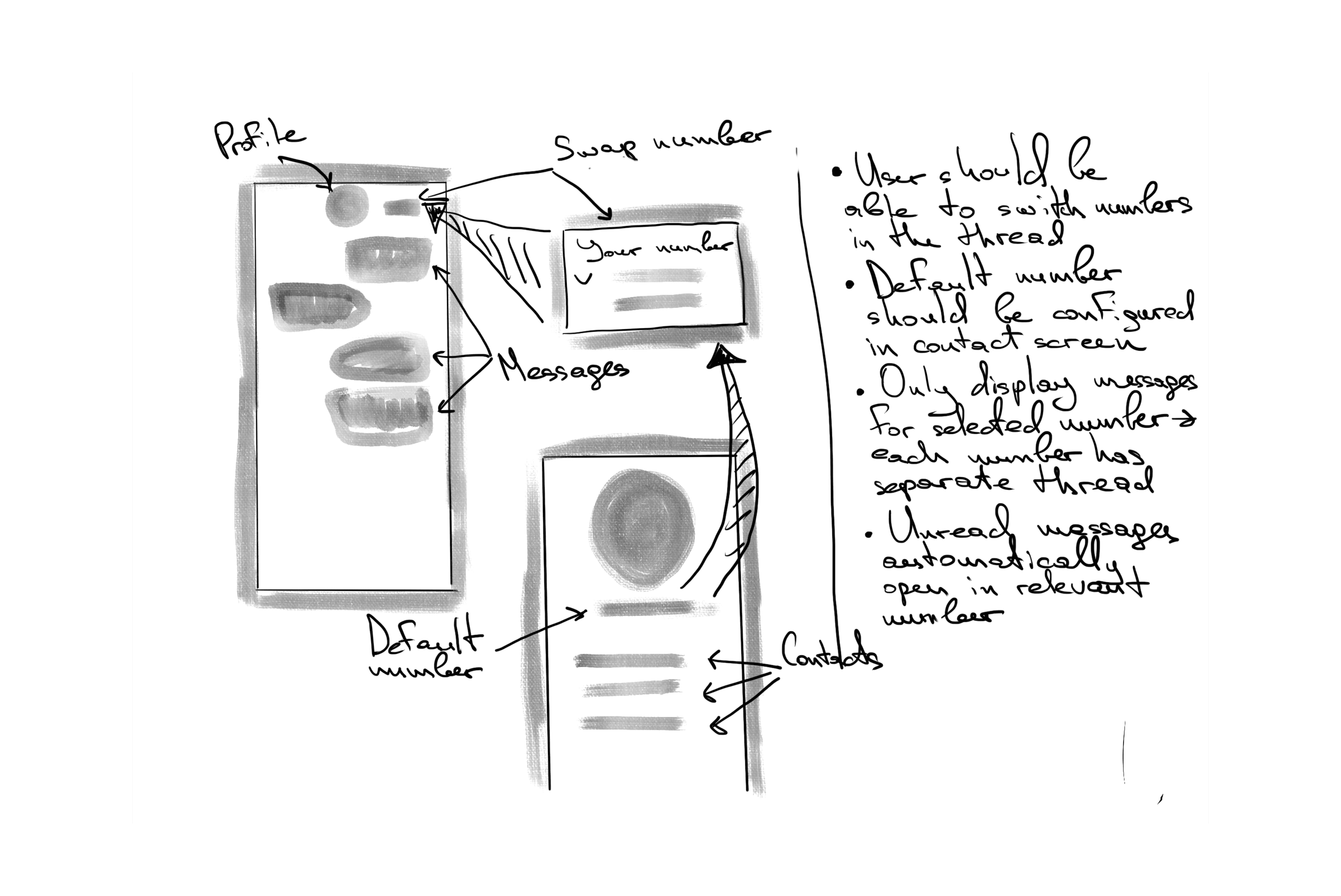
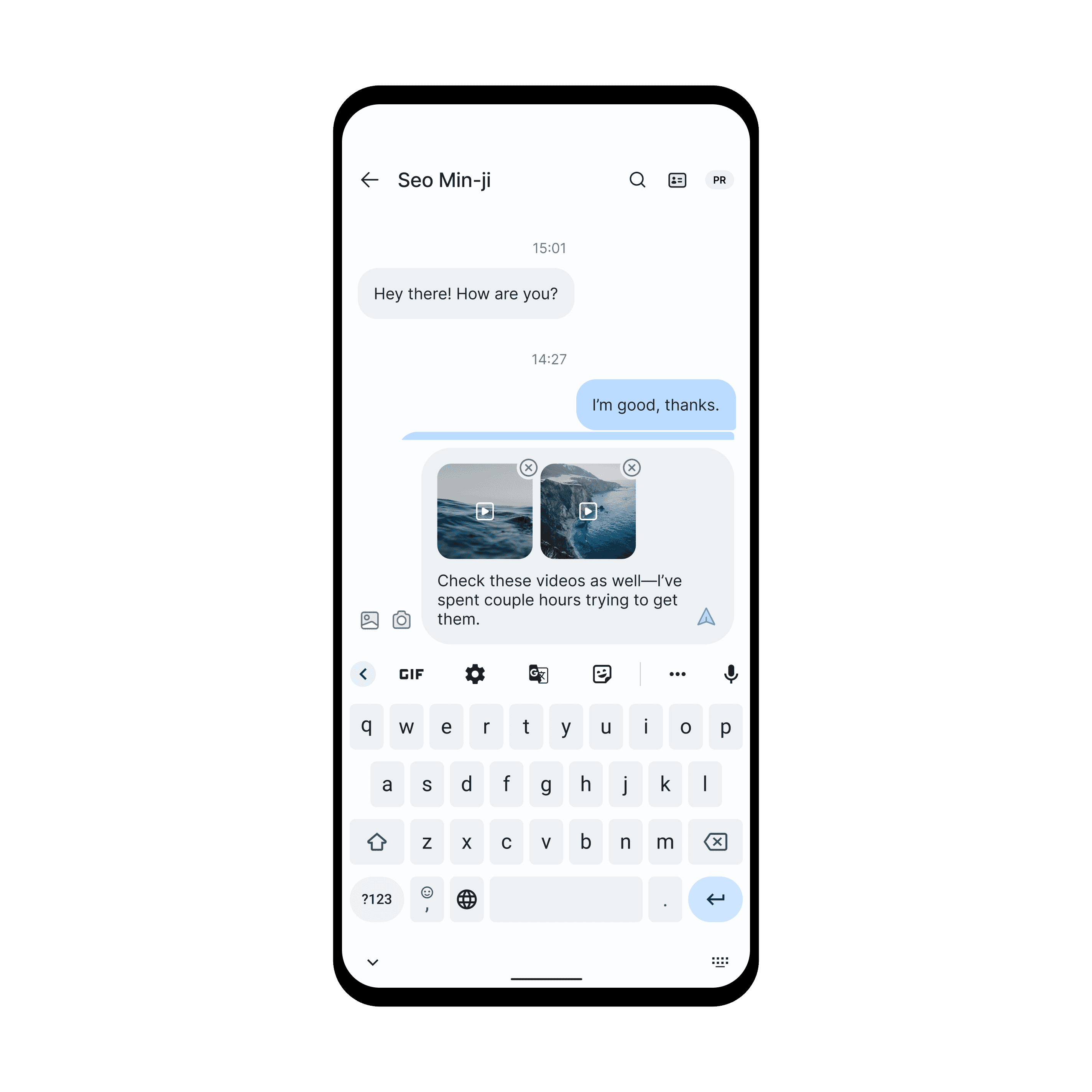
The design prioritized simplicity and ease of use, with a focus on messaging functionality.
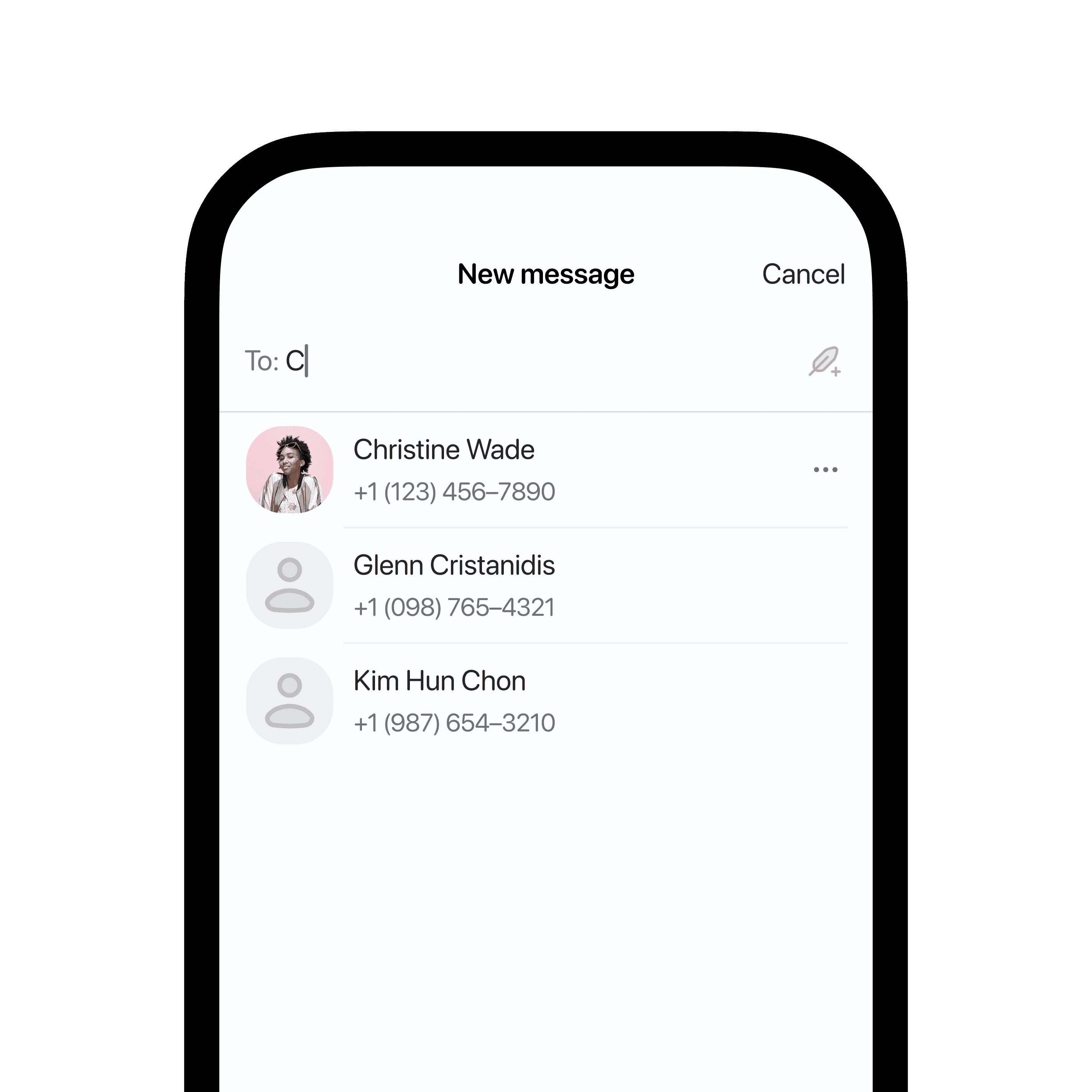
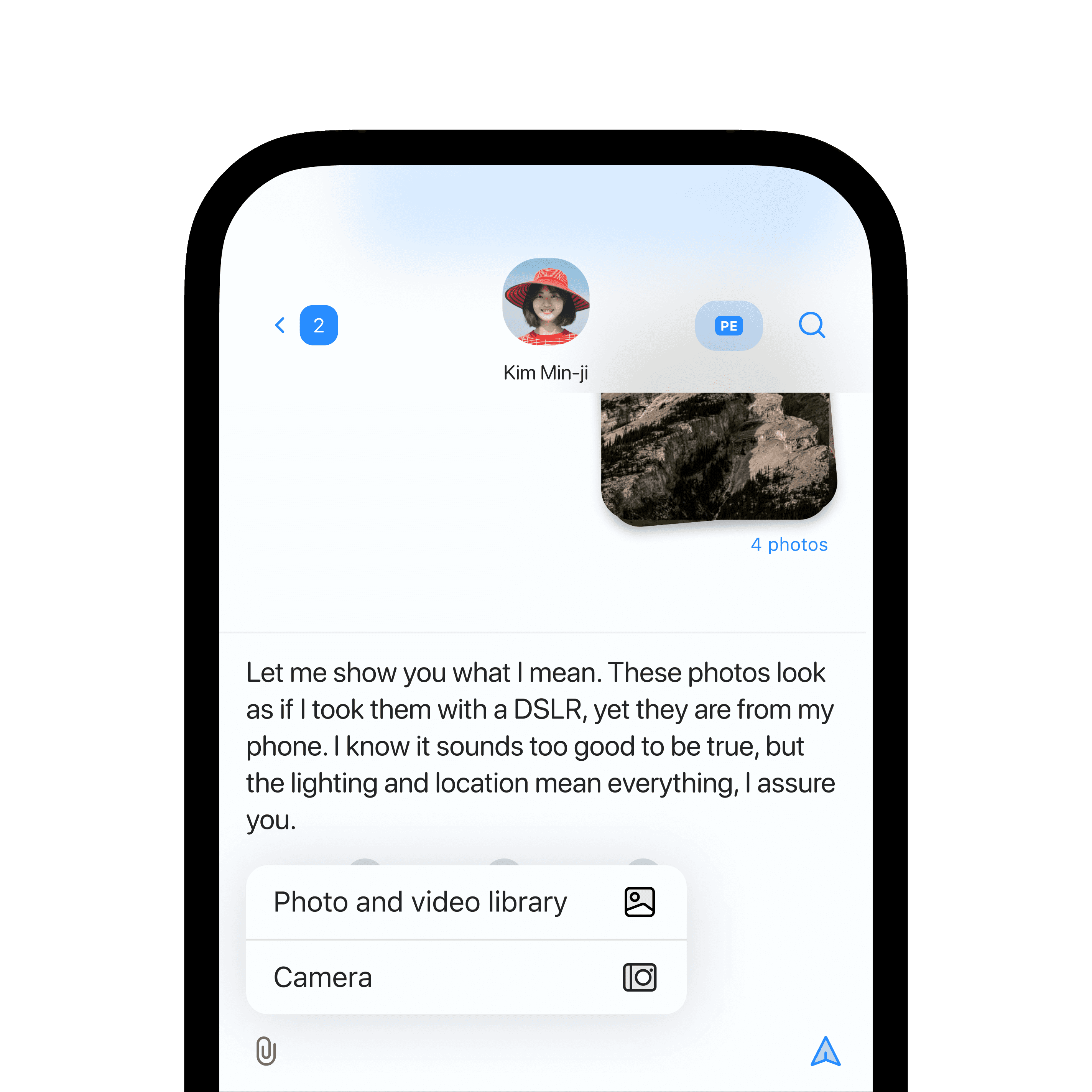
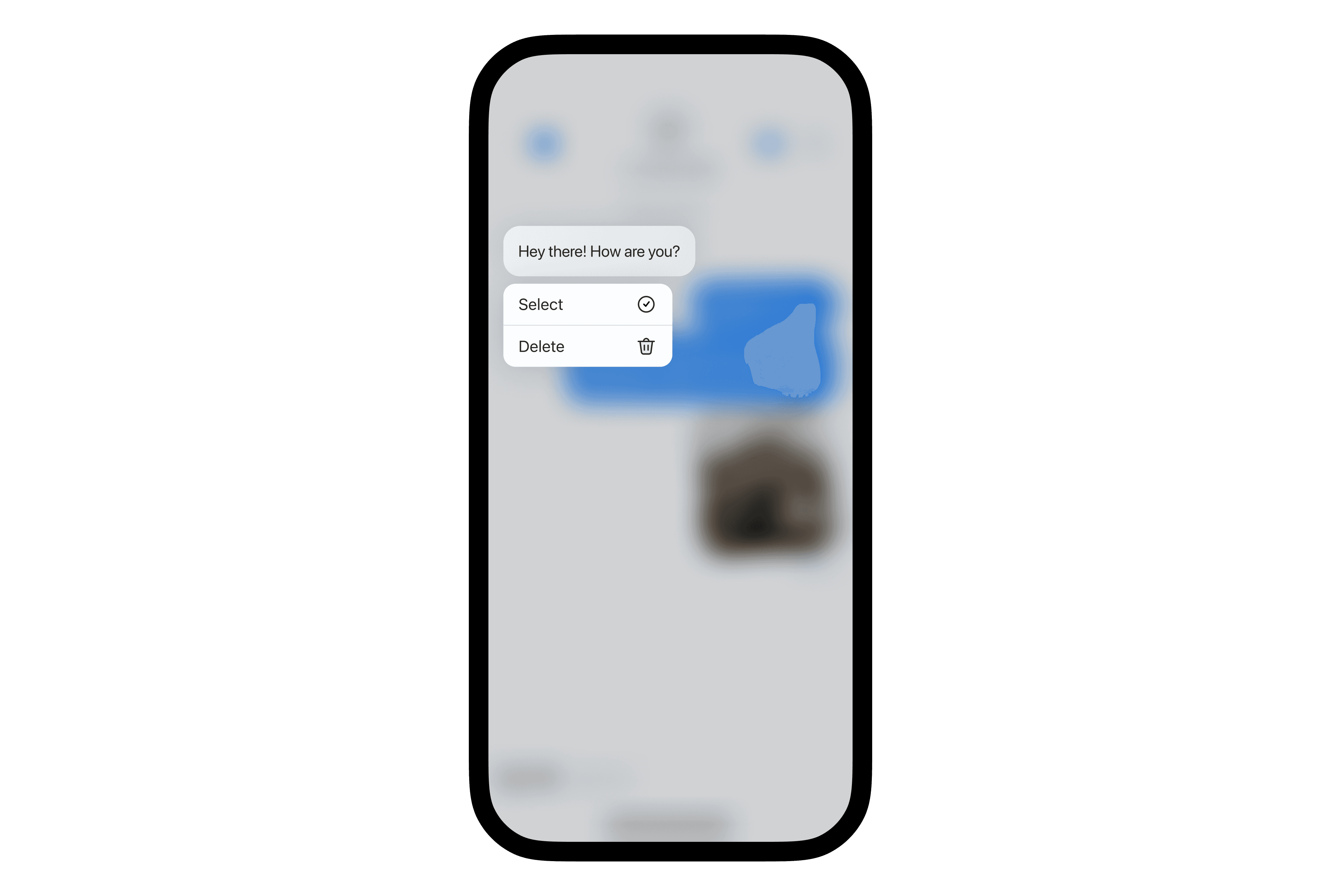
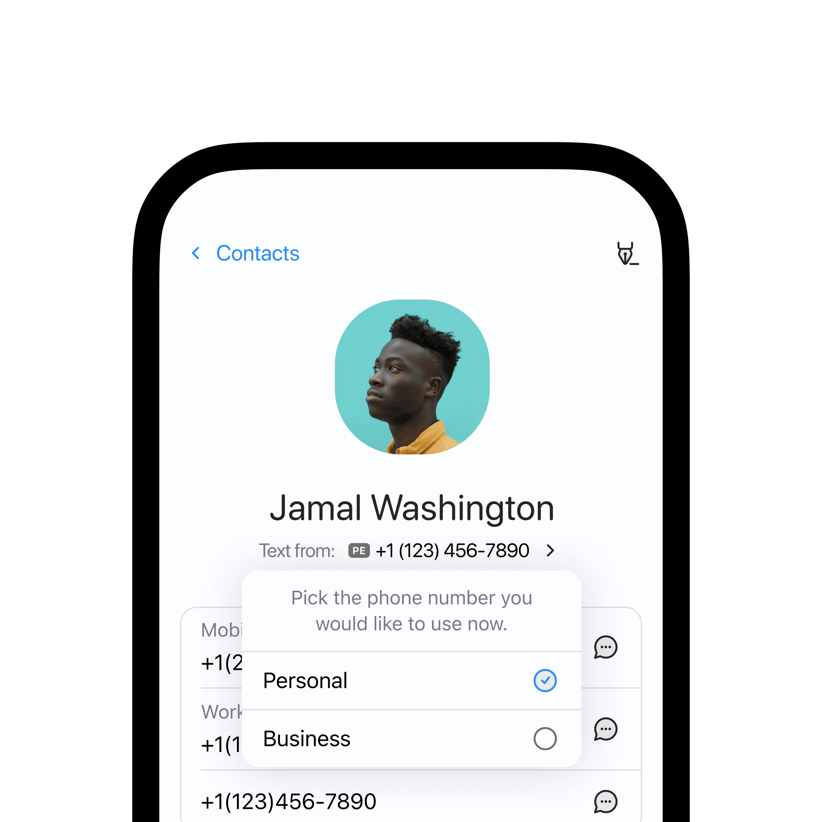
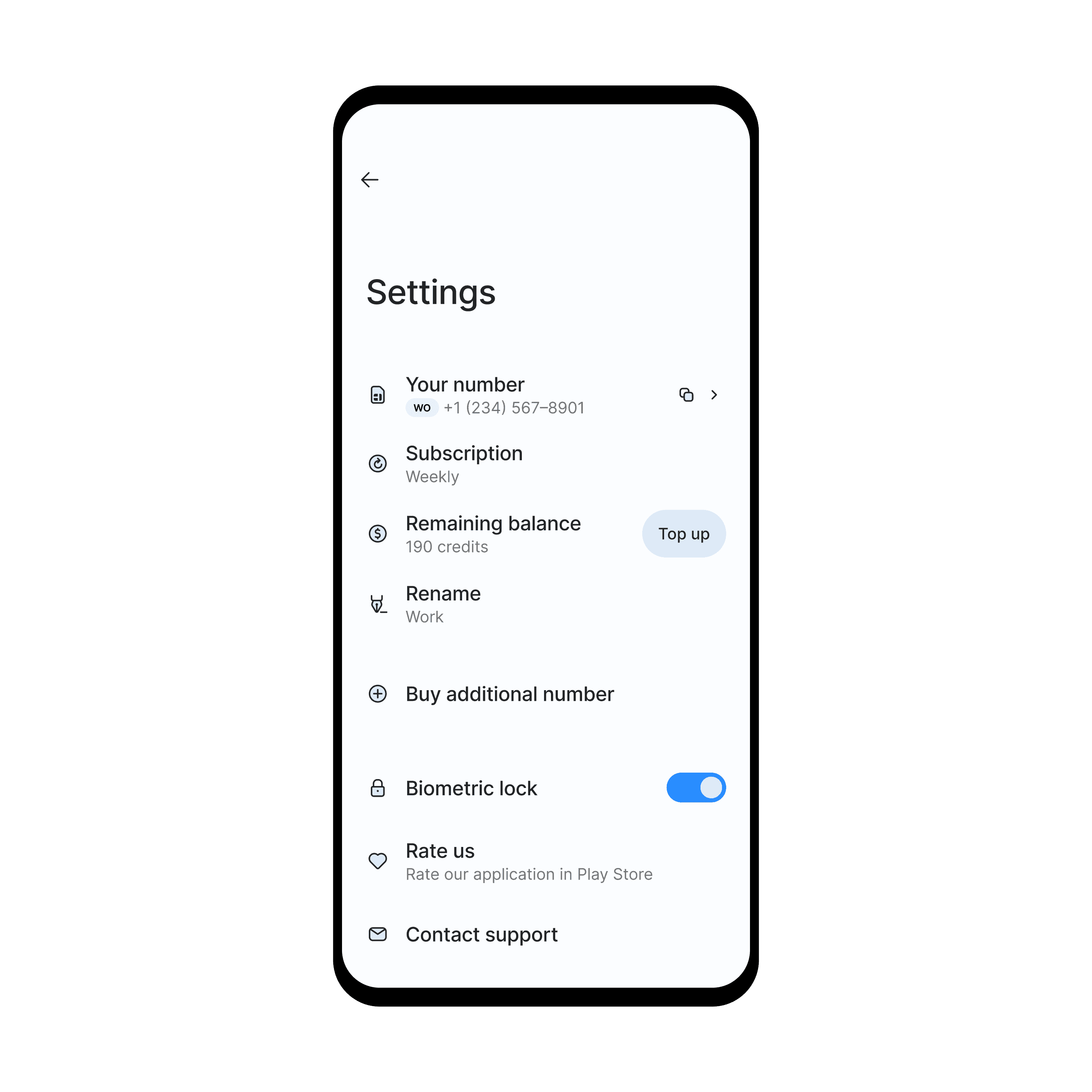
Complex number management features were easily accessible but not prominent. Key features included setting default numbers for contacts and easy number swapping within chats.
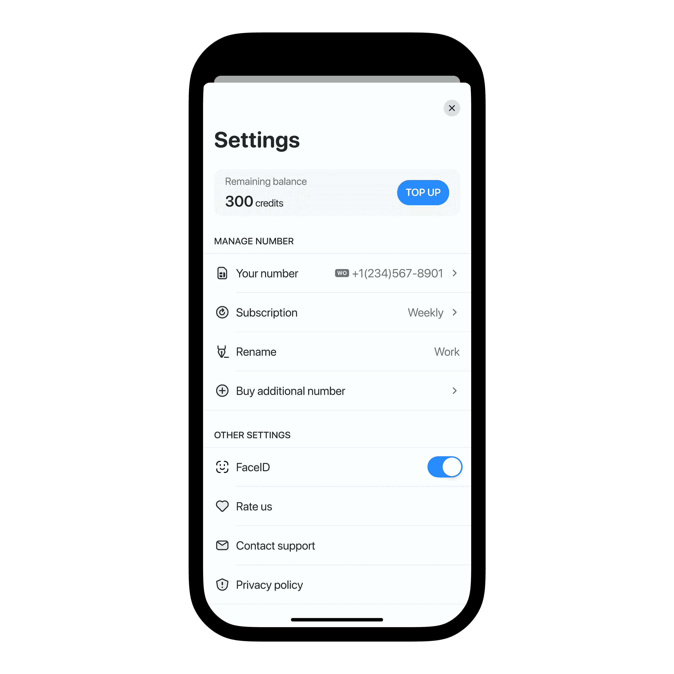
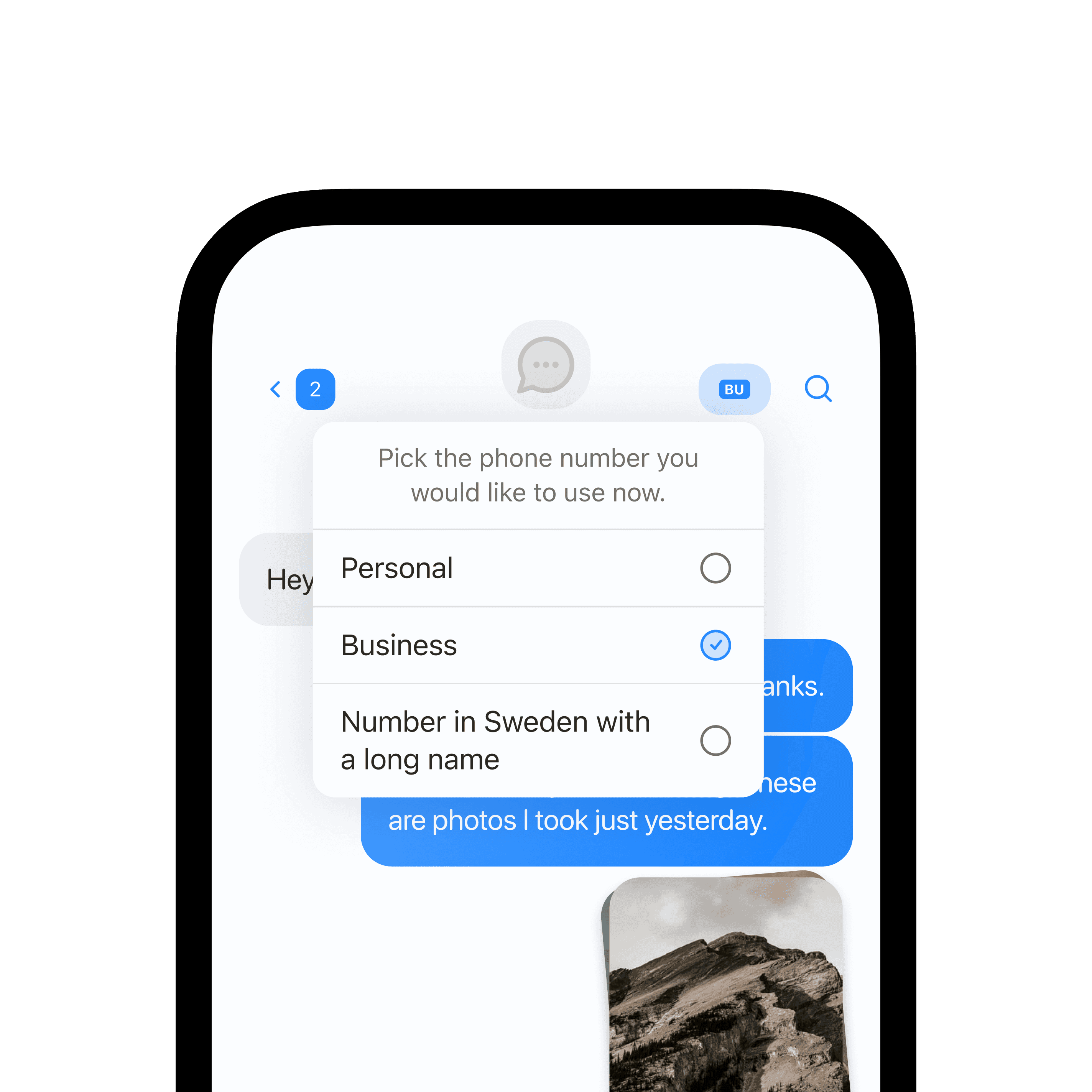
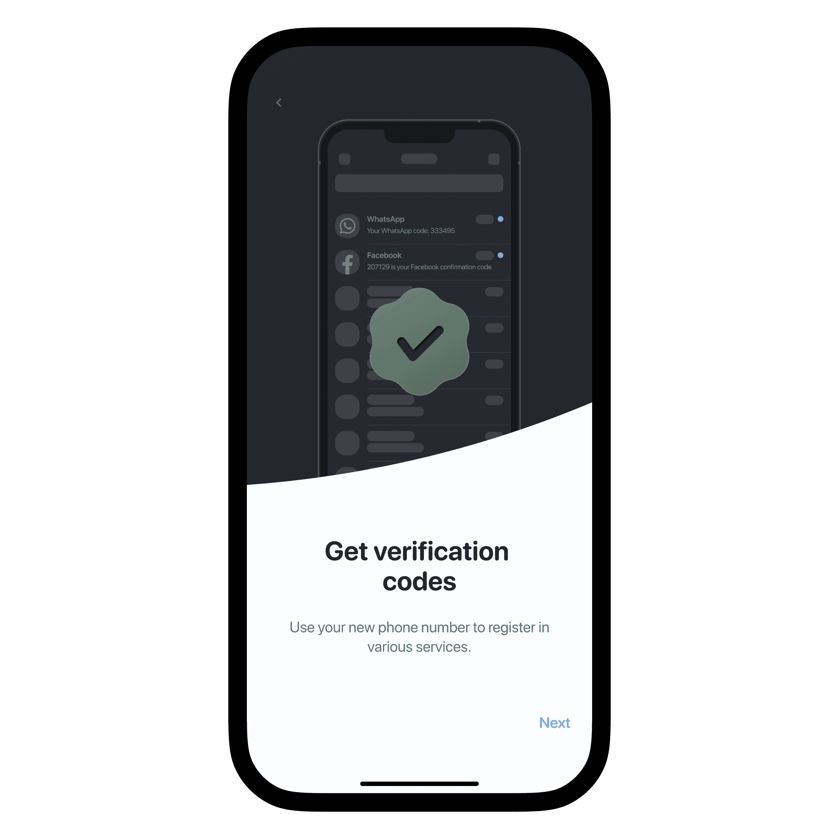
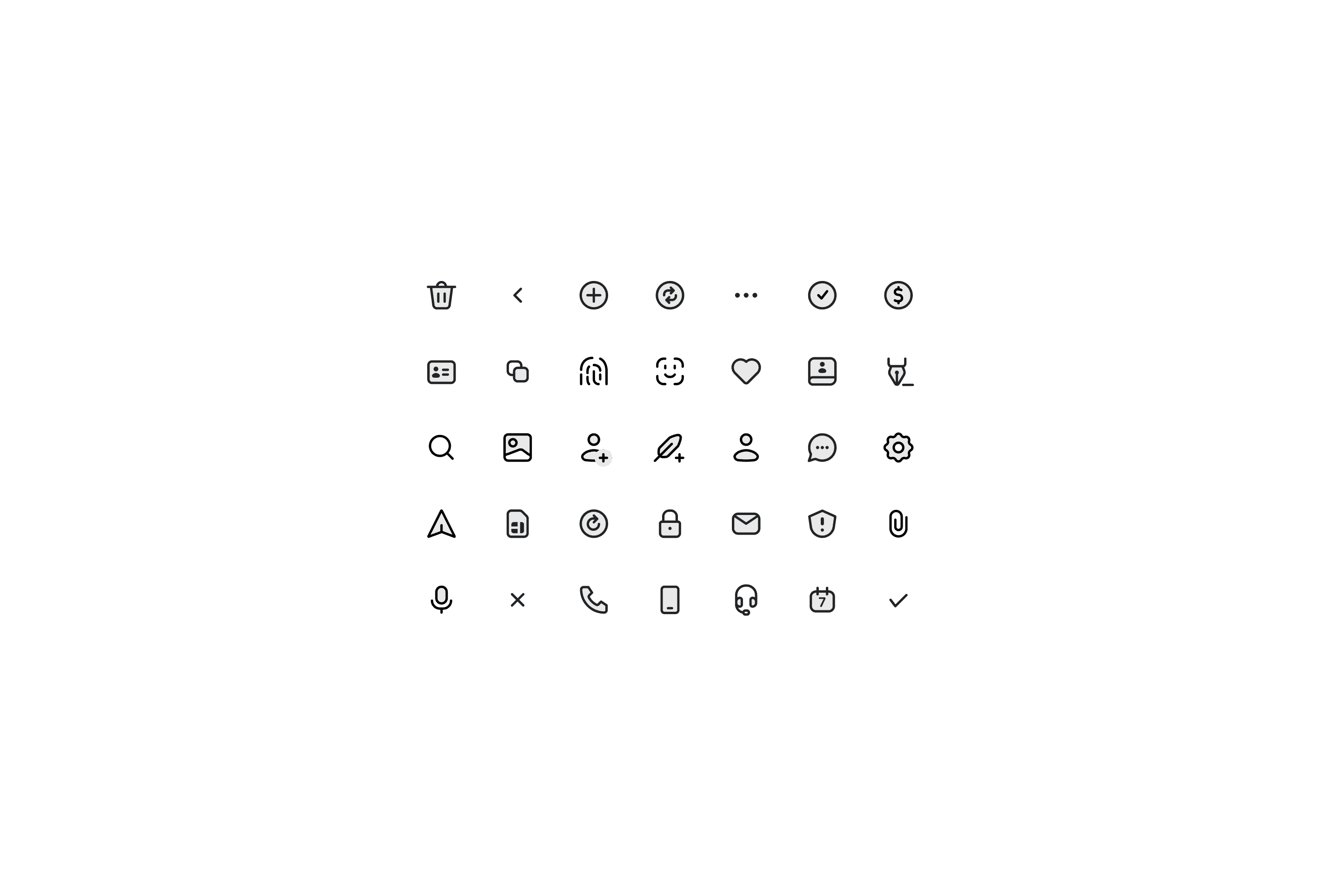
I had a lot of fun making custom icons and visual assets for the interface
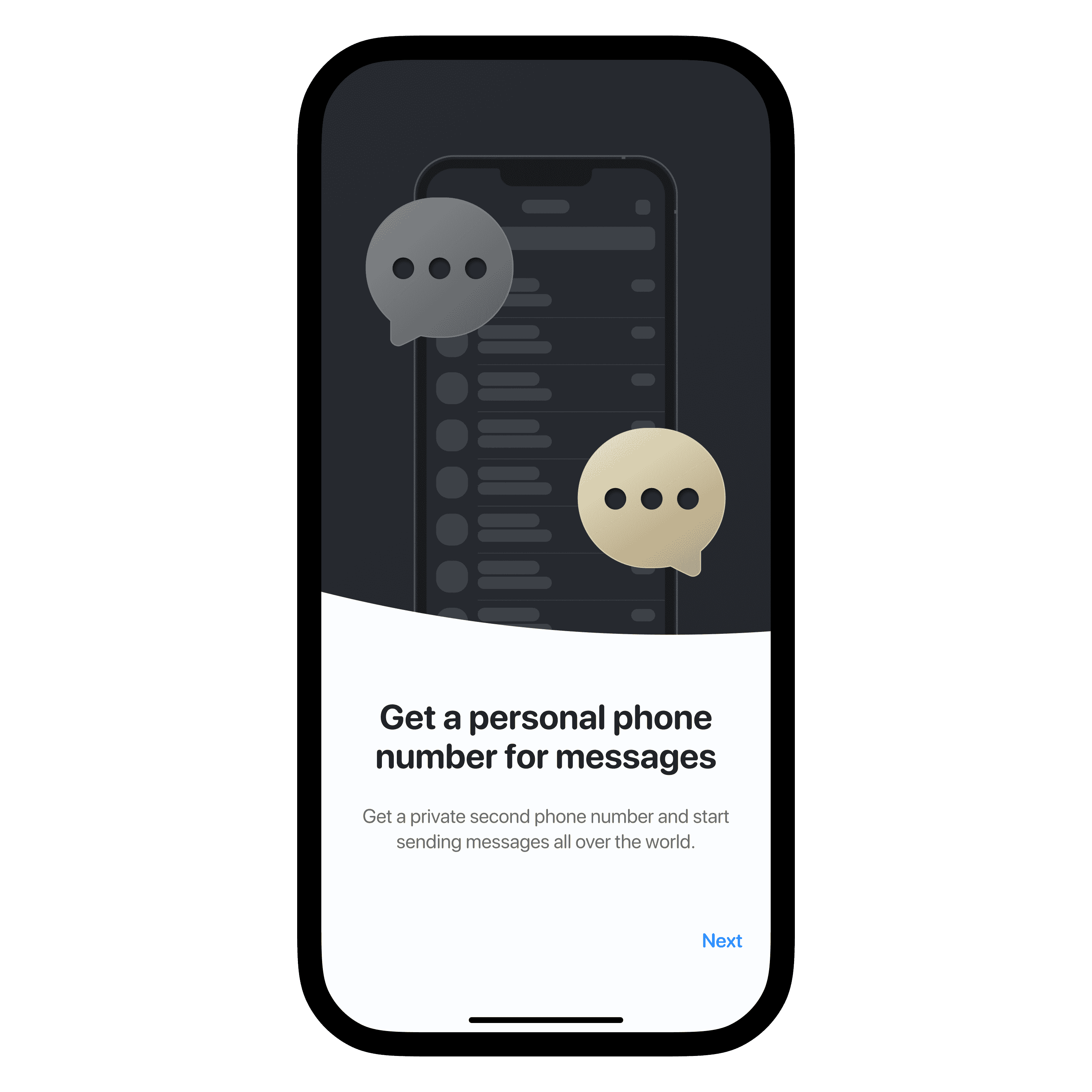
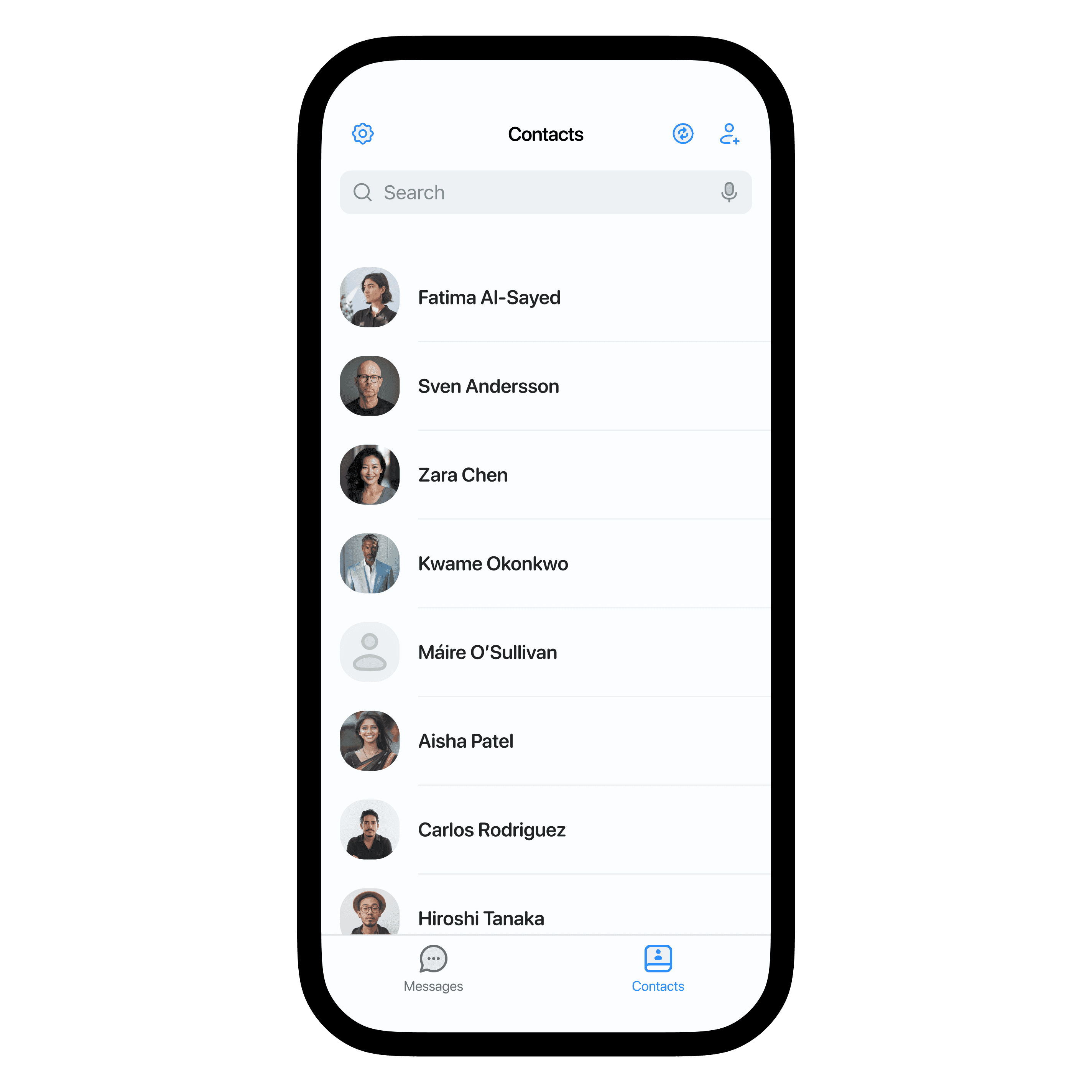
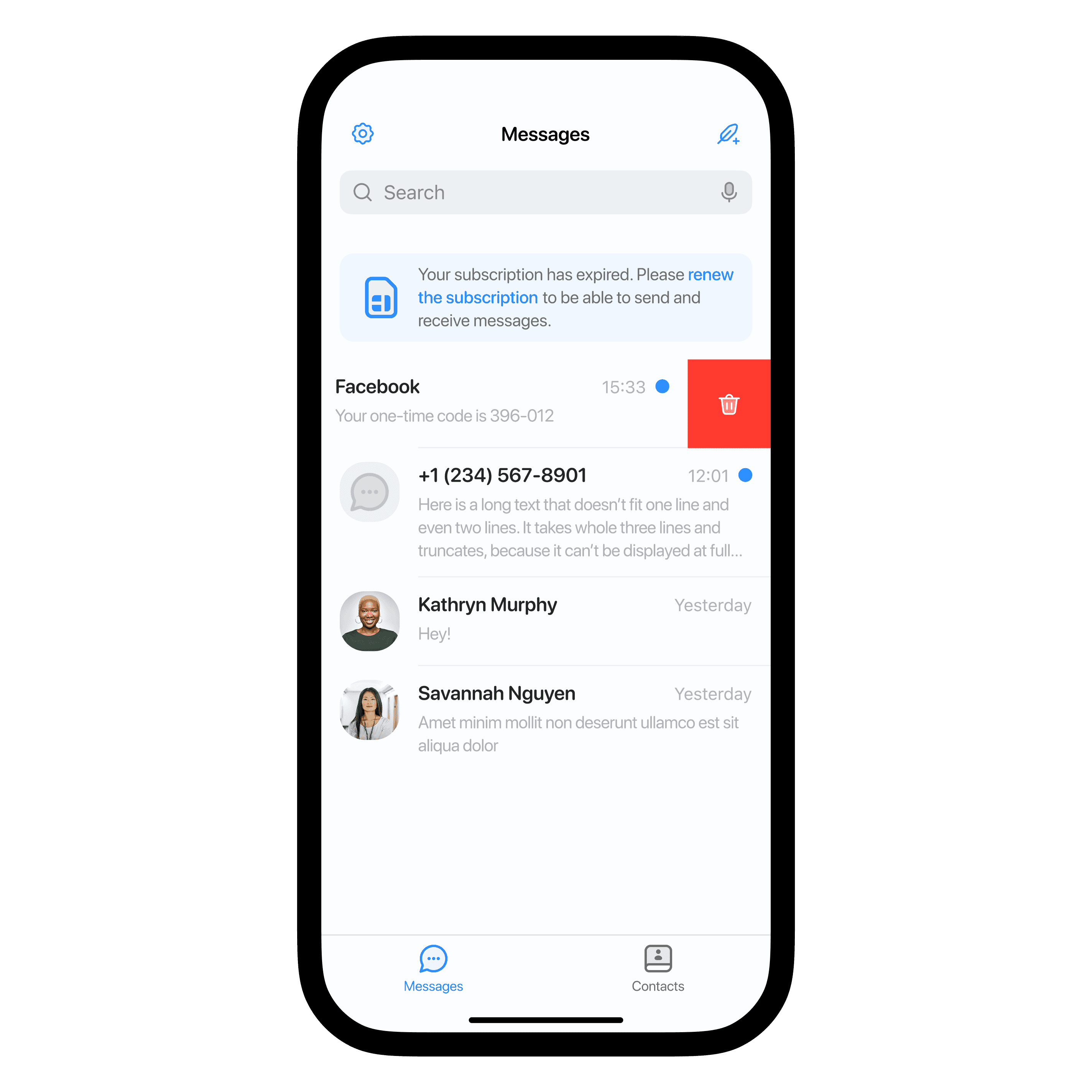
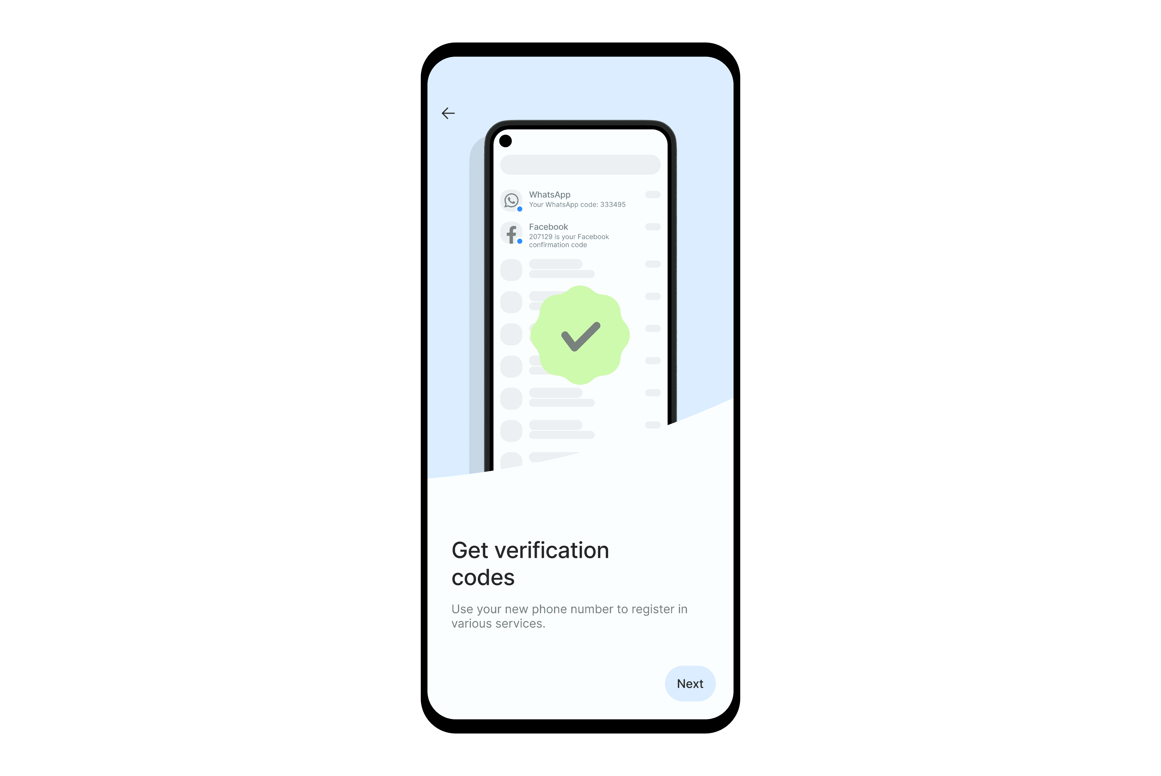
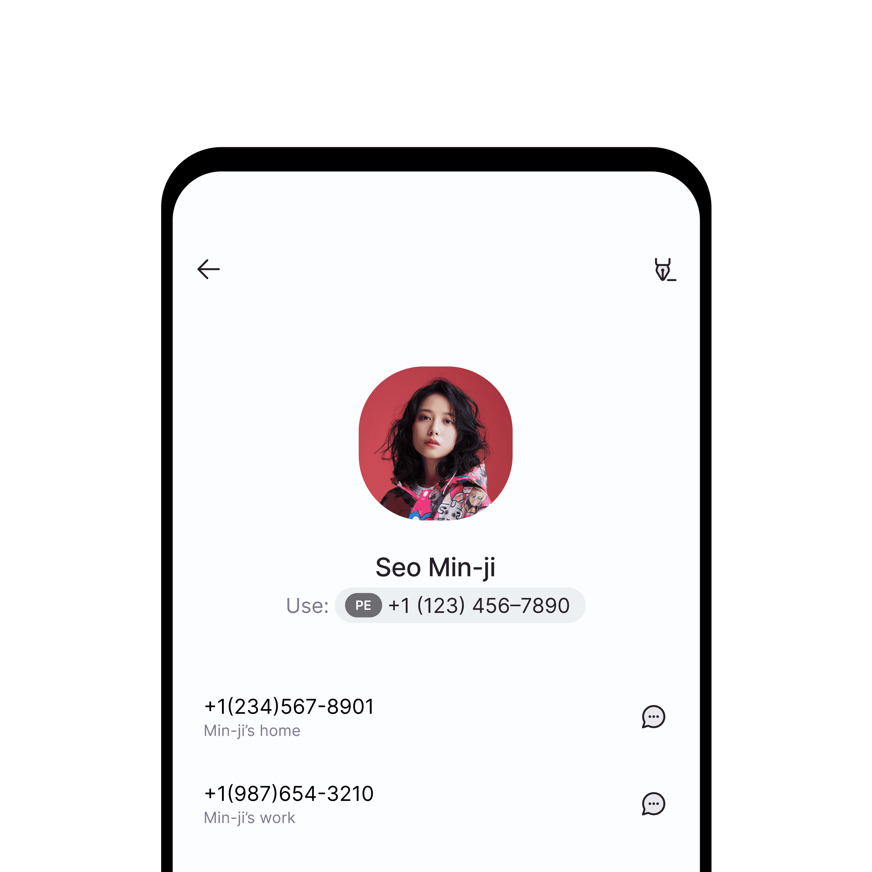
Android design. I implemented Material 3 design principles for the Android version, redrawing some assets to better fit the Android design language.
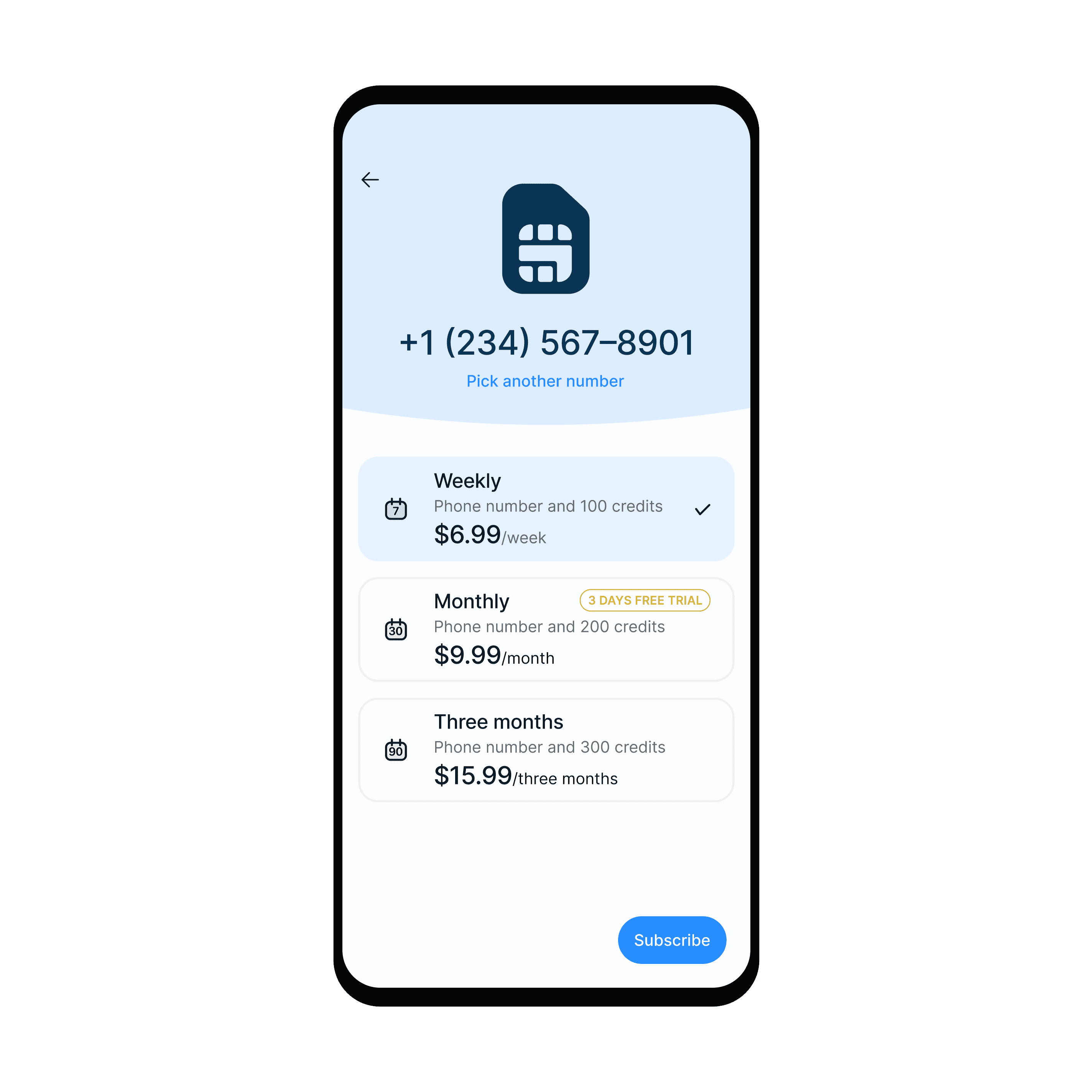
Challenge
The main challenge stemmed from the business logic involving third-party virtual number services:
- Numbers were rented for a minimum of one month
- App offered free trials and weekly subscriptions
- Cancelled numbers remained unused until released
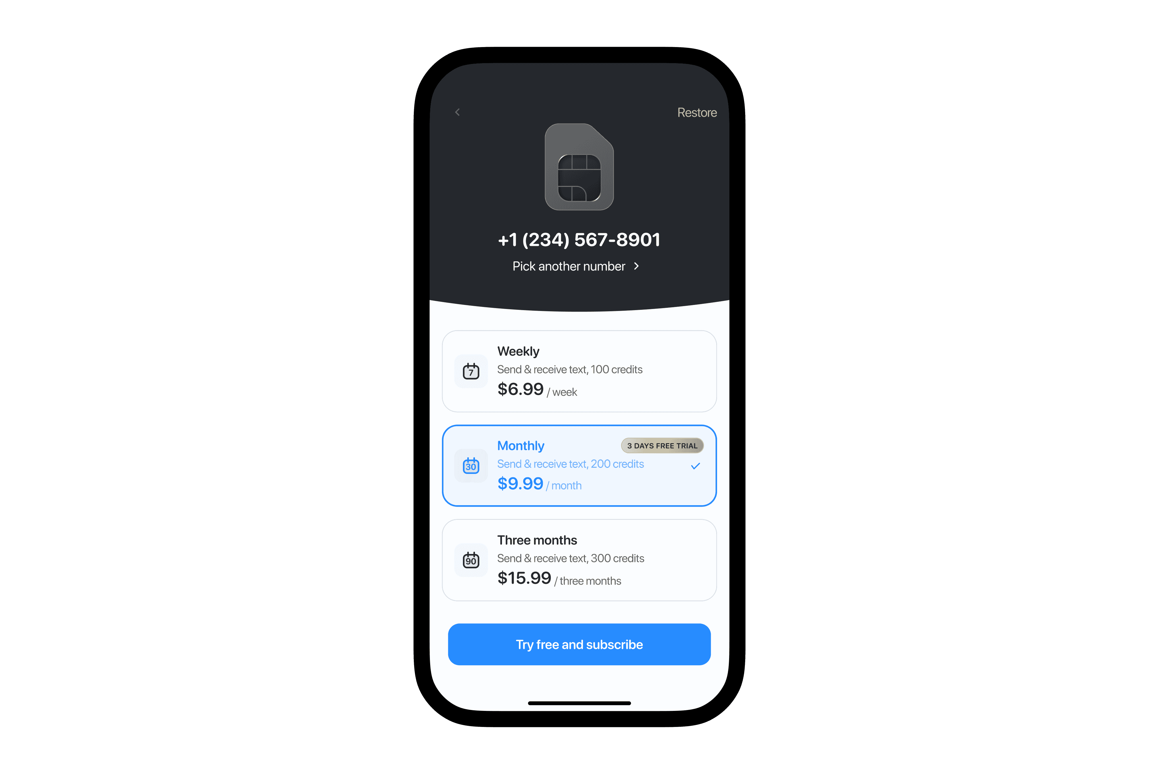
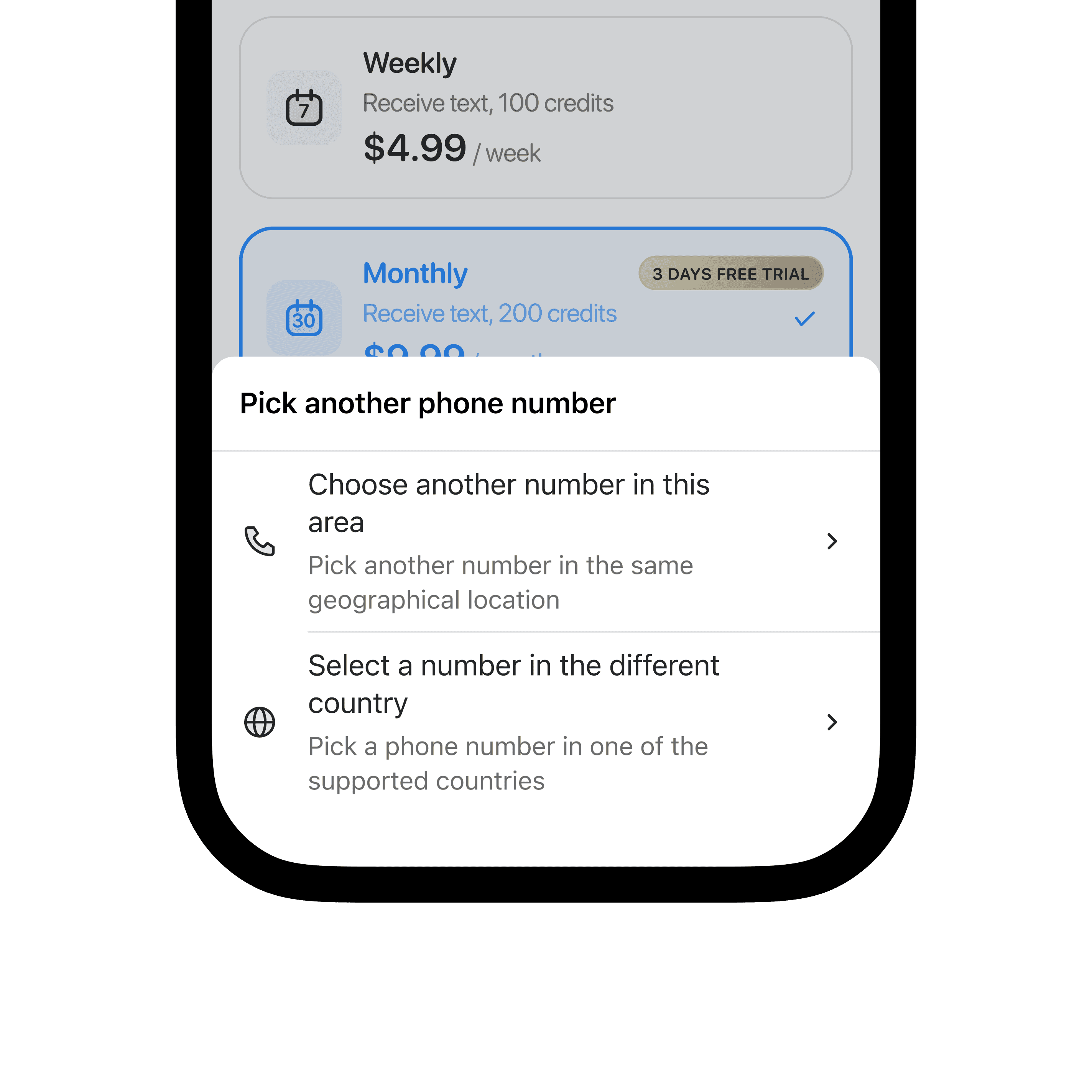
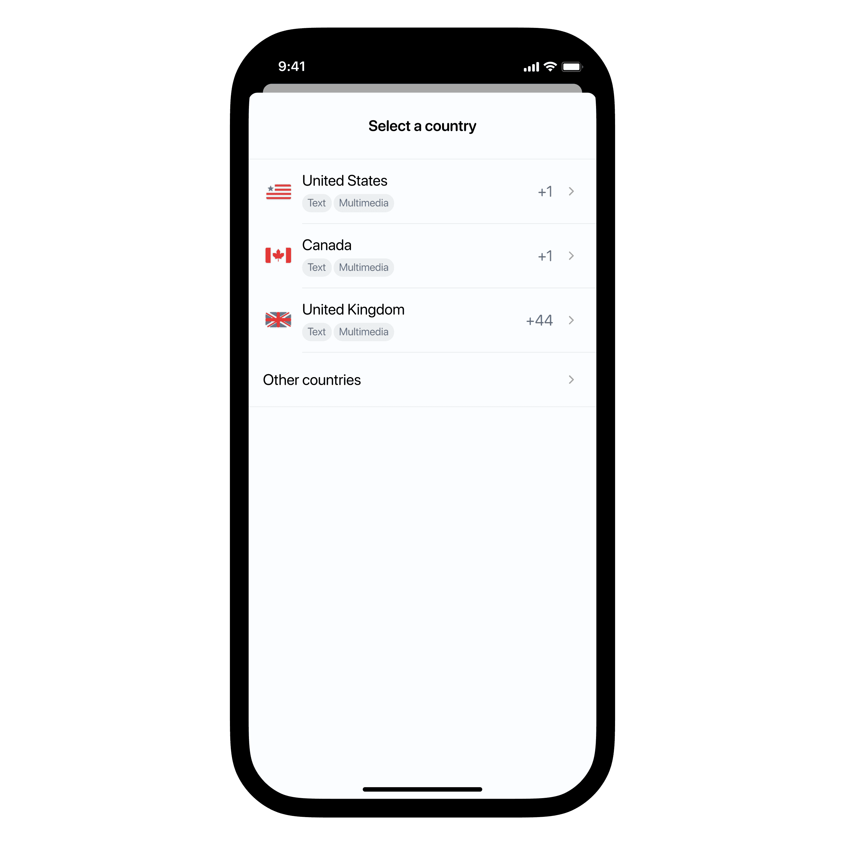
Solution: We implemented a "pool" of pre-paid, unused numbers. During onboarding, new users were offered a number from this pool by default, with the option to choose a different number if desired. Analytics showed that most users accepted the default number, optimizing our number management process.
This approach streamlined the user experience while addressing the complexities of our business model and third-party integrations.
Results
The app has turned out to be a real winner for our company. It's been steadily making money since launch, which is great because it lets us play around with building other apps without worrying too much about the bottom line.
People seem to love how easy it is to use and how it solves a real problem they have. We've built up a solid group of users who keep coming back, and that number is growing.
