- UI/UX
- Branding
- Front-end polish
Easy Stats
tools for poker players
I was part of a nimble team consisting of a project manager, two full-stack developers, and a junior designer tasked with building a website to sell apps and generate and analyze poker traffic reports. The website targets professional poker players. Our assignment was to construct the website from scratch — from concept to branding to the final product. I served as the lead designer, responsible for creating the branding, design system, and UI. Additionally, I coached the junior designer and assisted with fine-tuning the front-end code.
Background and scope
Our team was tasked with creating an e-commerce website for professional poker players. The client specializes in Windows apps and analytics for poker games. The team consisted of a product manager, front-end and backend developers, a junior designer, and myself as the lead product designer, responsible for the product design.
We were to build a functional e-commerce solution allowing poker players to purchase and download apps and analytics reports. The project also included developing a logo and branding for the site. Our timeline was three months to conceptualize, gain client approval, and build a responsive website with a landing page and full e-commerce functionality, including user profiles and access to purchased items.
Process
I began by collaborating with the product manager to gather information about the target audience through client Q&A sessions. This resulted in a comprehensive set of notes to guide our work.
The initial step involved creating quick wireframes and high-fidelity screens in various styles for client approval of the branding. Once approved, I designed the necessary flows for the app while simultaneously developing a small design system to ensure design coherence and assist front-end developers.
As designs for each flow were completed and approved, they were passed to developers for review and implementation. With the core functionality underway, I focused on crafting the landing page, which required the most revisions and time to perfect.
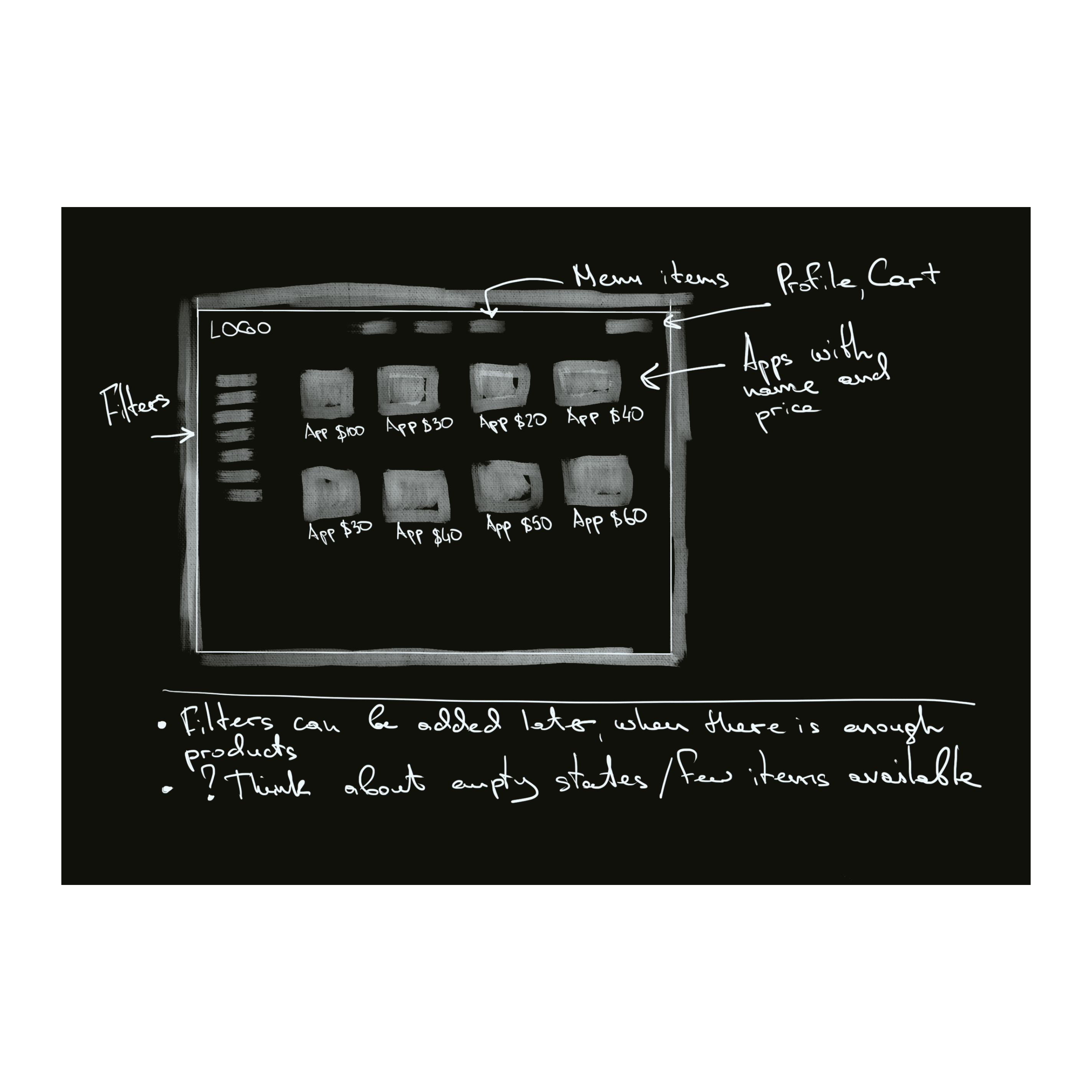
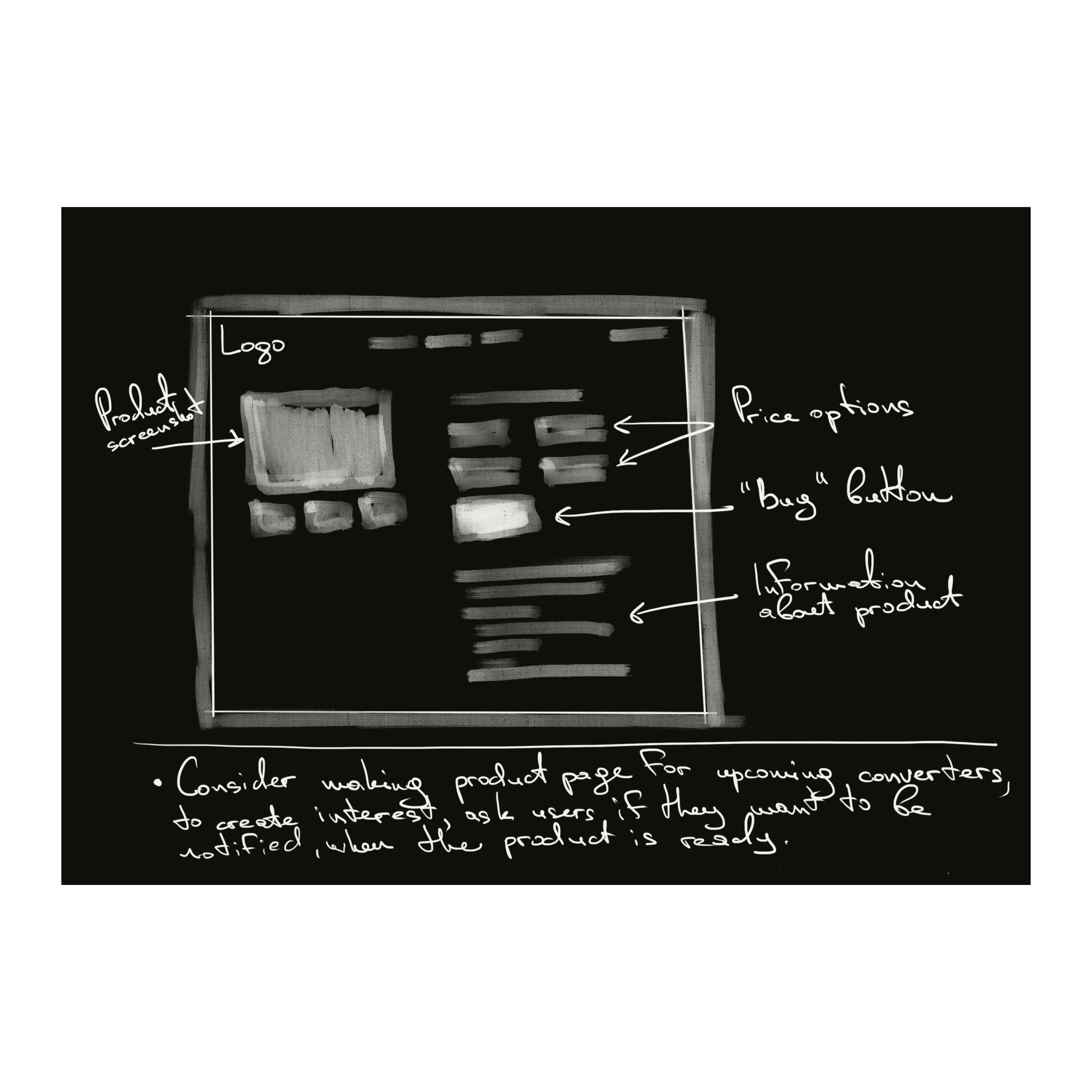
Wireframes. Given tight timeline, I sketched wireframes on my iPad. The product manager and I then worked on improving these sketches, discussing them with the team to check if everything was doable. We kept adjusting the wireframes until we all agreed they showed the main parts of the website clearly.
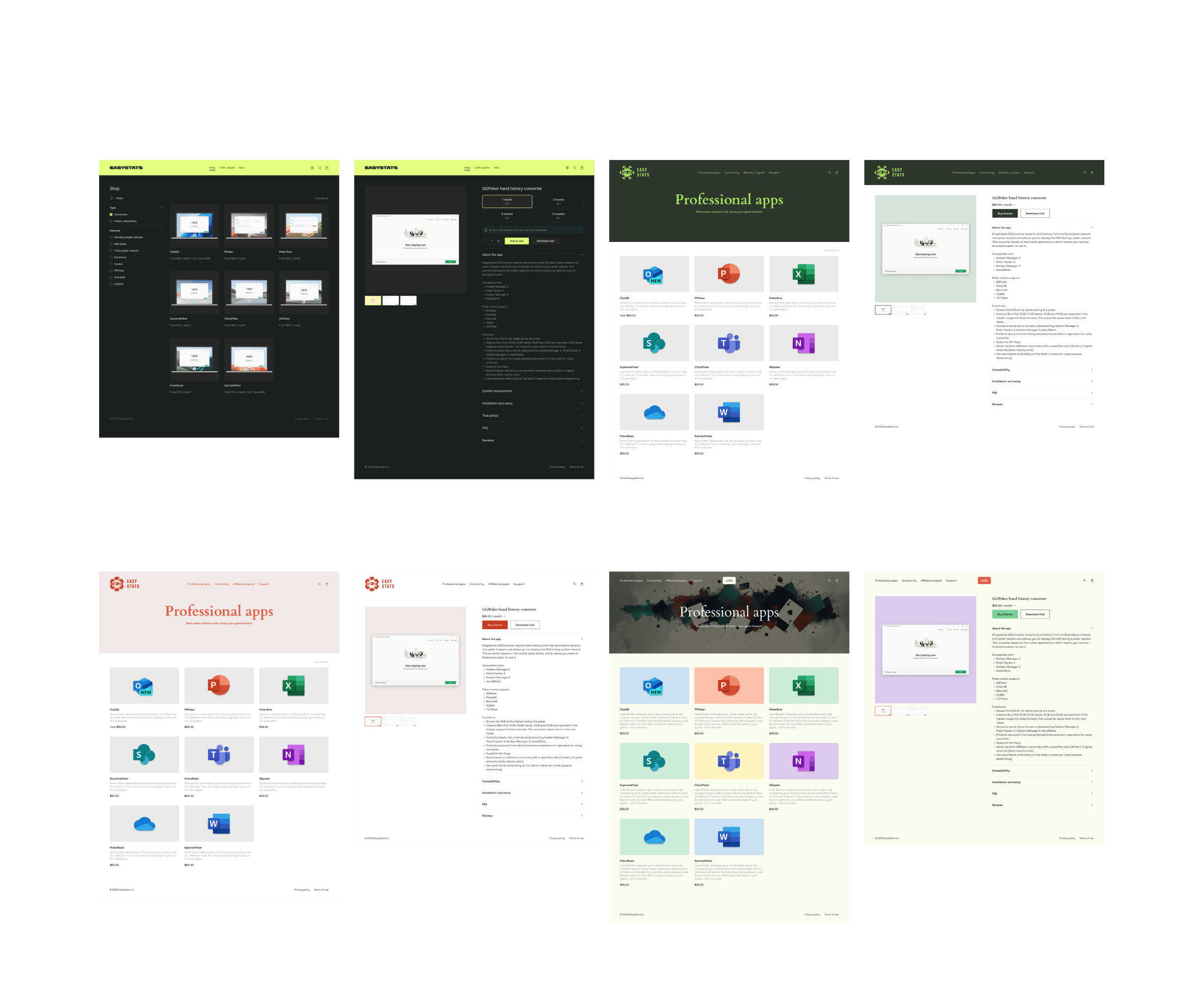
Branding exploration. The client initially requested a darker tone for the app, but also wanted to see light versions. I created several design variations, experimenting with different typefaces and graphic elements for both dark and light themes. We presented a range of options, from minimalist to more elaborate styles. Ultimately, the client preferred a tech-oriented dark version, which aligned well with the product's professional nature.
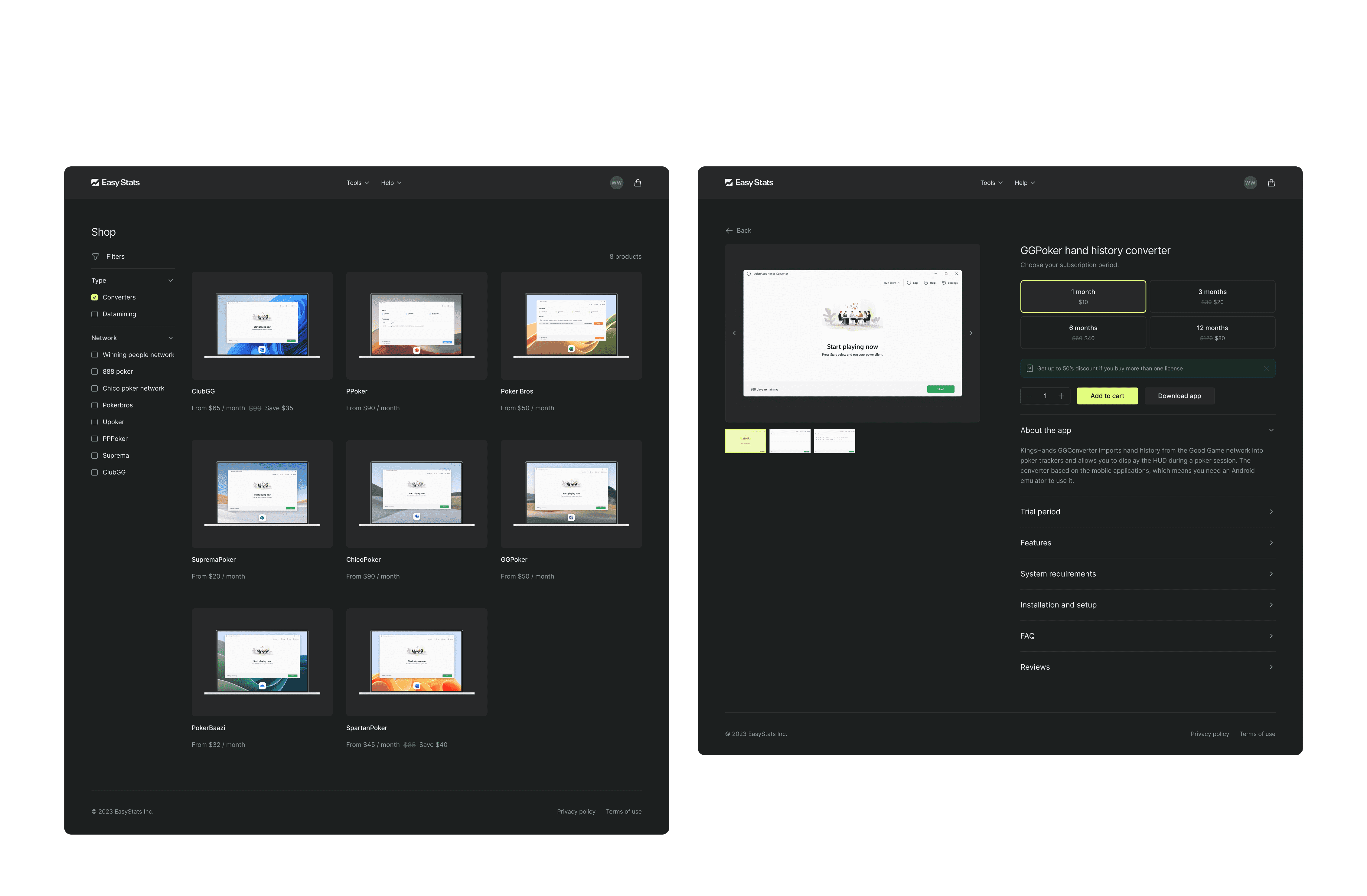
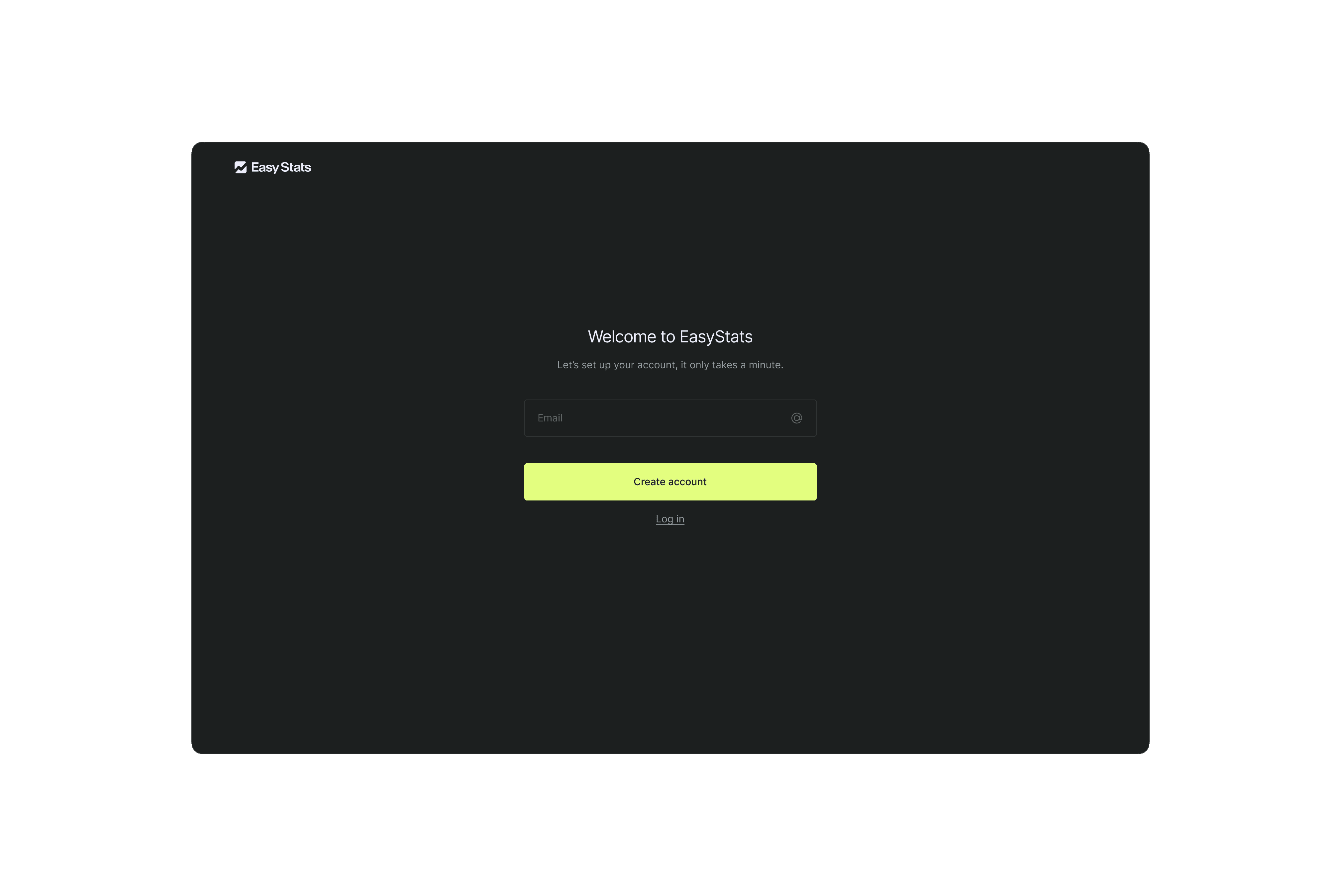
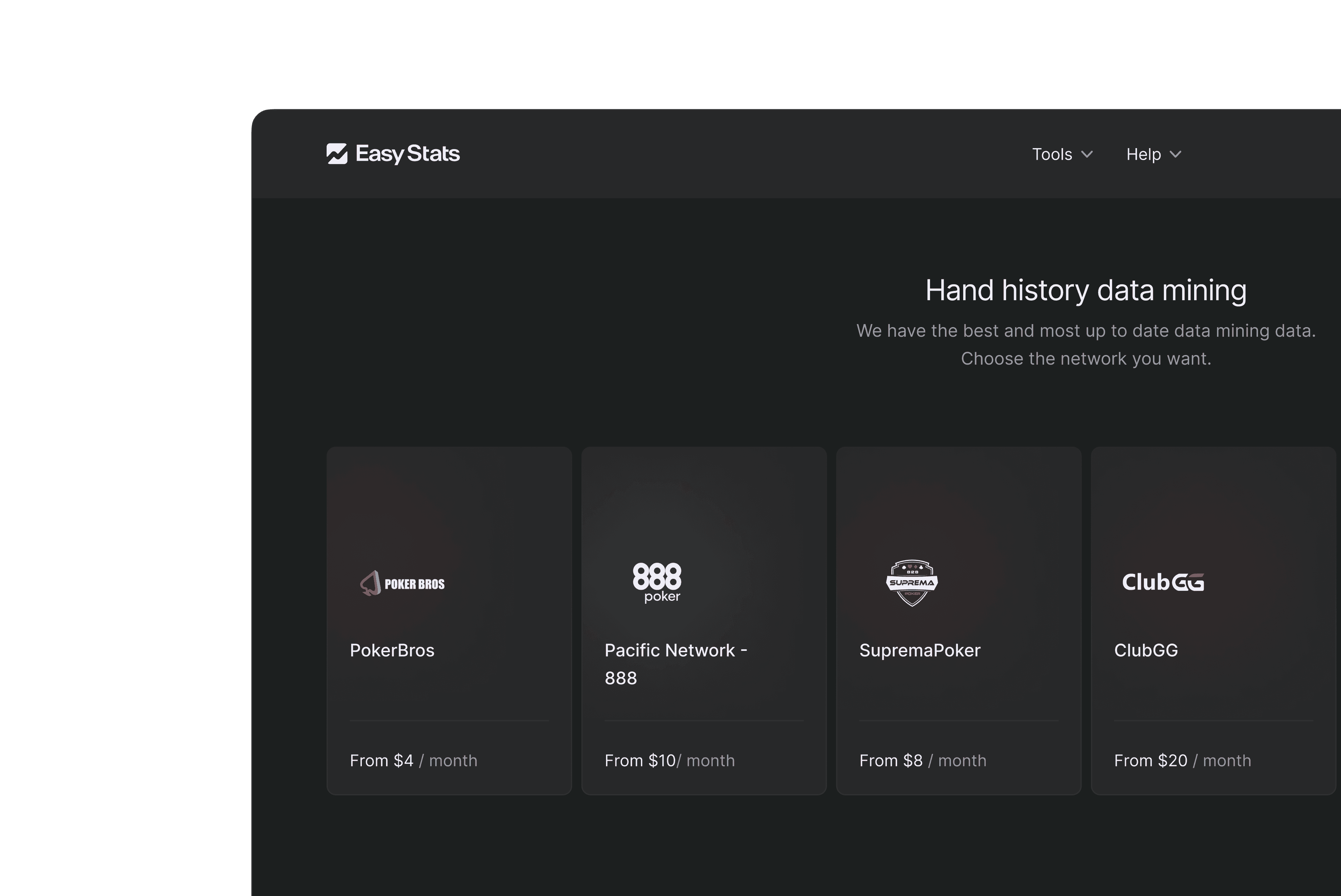
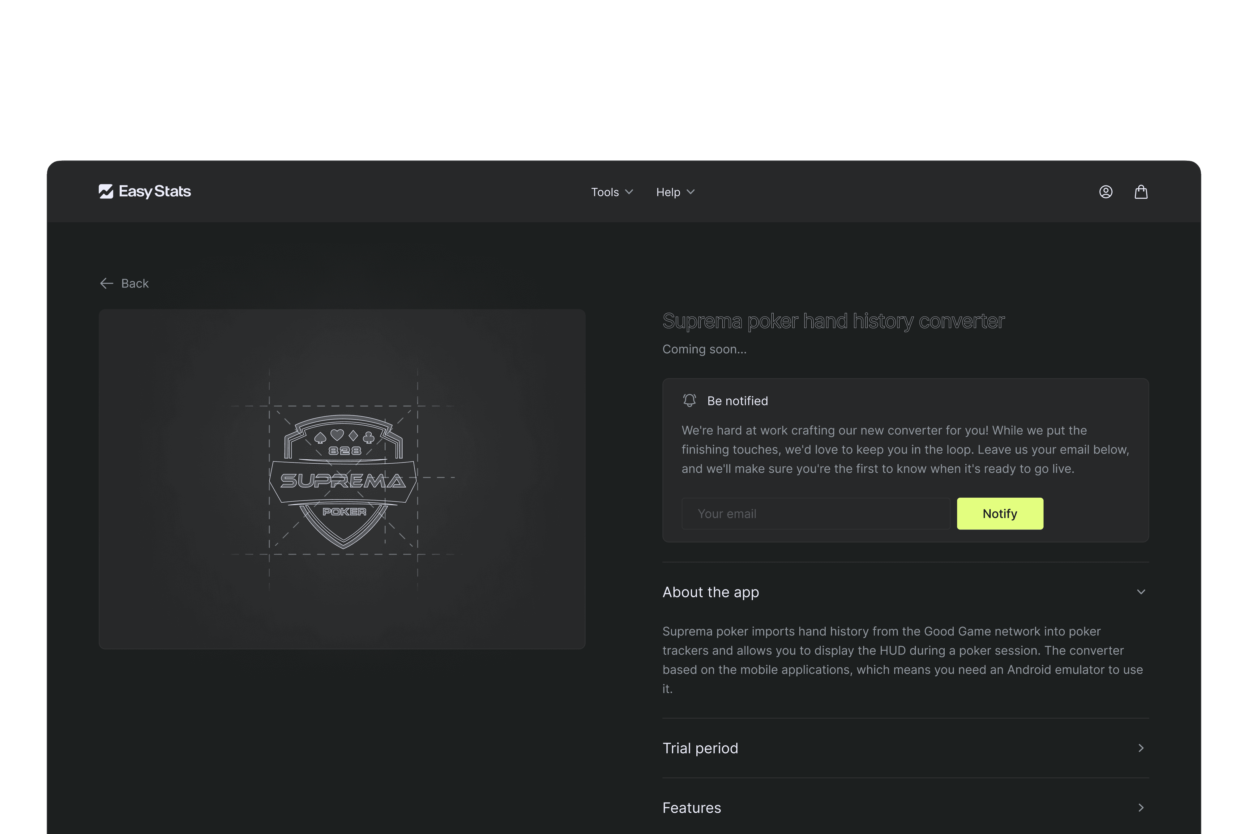
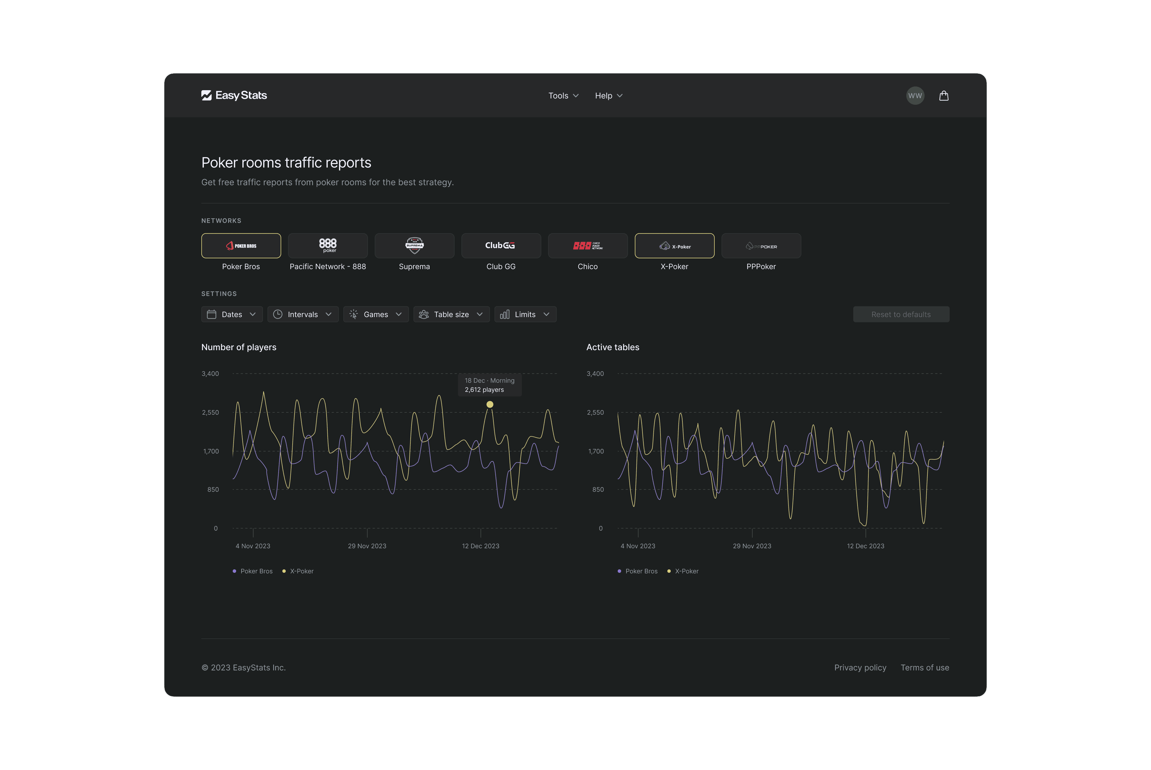
To address responsiveness, we agreed on creating desktop (1440px), tablet (834px), and mobile (375px) versions for each page. I typically started with the desktop version, then adapted for tablet and mobile, retaining only essential elements for each medium.
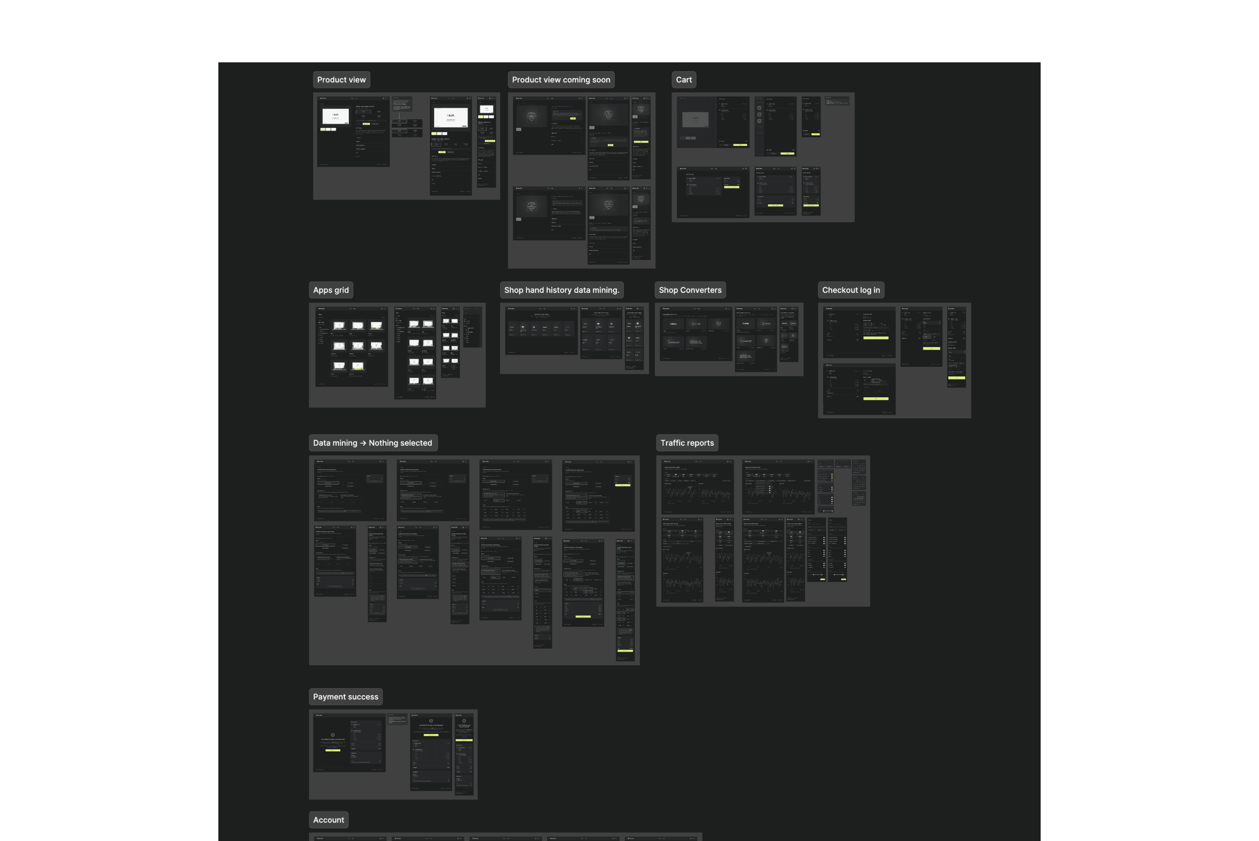
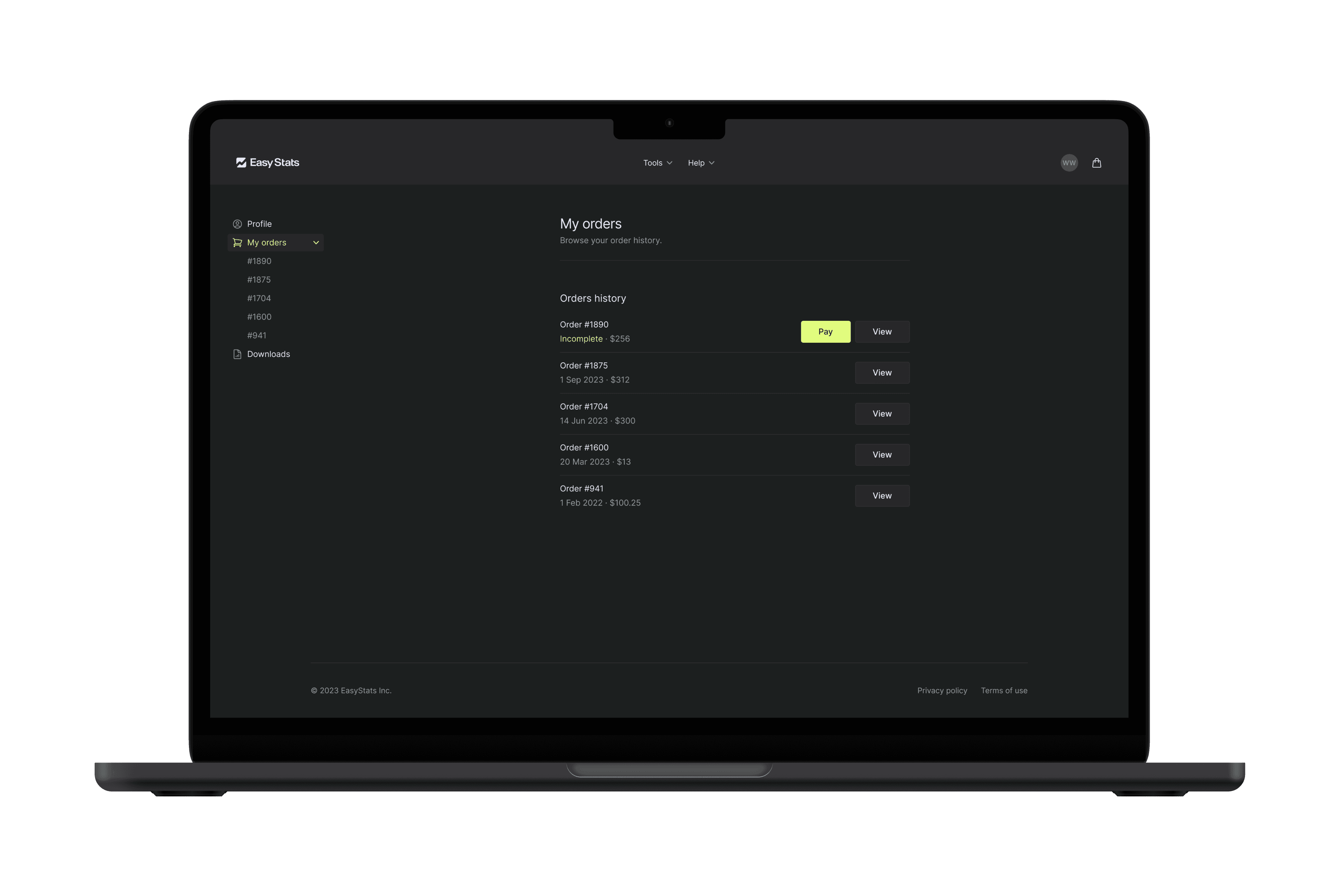
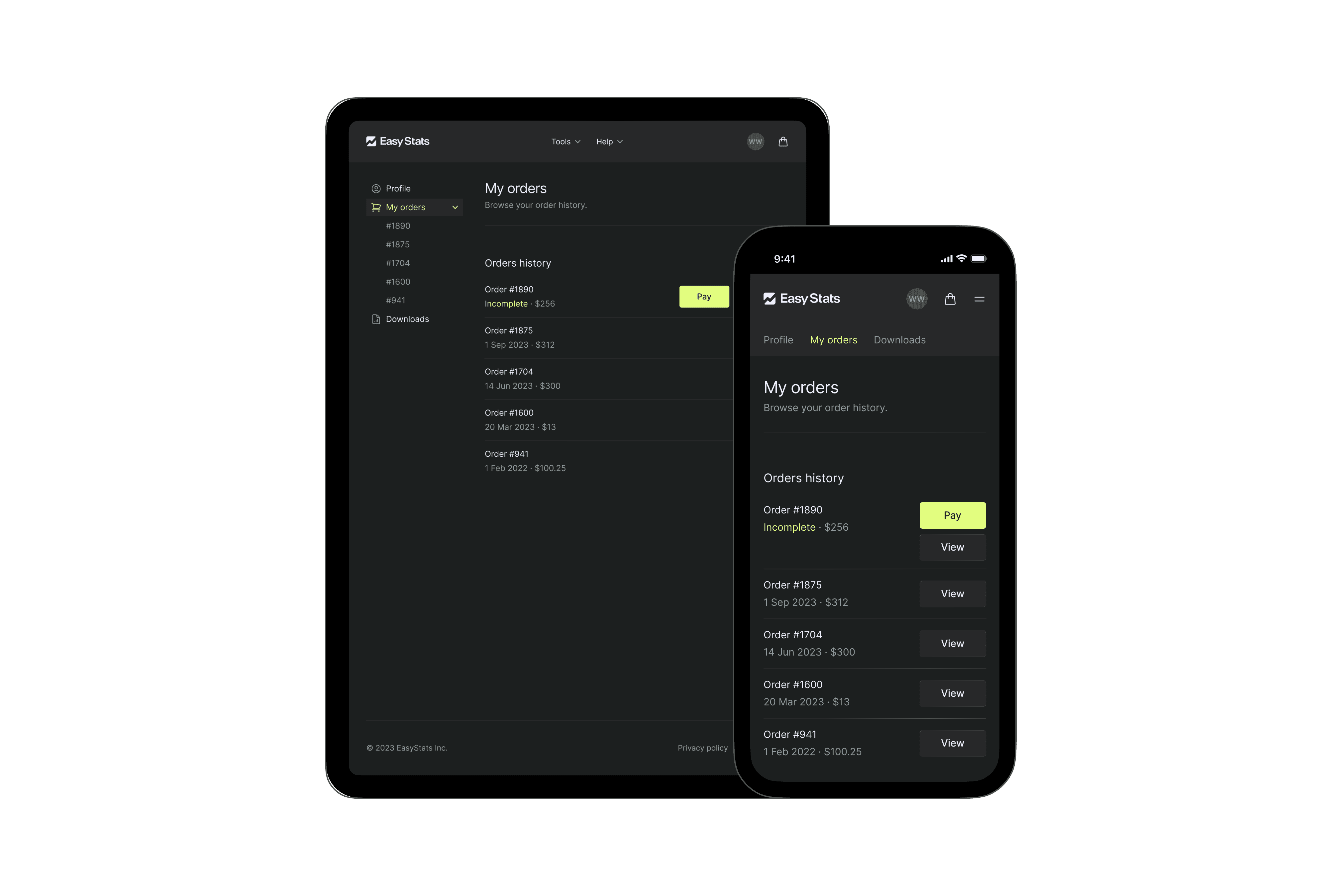
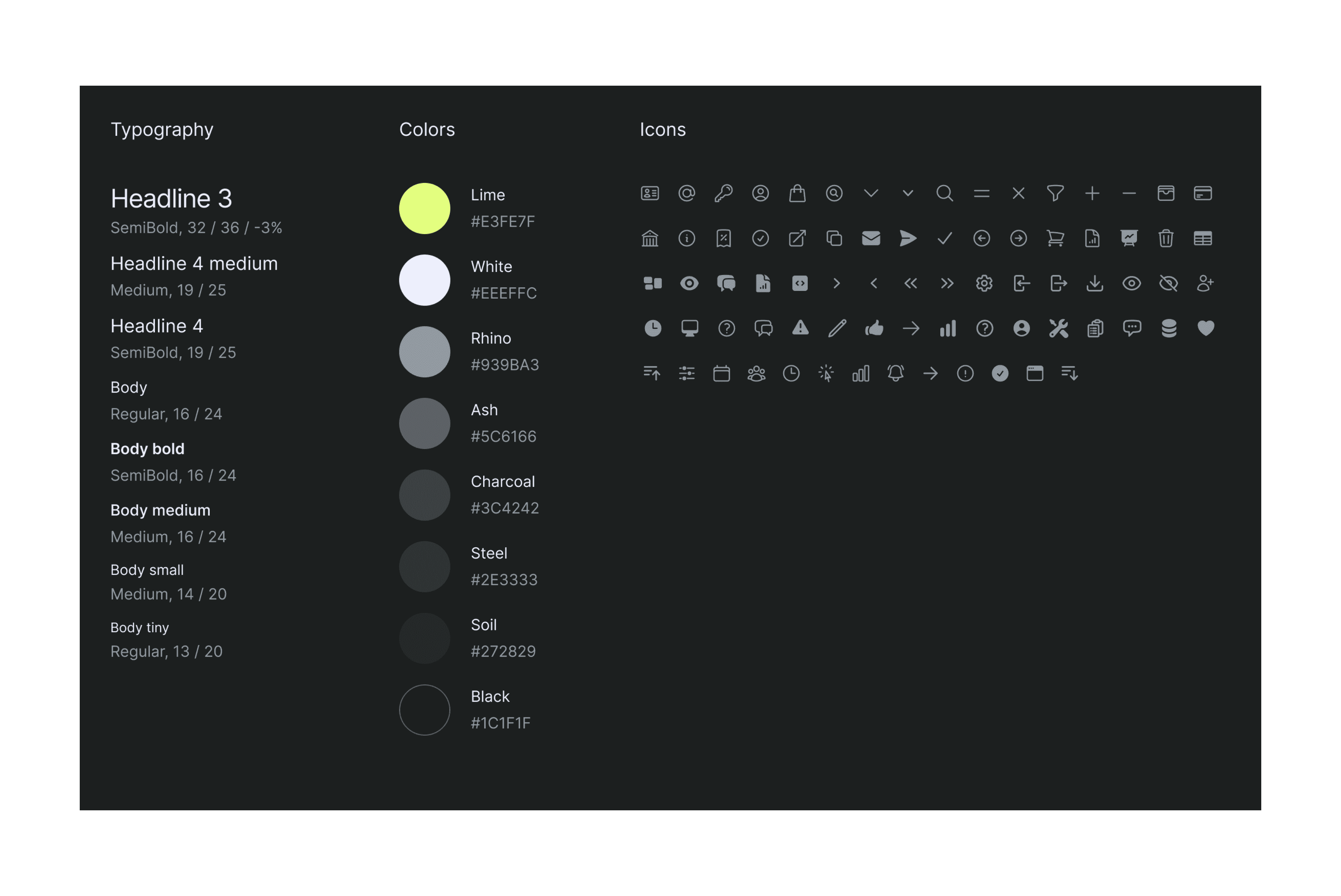
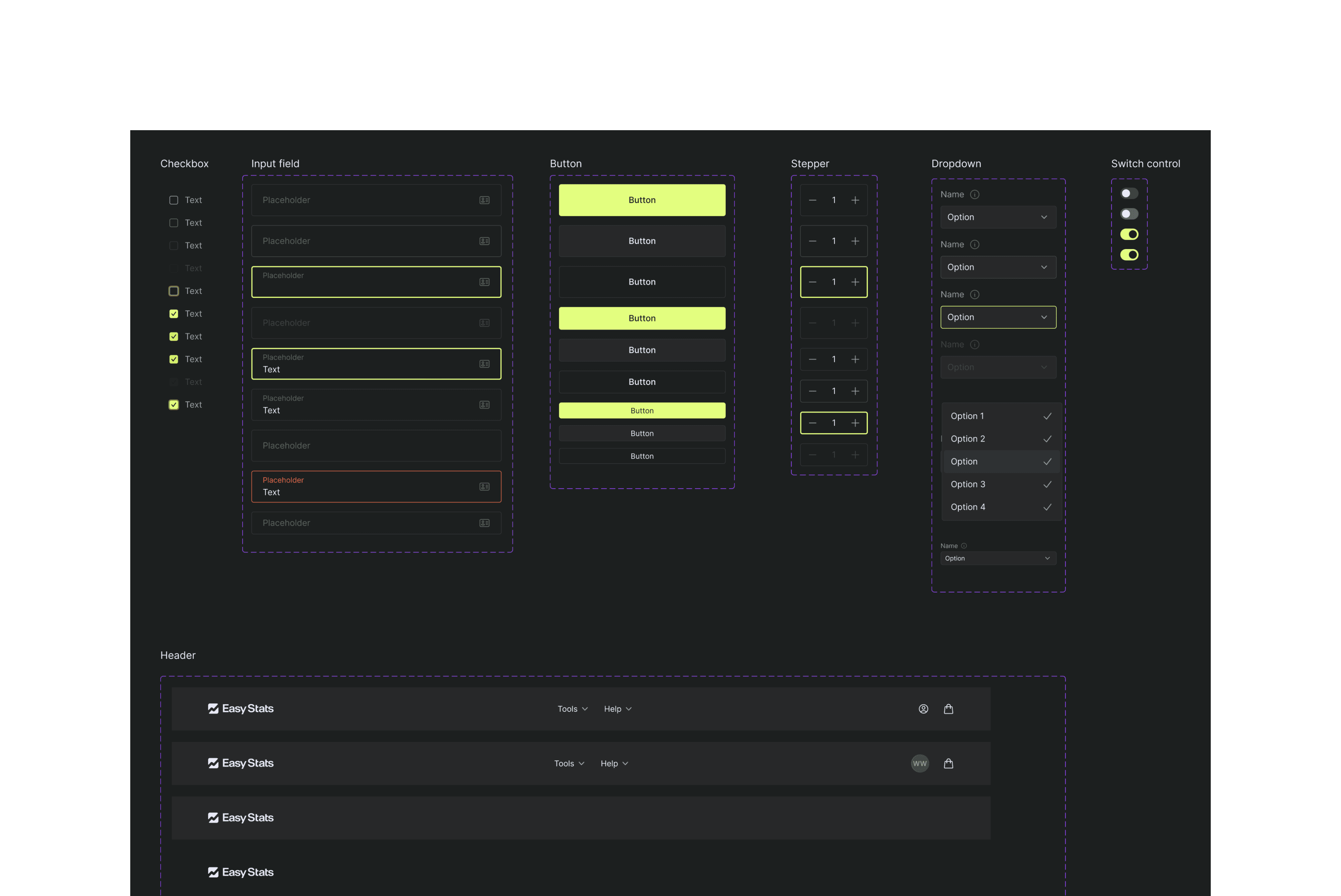
The design system evolved alongside the screen designs. I extracted reusable elements and tokenized them, aiming for design coherence, easier implementation for developers, and future extensibility for the client. The system included typography, colors, and key UI elements.
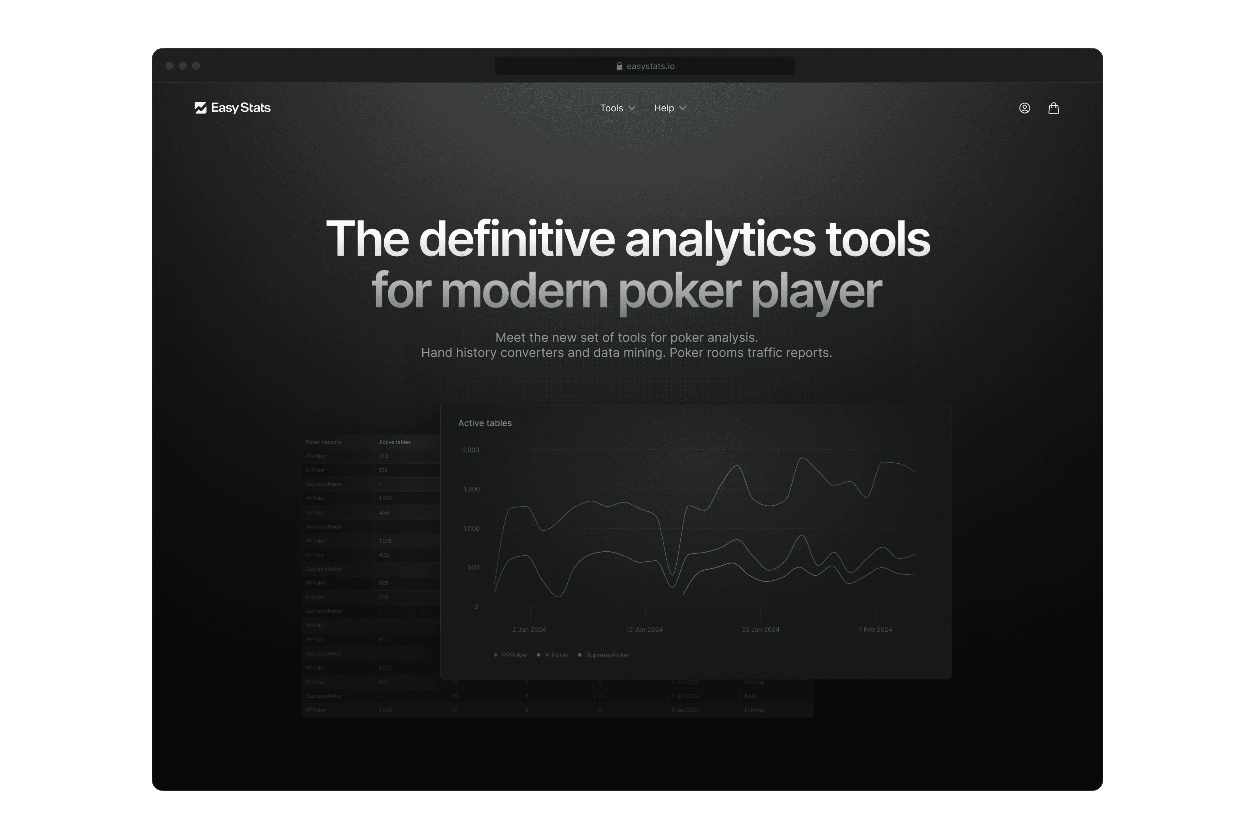
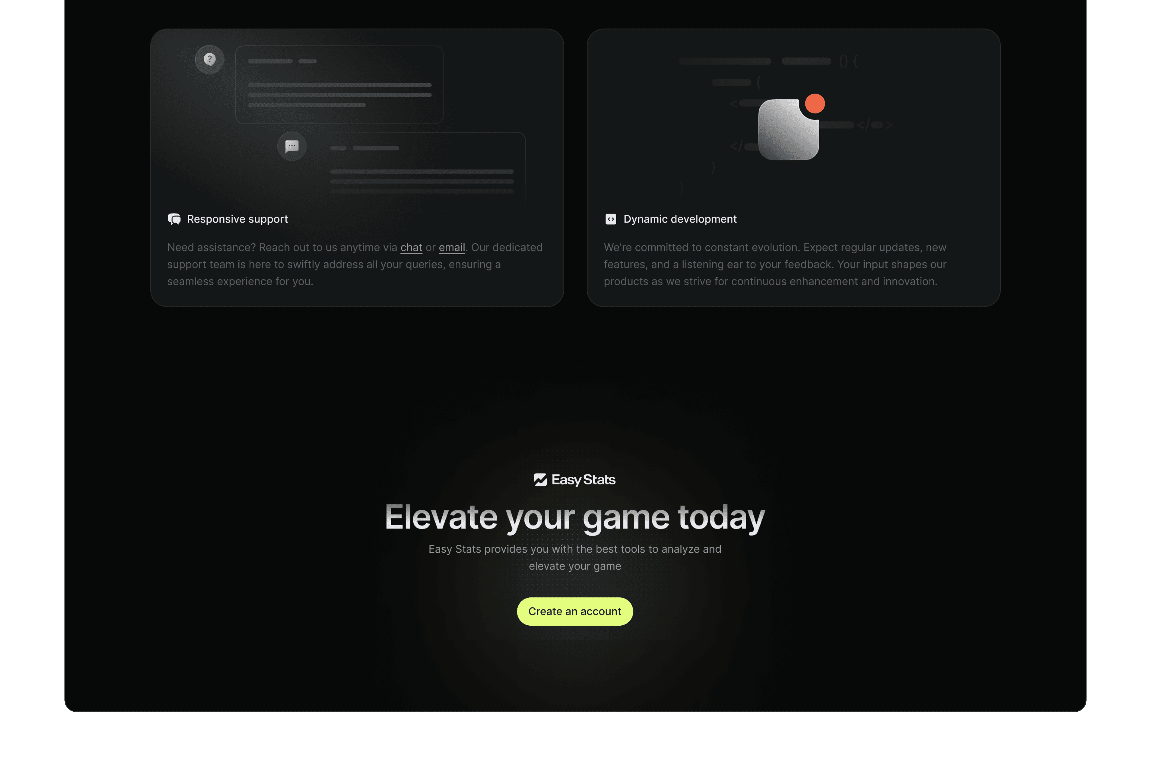
For the landing page, I opted for a bold, contemporary tech aesthetic to capture the essence of the product.
Challenge
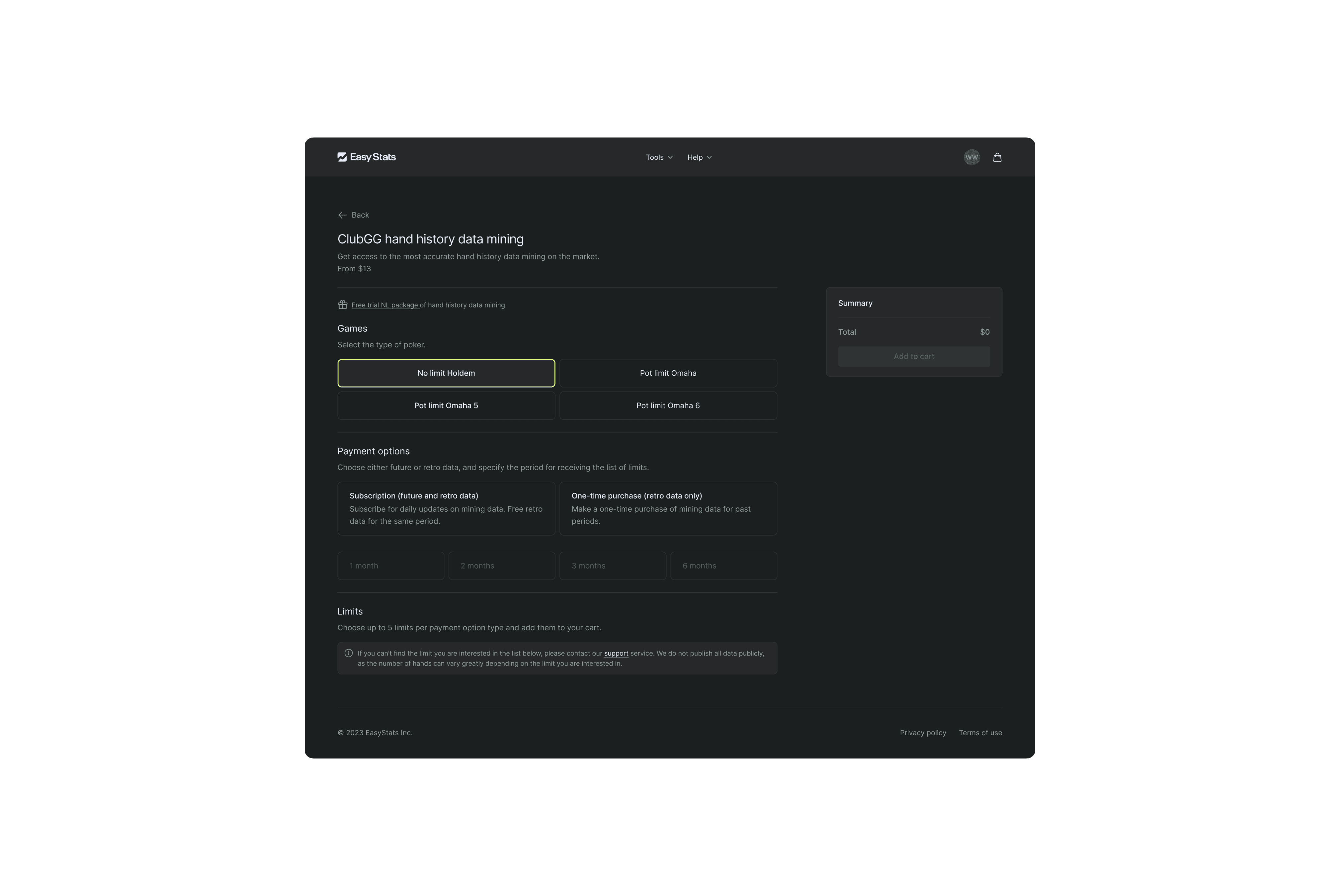
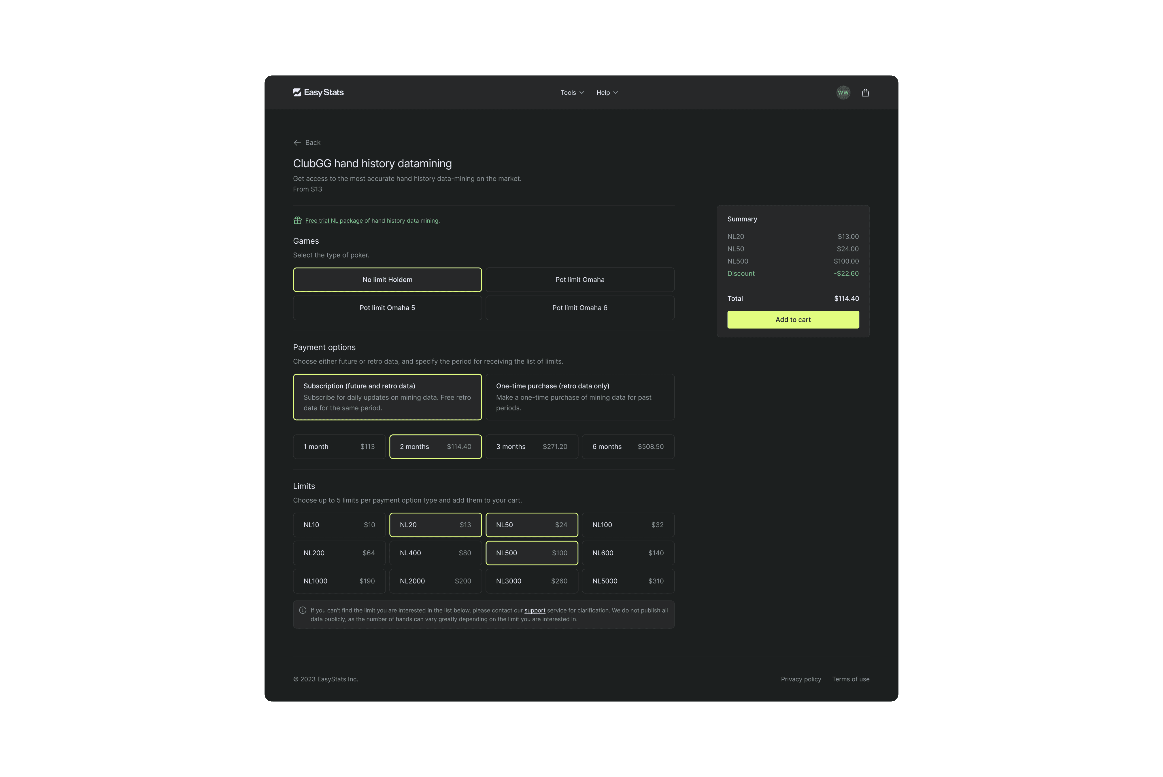
Our goal was to declutter the visual noise common in competitor sites while maintaining a wide range of options. The most complex aspect was the hand history datamining feature, which required numerous options and configurations. I proposed a solution that gradually revealed only relevant options to users.
Results
We successfully delivered the e-commerce solution to the client within the agreed timeframe, meeting their satisfaction and project requirements.


