- UI/UX
- Product
- Branding
Cuddlynest*
the future of travel
Online travel accommodation startup with a vision to make people's booking experience easy and effortless to let them focus on their travel.
Product background and my ideas
By the time I join, the team has been building the product for two years since 2017. The product is not well defined, lacks intention and in the nutshell is a sum of different parts of various online travel agencies from Airbnb to Booking.com.
That was the situation when I was hired in 2019 as a first designer on the team to help with a visual design. As a sole designer in the company I was also granted a permission to shape the product however I want.
Working closely with CEO I start with outlining the problems the product has:
- Lack of intention. What are the core values we live by, how do we want to help our users?
- Lack of focus and uniqueness. Why would anyone picked us instead of competing online travel agencies?
- Lack of design language and system. No designer prior to me ever worked on a product, hence usability and visuals are quite underwhelming.


Trip types. After interviewing my colleagues and friends, I've realized that every person has various types of trip, which changes the requirements for accommodation in every case. Today she meets with business partner in Singapore, next month goes to Crete with her family for 2 weeks vacation and in three months flies to Mexico with colleagues for company meet up.
Every such trip type is unique. After several interviews and reflection on my own experience I recognized common patterns, even though each trip was unique. I grouped trips into six distinct yet wide enough trip types to fit most of the experiences.


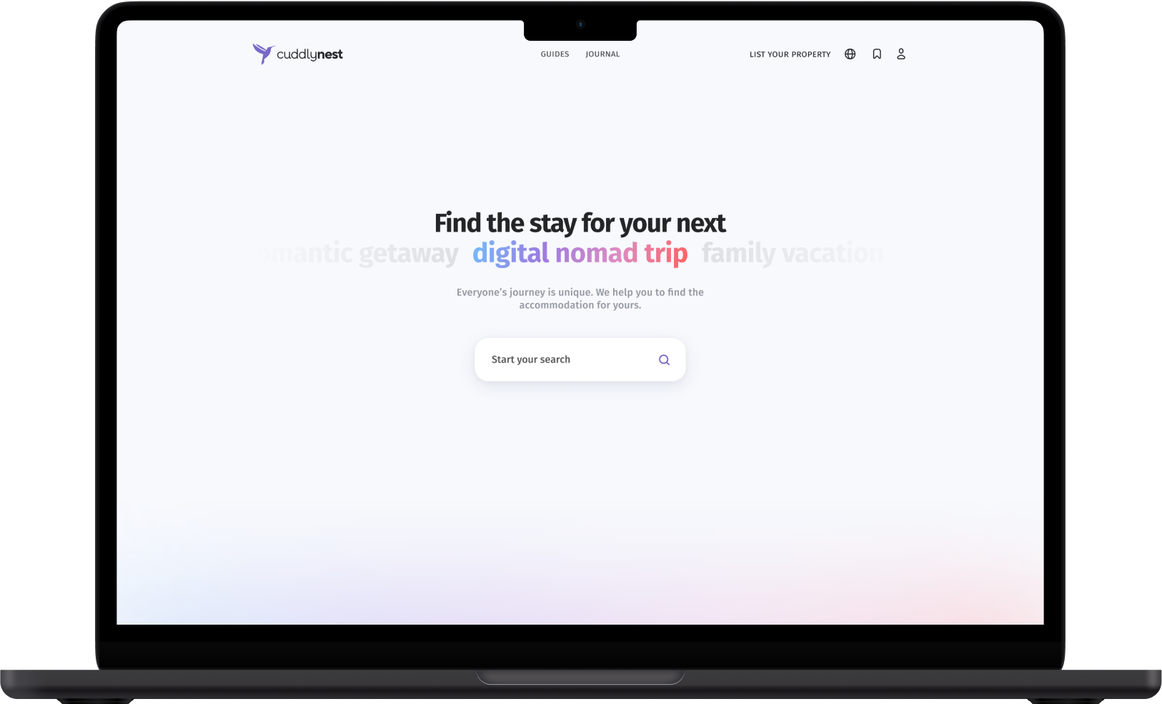
Easily reachable omnisearch with built-in natural language processing and no specific information required to start the search. People should be able to talk to computer in human language, it's a job of a computer to translate it.

Search may be as precise or as vague as traveller wants. Product understands and respects that people have different trip types ahead and at the time of visting a website they are on a different stage of their journey planning. At any moment traveller may add or remove details to their accommodation search.


Everything is in it’s right place. For both property owners and guests interface is designed in a way to show the actions that person most likely want to use at the moment.


Fully responsive. Designed to be easy to use on whatever screen size person has—mobile, tablet or desktop.


Branding*
It should have been a product for international audience and the high variety of users—from students, to adults, to retired people.
Founders had a special affection to the purple and pink colors, which I couldn't touch, other than that I had the freedom of shaping the brand however I like.
I wanted the product to feel approachable, down-to-earth, imputing travel, exploration and joy. I've tried to achieve that via typography, colors, imagery and copy (with the help of copywriters of course).
* I’m not a brand designer, but being the only designer on the team, I had to be one here.
Logo. The logo was too complicated with many fine details that looked messy in smaller sizes. I've simplified it and changed the logo word.

Typography. I needed something approachable, friendly and modern. Besides selected type should work in both big and small sizes, in interfaces and branding. I've picked Fira Sans — versatile humanist open-source typeface created by Erik Spiekermann. The typeface looks more humane than widely used grotesques or geometric sans-serifs. It is free, well designed and supports many languages. Typeface works in display, text and micro sizes (with minor letter spacing adjustments).


