- UI/UX
- Product
Cuddlynest
property owner interface
Scope
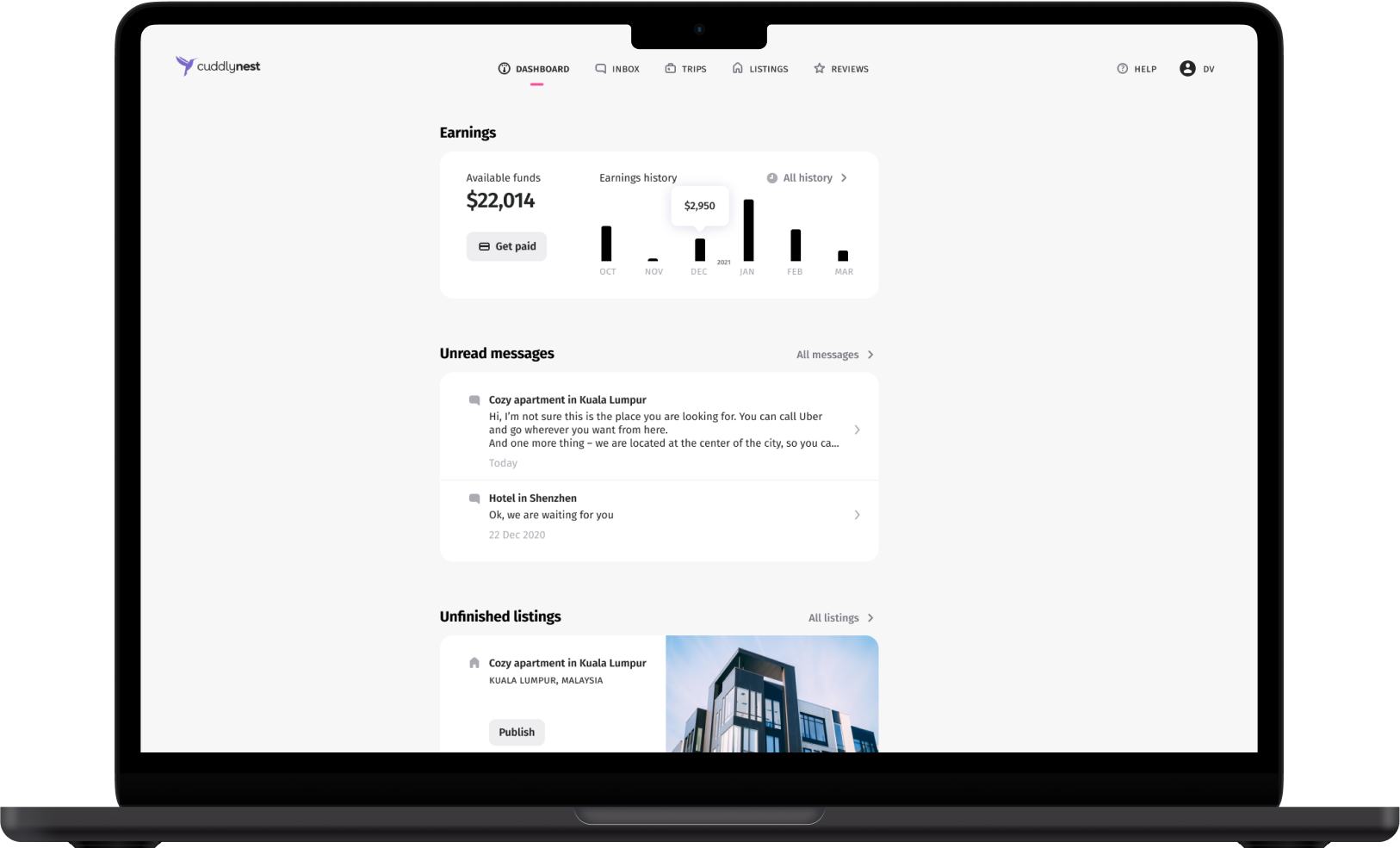
Cuddlynest, an online travel agency, needed a new interface for property owners to list and manage their properties. The existing interface was developer-built and overly complex. The project involved:
- Redesigning the property listing flow
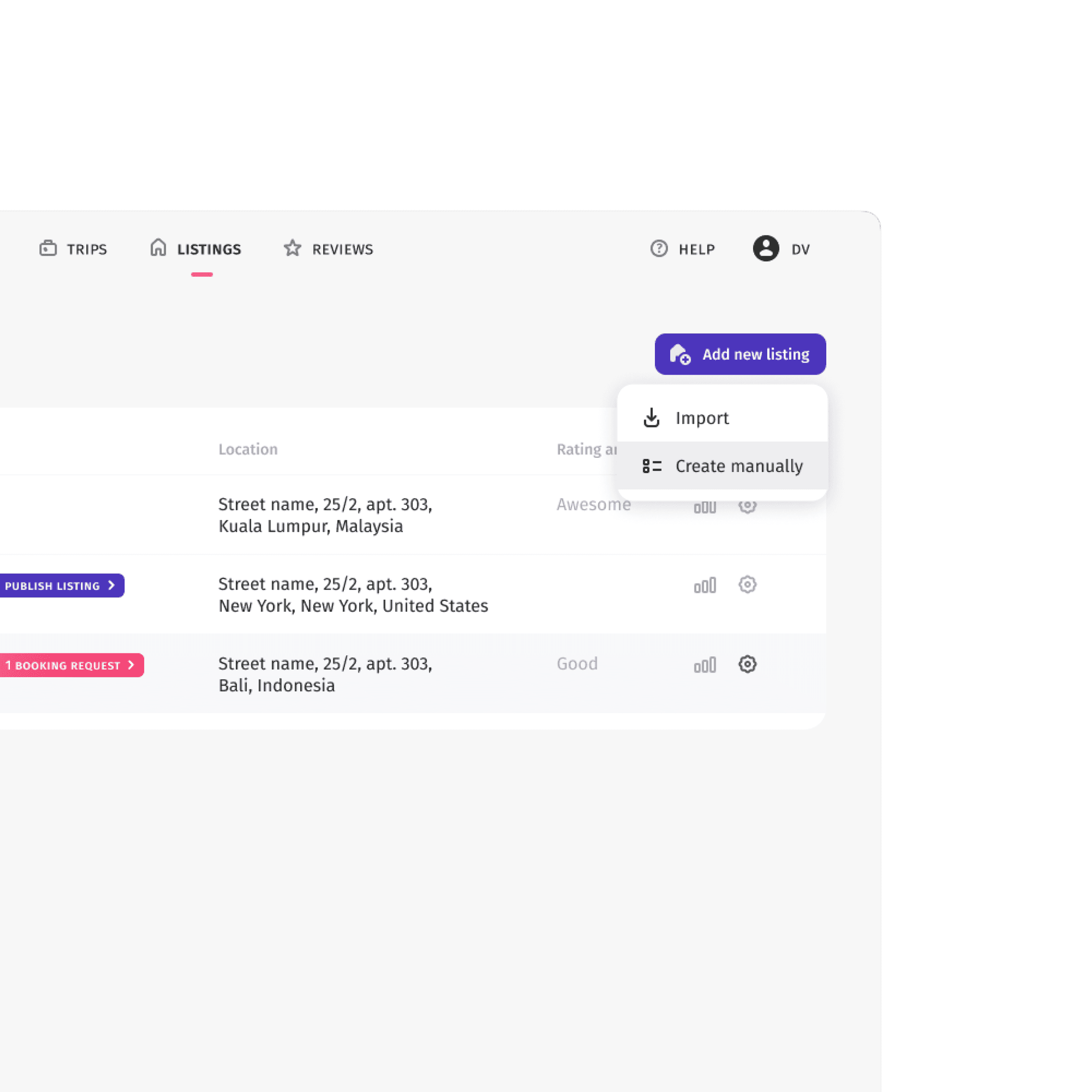
- Creating a manageable dashboard for property owners
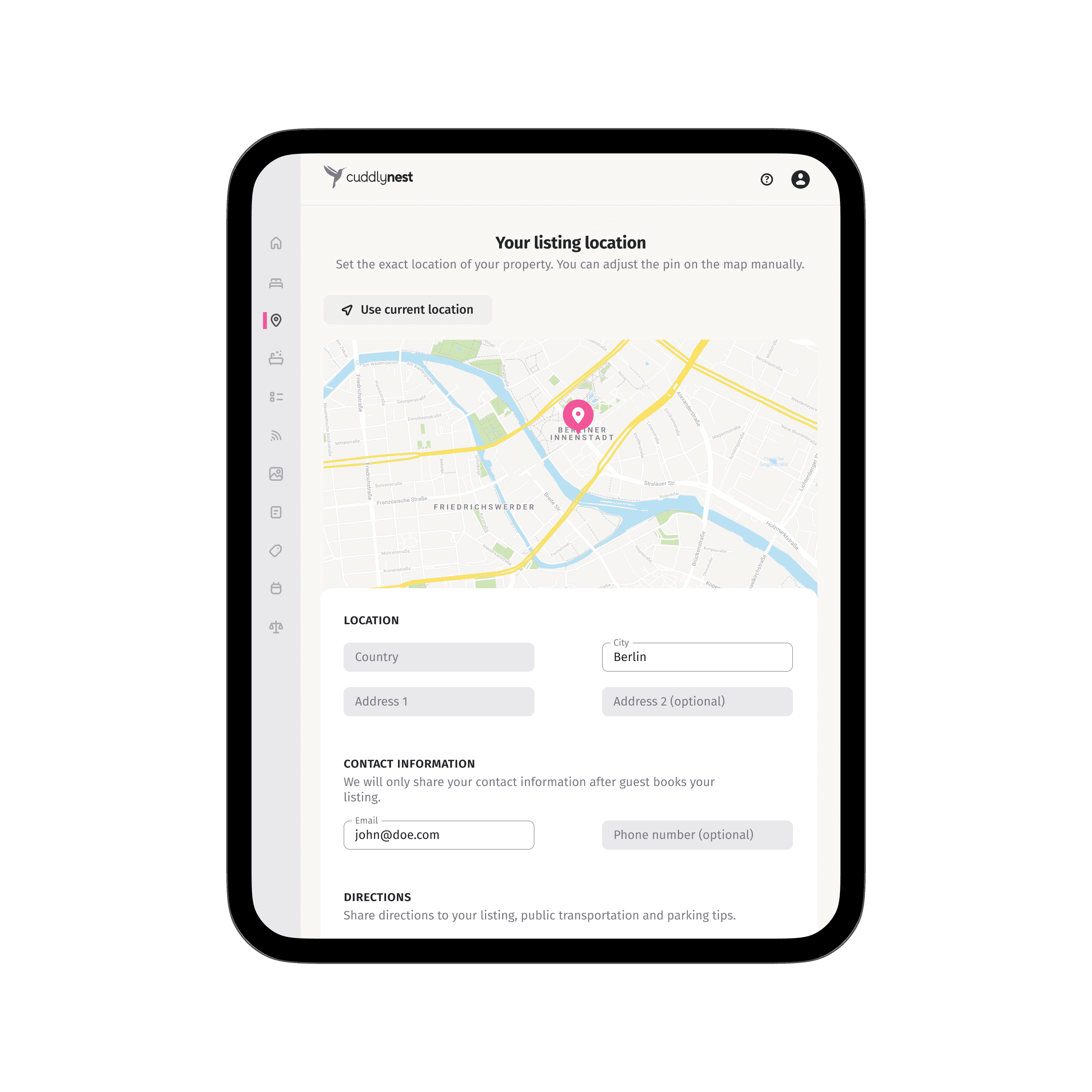
- Developing responsive designs for desktop (1440px), tablet (768px), and mobile (375px)
Process
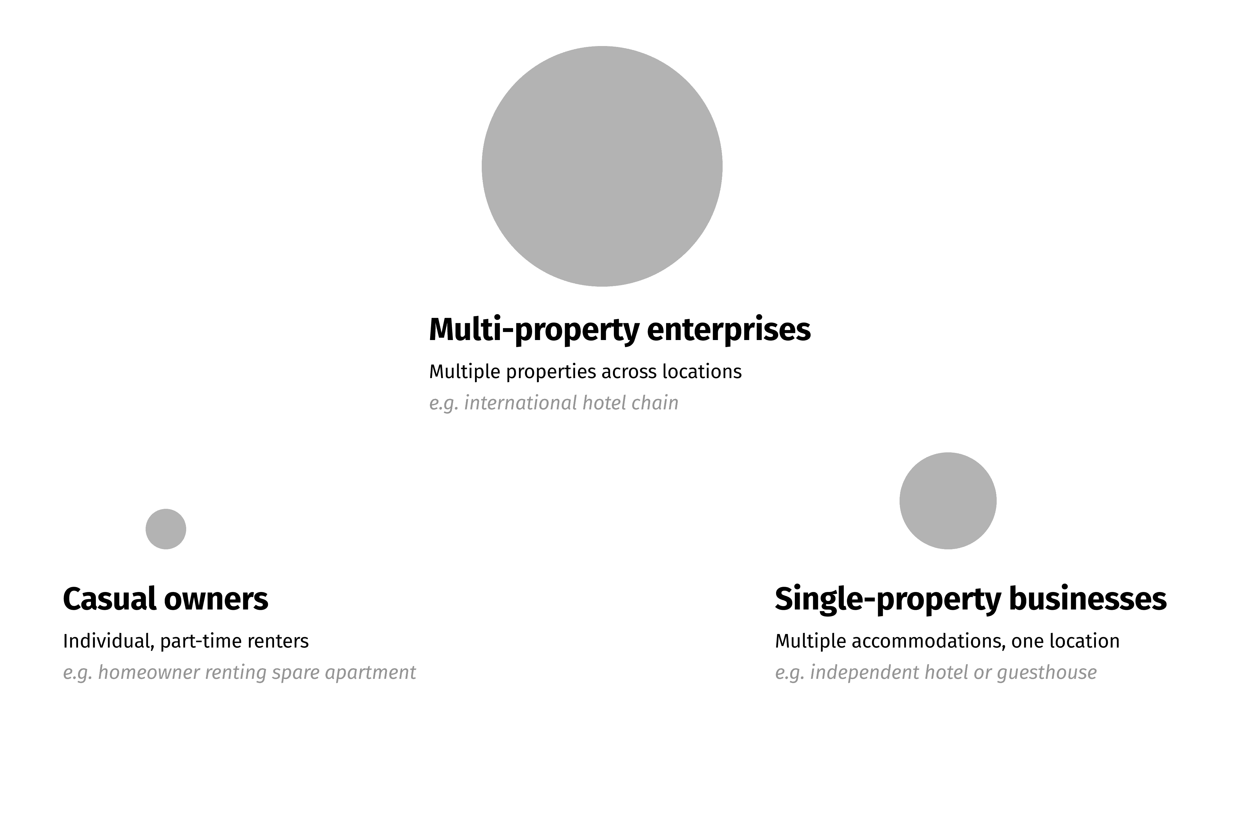
- Interviewed Product Owner to understand different types of property owners
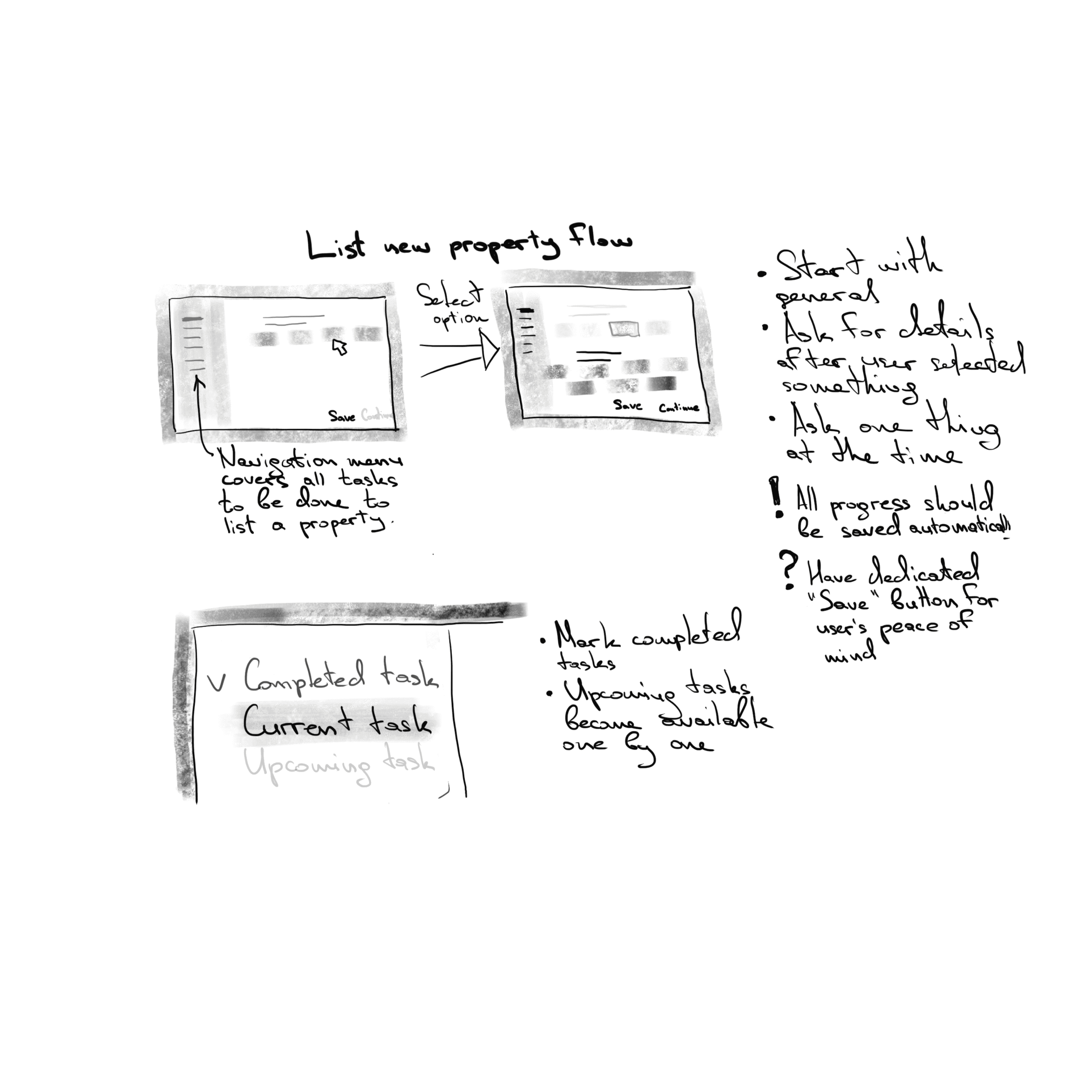
- Developed a concept of progressive disclosure and step-by-step saving
- Discussed and got approval from Product Owner
- Designed the interface, constantly communicating with backend developers for feasibility
I conducted in-depth discussions with the Product Owner to understand the diverse range of property owners using our platform. This helped me create user personas, from individual apartment owners to large hotel chains.
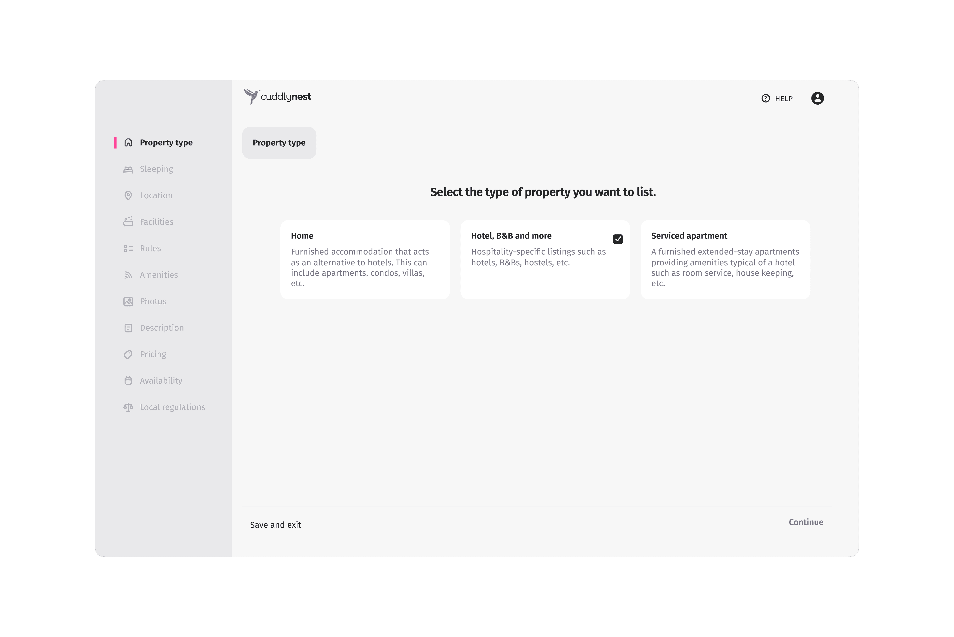
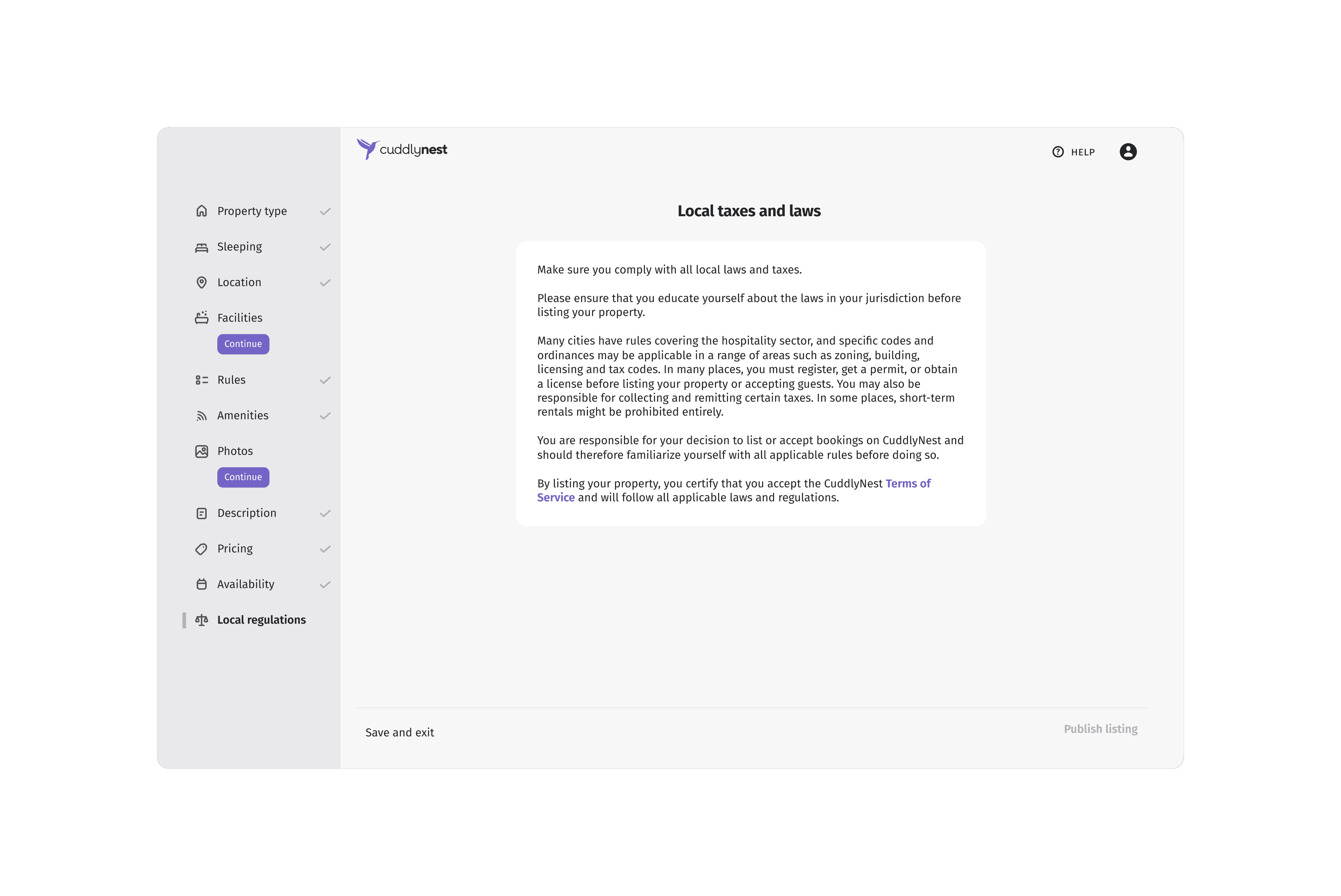
I created a concept that gradually revealed information and options to users as they progressed through the listing process. This approach aimed to reduce overwhelming users with too much information at once.
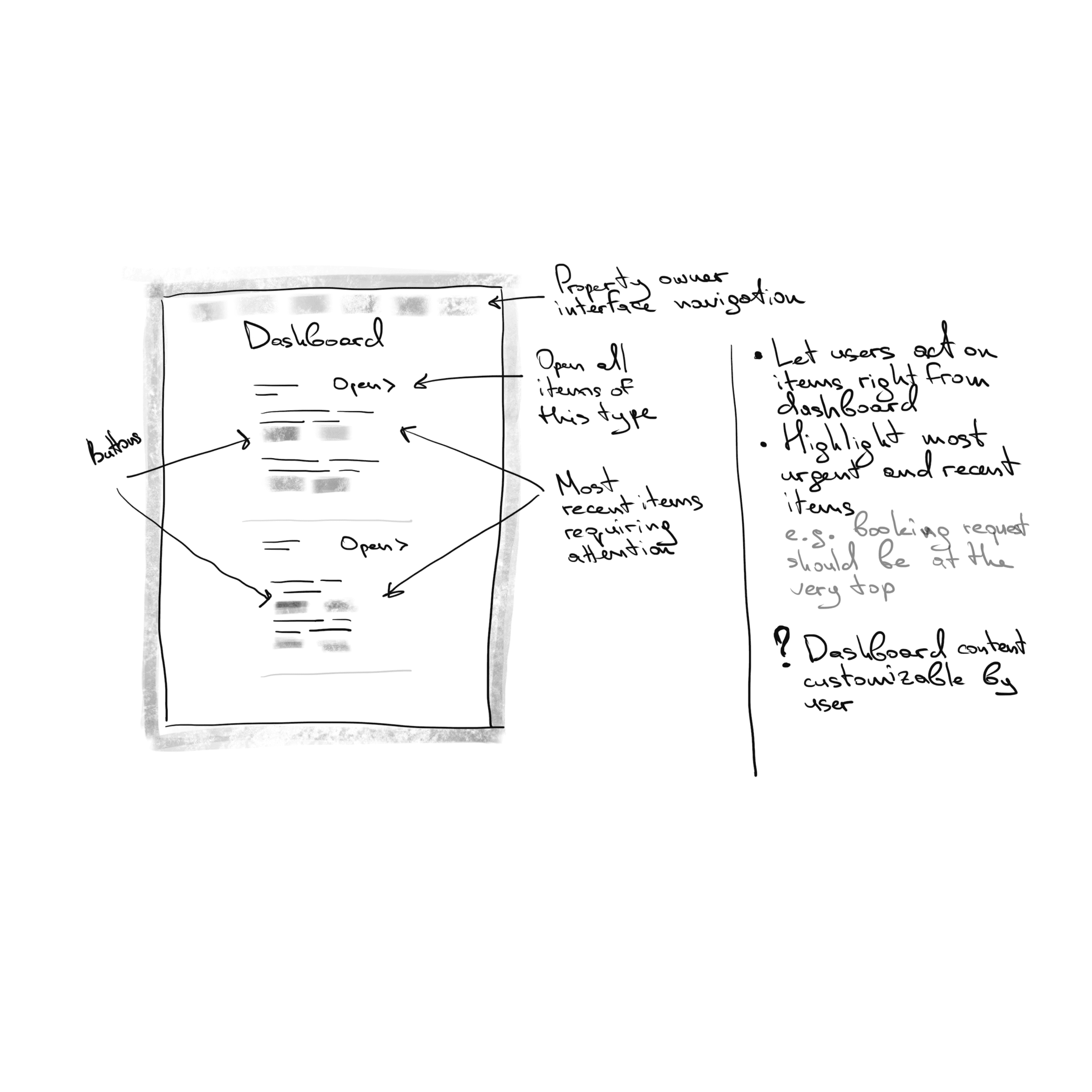
I created wireframes and high-fidelity mockups for each step of the listing process and the dashboard. Throughout the design phase, I maintained constant communication with backend developers to ensure technical feasibility.
Challenges
The biggest challenge was creating an interface that would work for a diverse range of property owners. We needed to cater to small-scale owners renting out a single apartment during their vacation, as well as large hotel chains listing hundreds of accommodations across multiple online travel agencies.
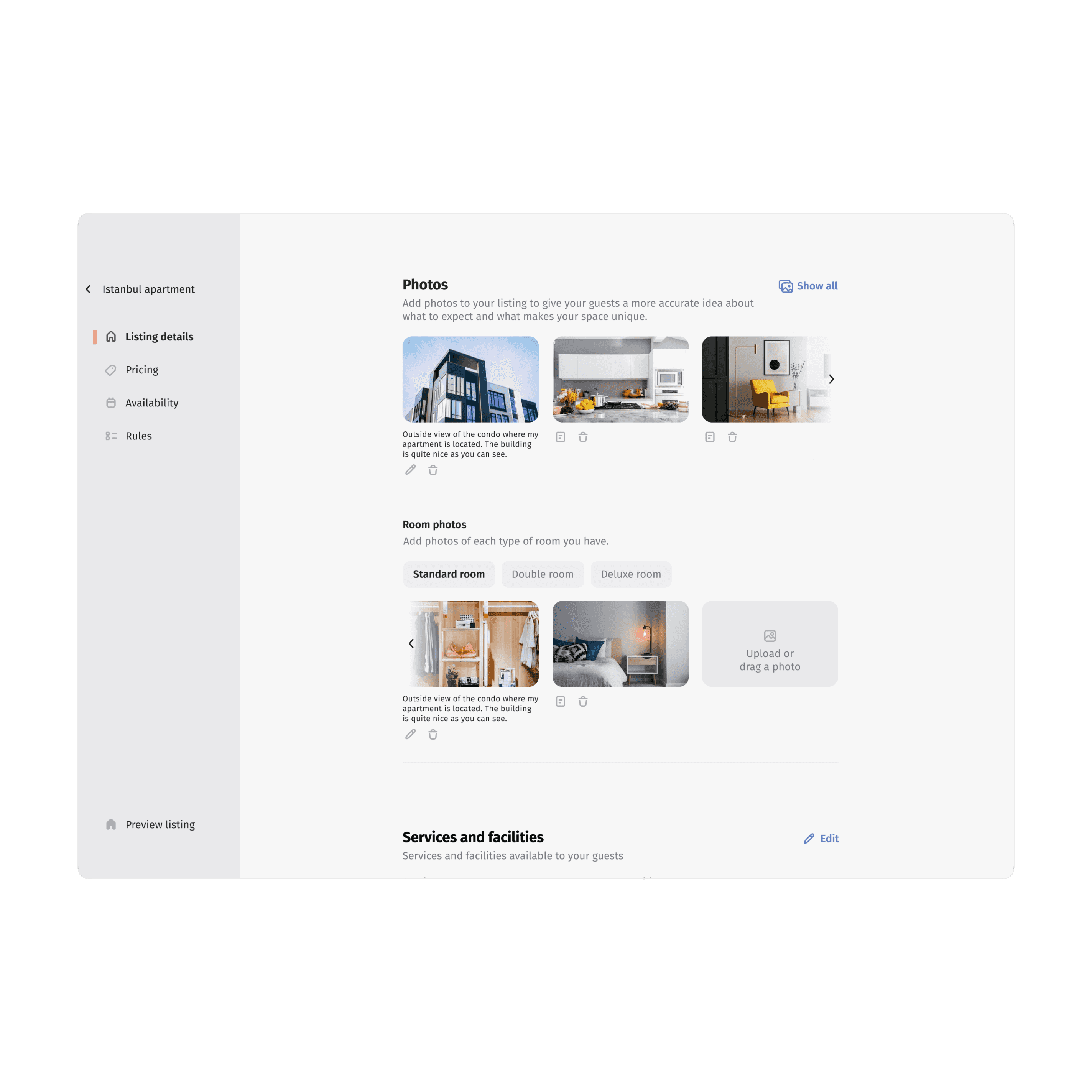
Our backend system allowed integration with APIs of major hotel management software used by our larger clients. This enabled automatic import and synchronization of their listings with all the necessary details. My task was to design an interface that could display this imported data effectively while still allowing for manual edits when needed.
Another significant challenge was striking a balance between a clean, focused interface and providing power users with easy access to advanced features. We wanted to avoid cluttering the interface while still allowing for detailed customization of listings.
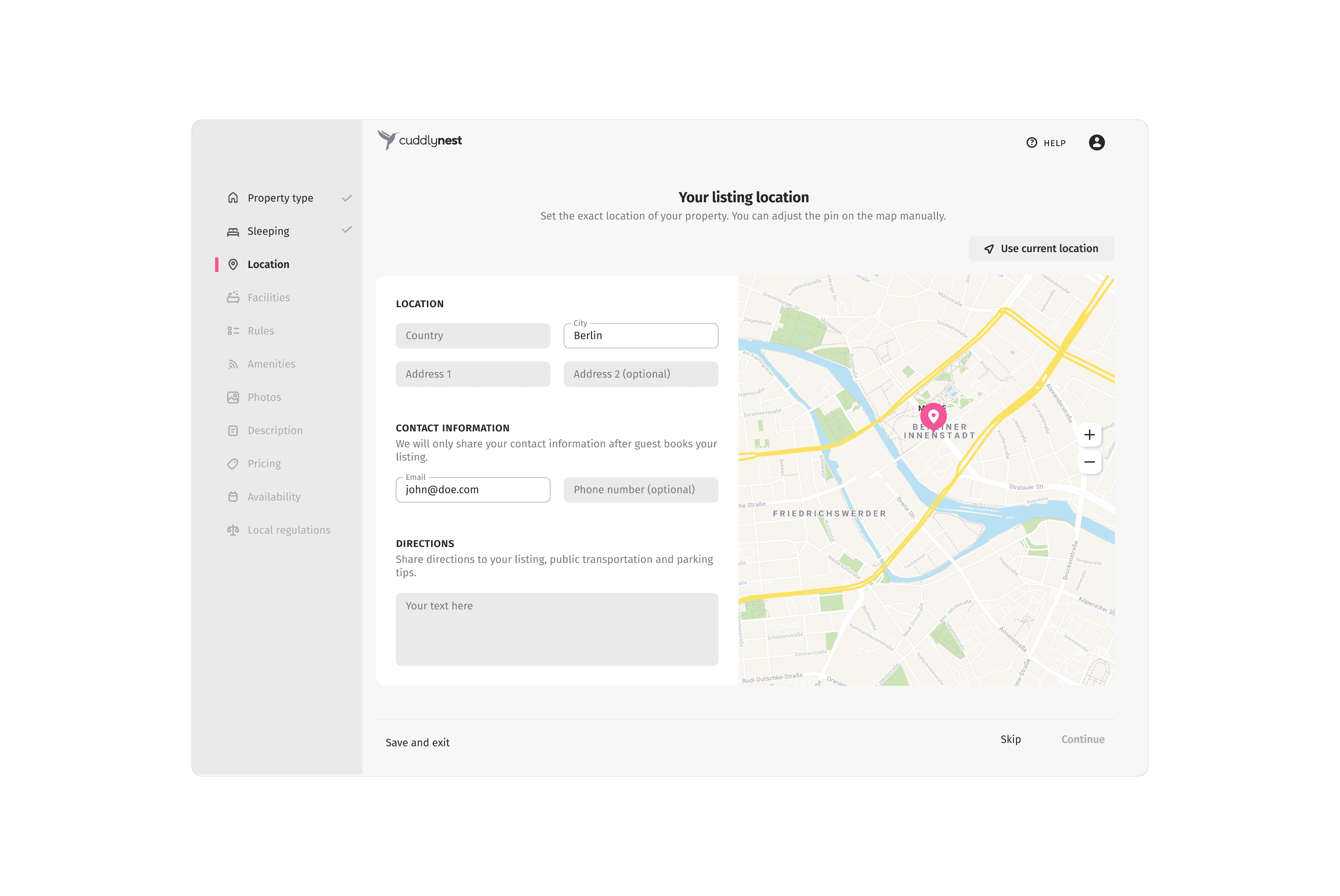
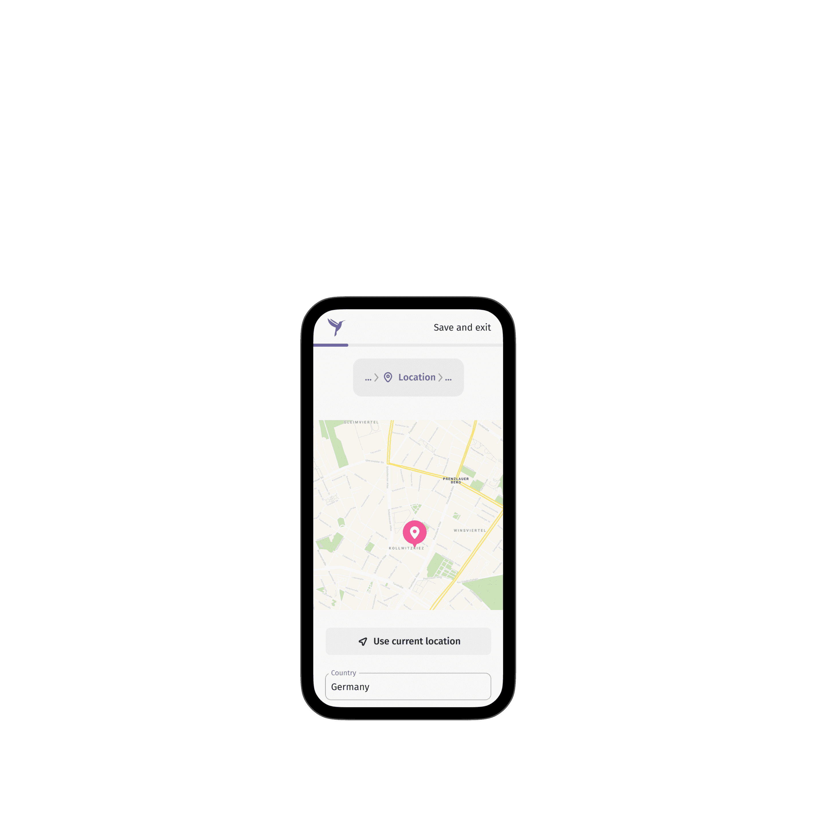
In the new property listing flow, I addressed these challenges by implementing a step-by-step process. This approach only asked for necessary information at each stage, preventing user overwhelm. Additionally, we allowed users to save their progress at any point and return later, providing flexibility for both casual and power users.
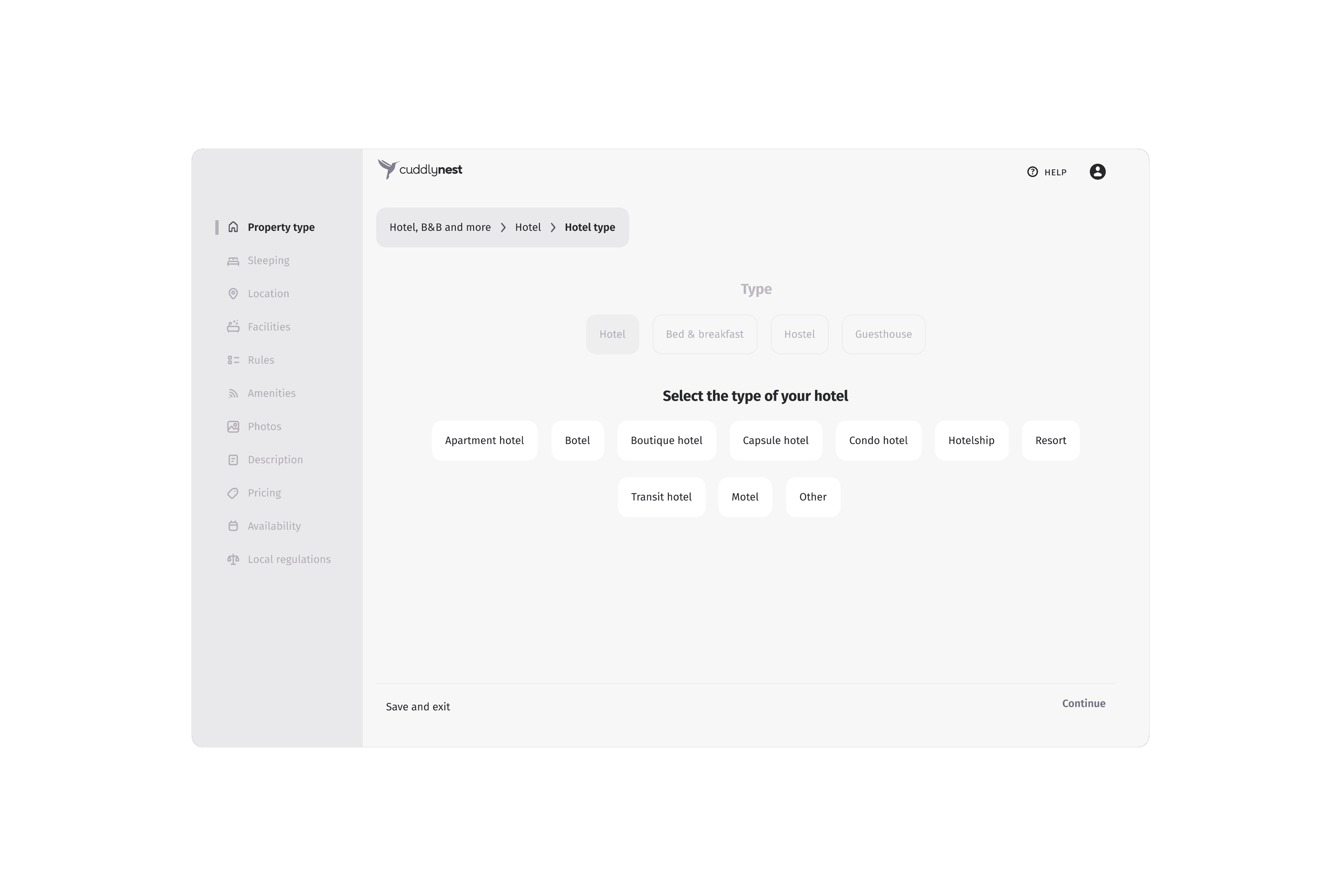
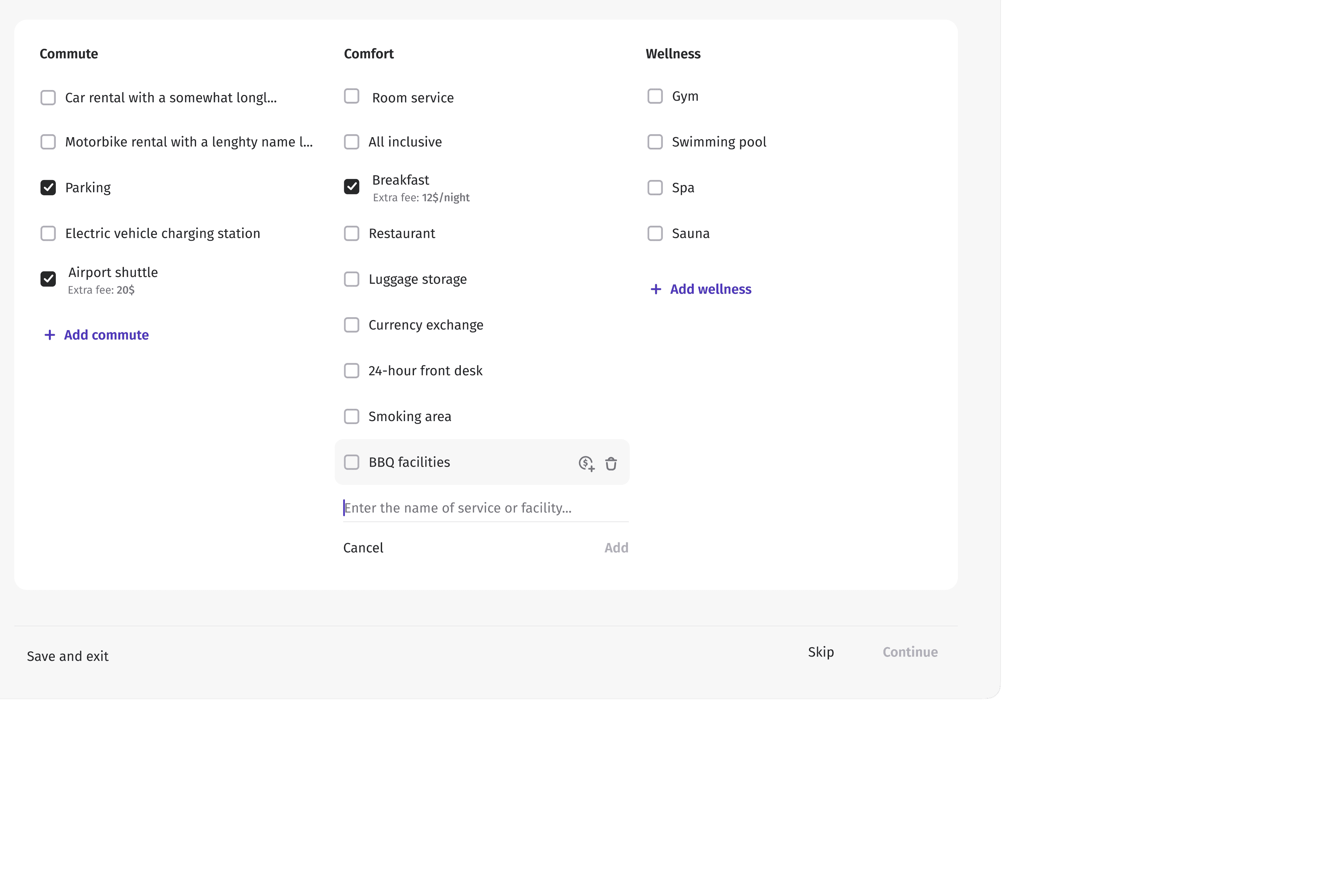
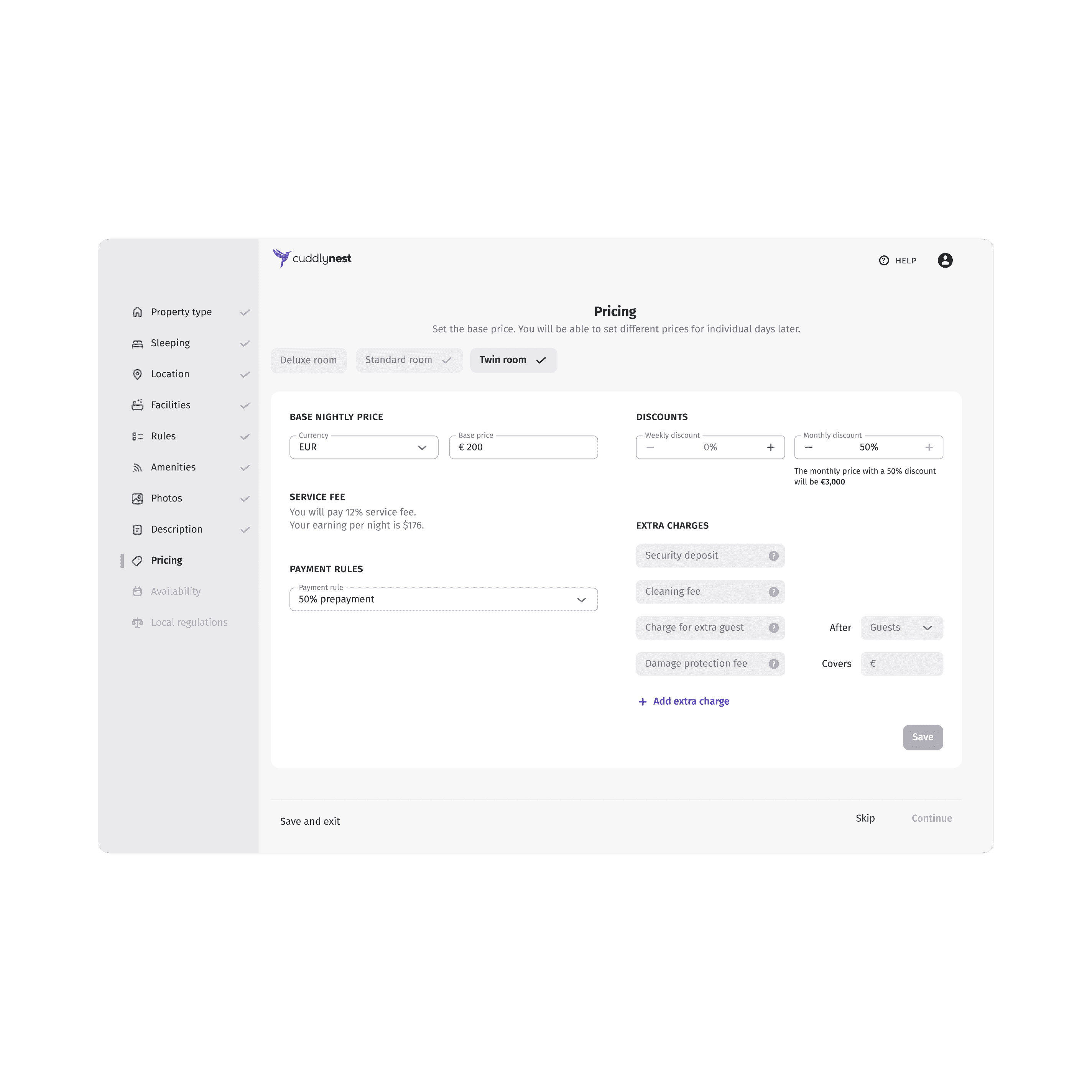
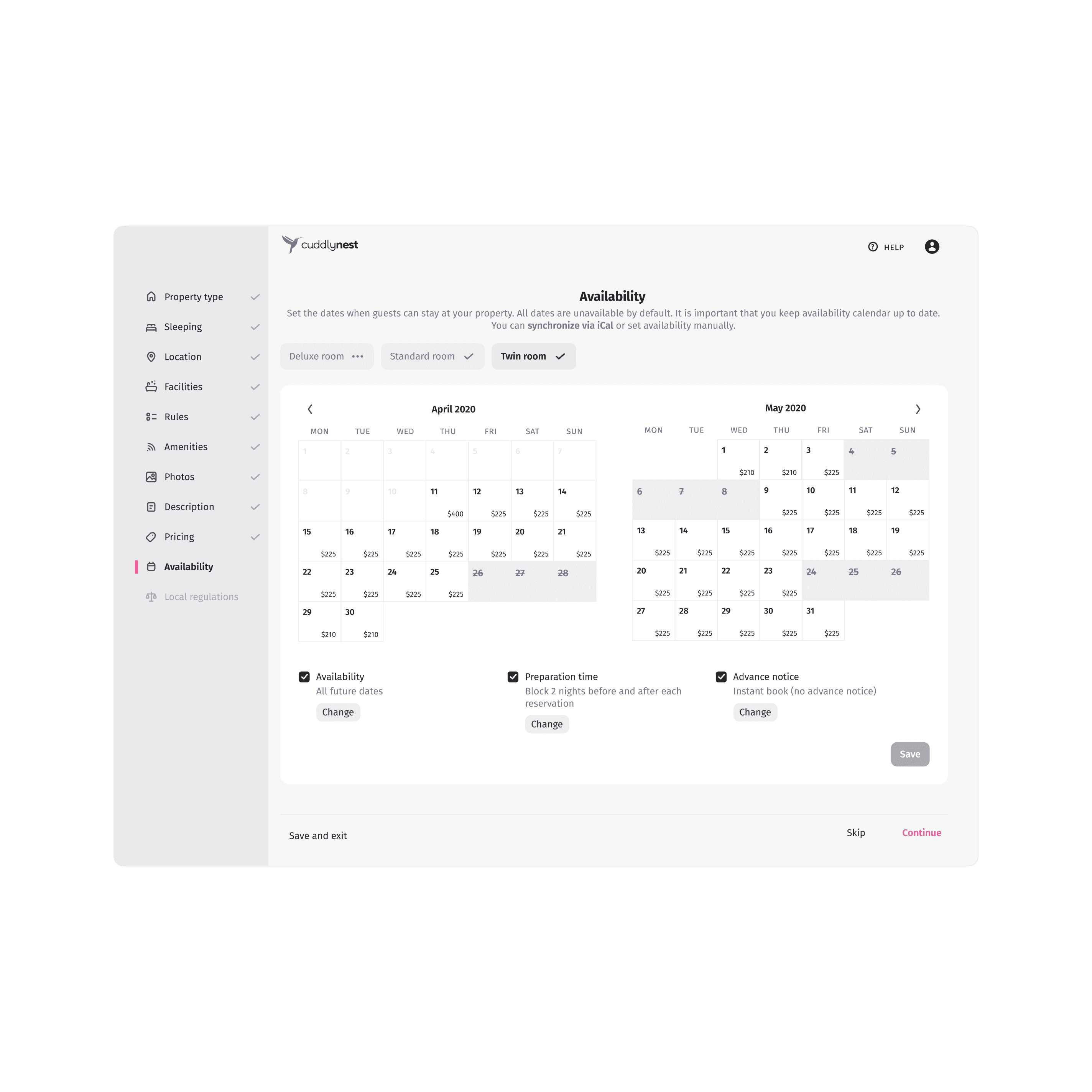
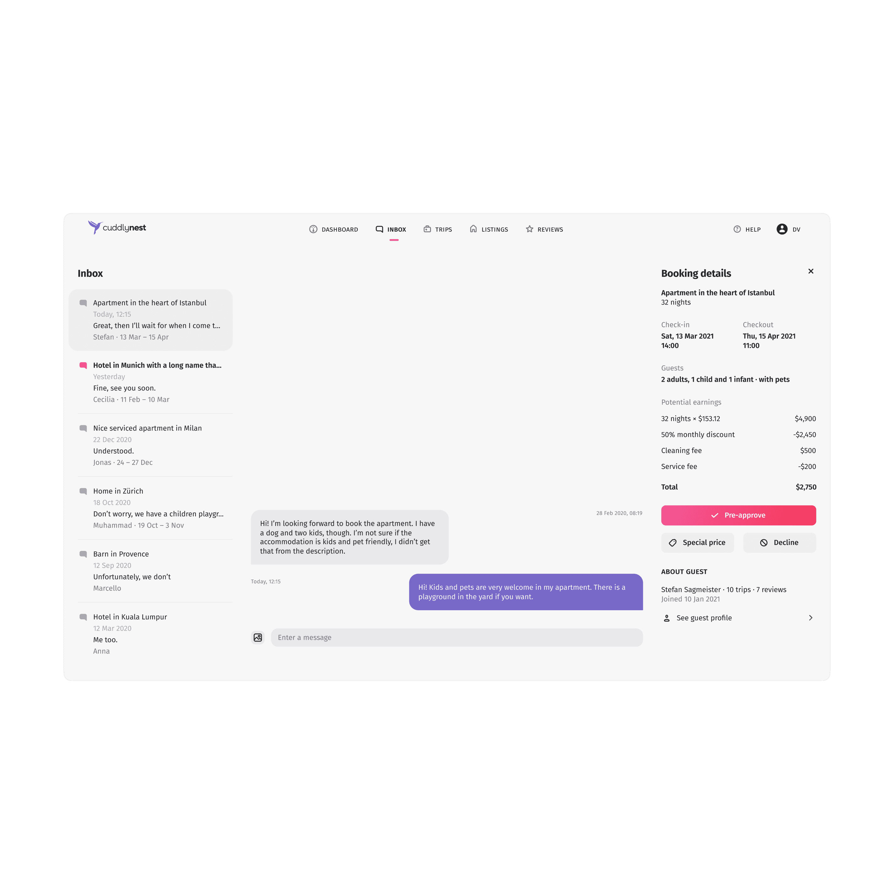
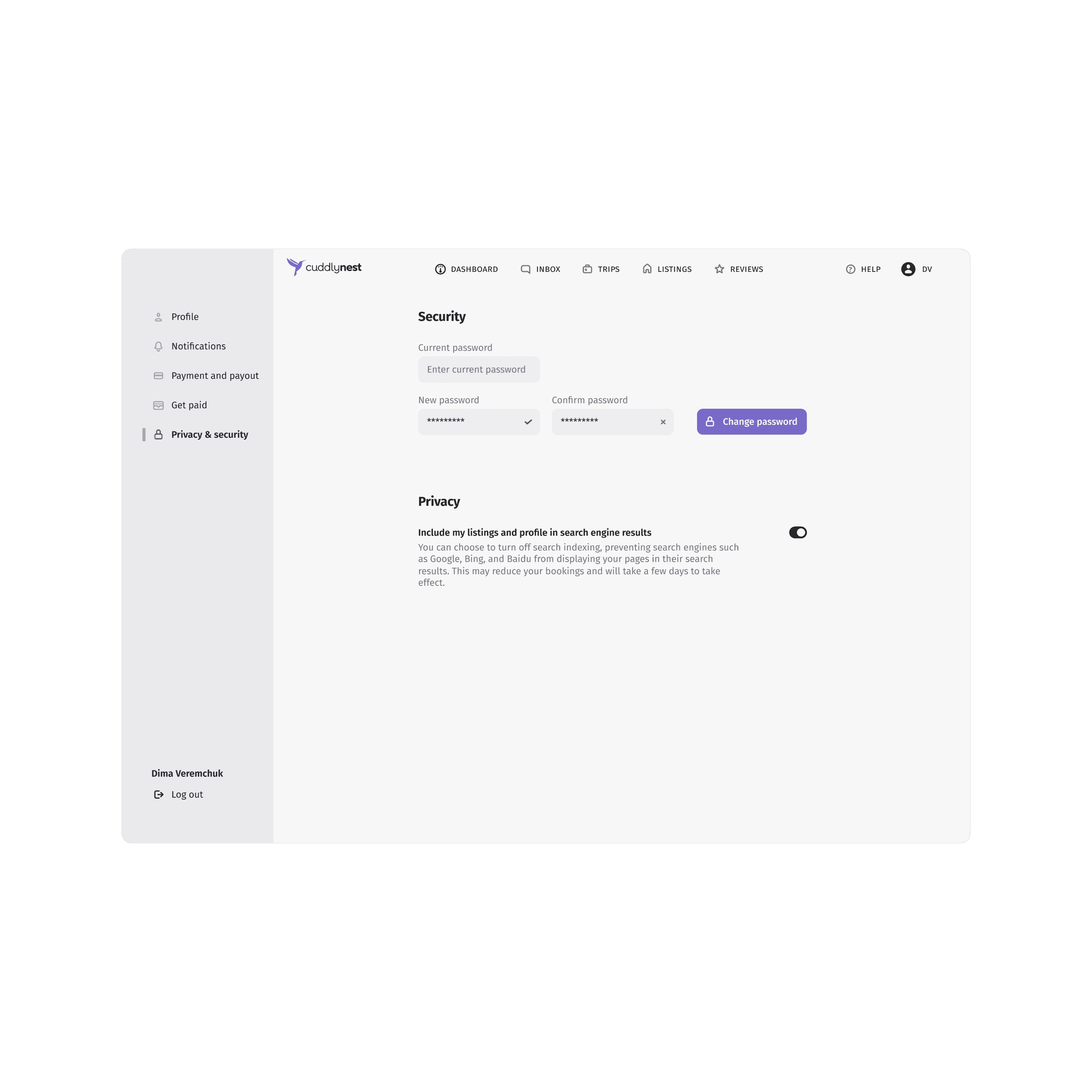
In the property management dashboard, I implemented a two-tiered navigation system to manage complexity. The main navigation at the top allowed switching between major sections, while a context-sensitive local navigation on the left provided quick access to specific details. This structure organized large amounts of data effectively, benefiting users managing multiple properties by allowing easy access to information without losing context.
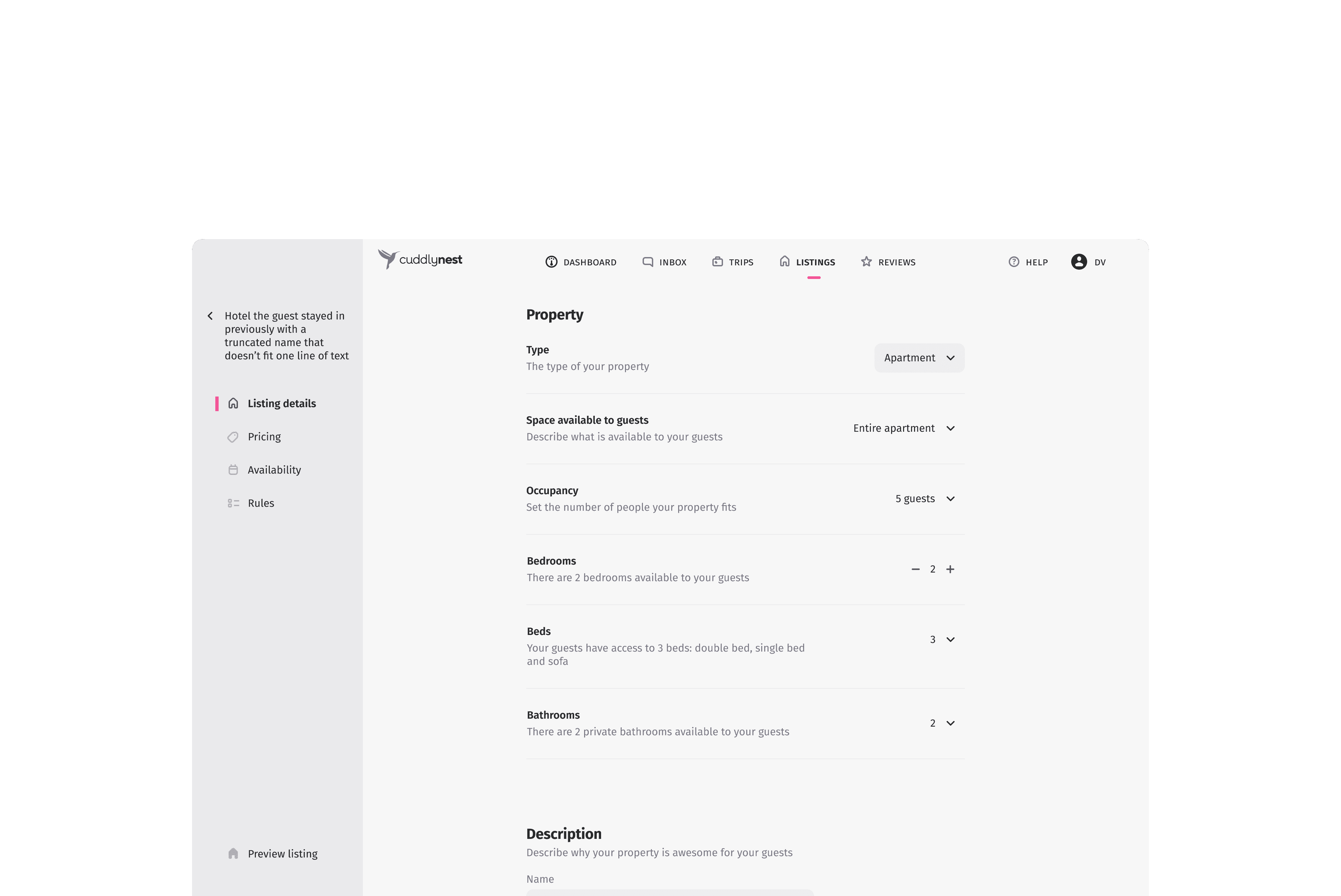
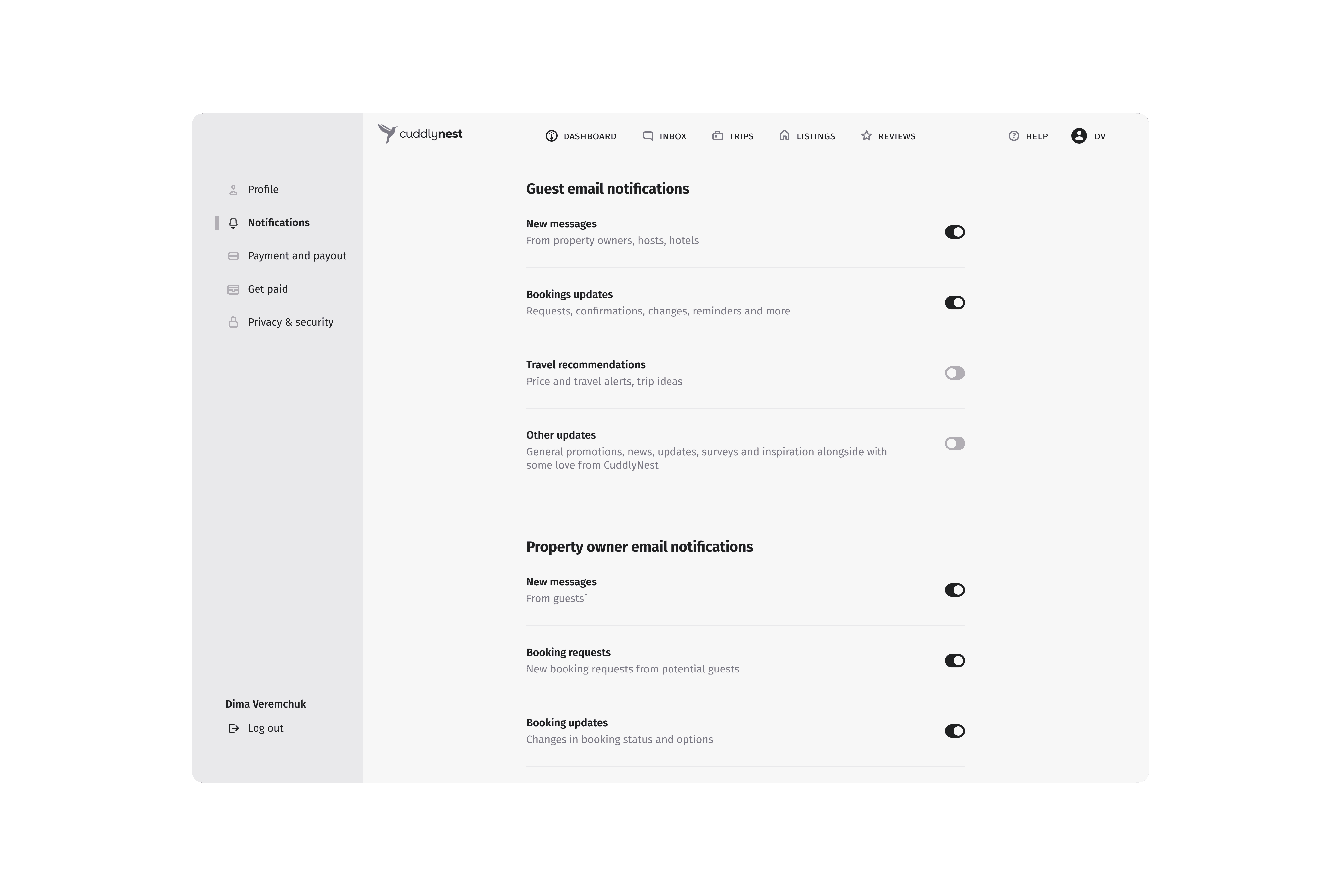
Clear information architecture with single-point focus for users
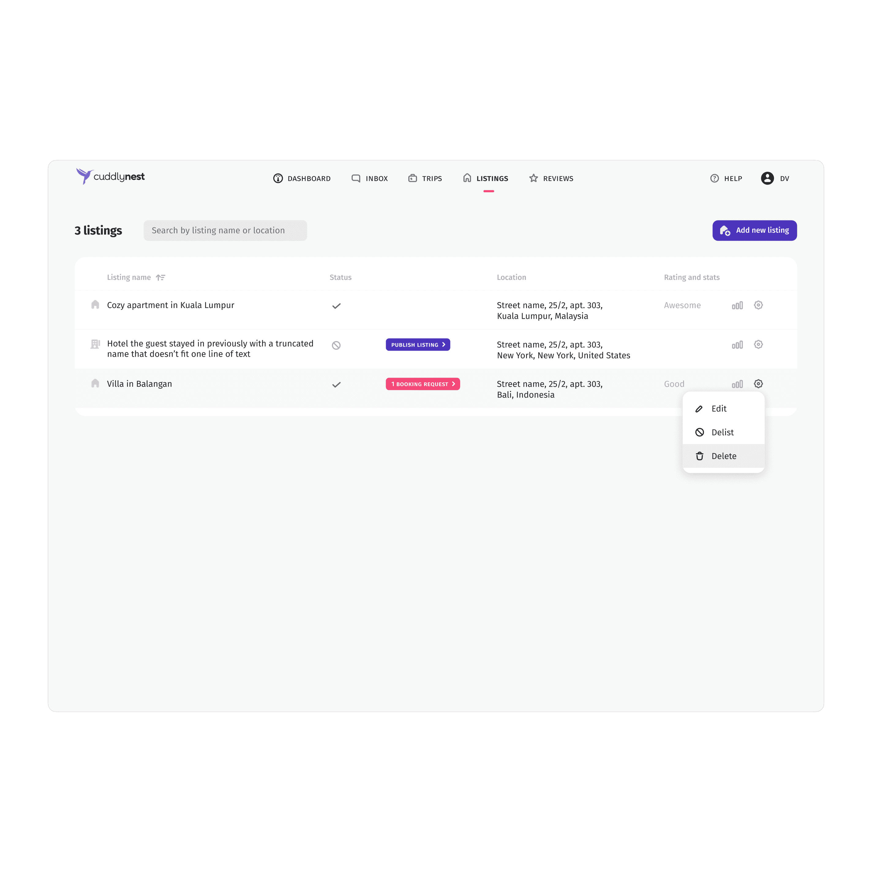
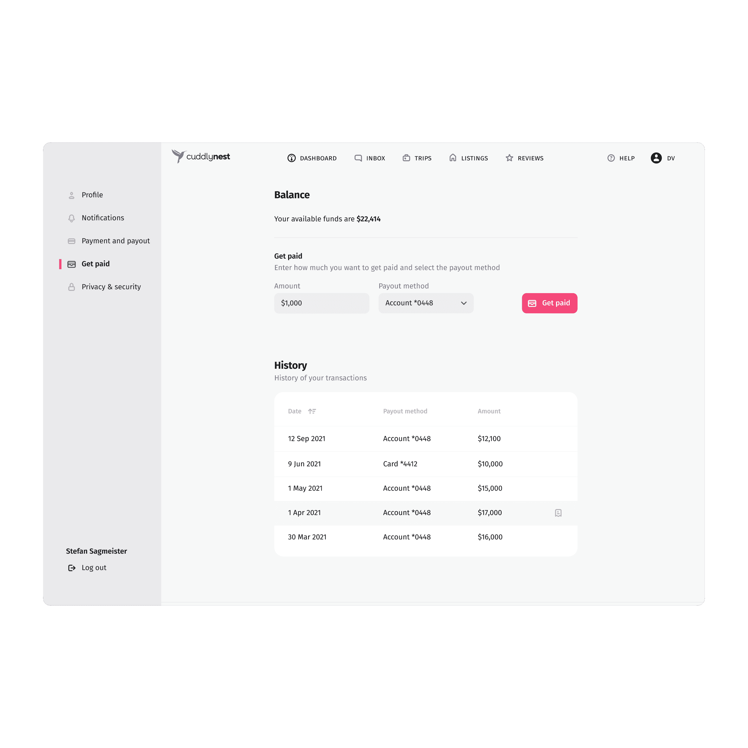
Dashboard with only actionable elements
Responsive design prioritizing crucial actions
Results
This redesign significantly improved the user experience for property owners, making the listing process more intuitive and manageable across different user types and device sizes.
- Bounce rate for property owners creating listings decreased by more than 50%
- Received positive feedback from property owners
